%20--%3e%3csvg%20version='1.1'%20id='Layer_1'%20xmlns='http://www.w3.org/2000/svg'%20xmlns:xlink='http://www.w3.org/1999/xlink'%20x='0px'%20y='0px'%20viewBox='0%200%20236.2%20238.3'%20style='enable-background:new%200%200%20236.2%20238.3;'%20xml:space='preserve'%3e%3cstyle%20type='text/css'%3e%20.st0{fill:%23FFFFFF;}%20.st1{fill:%23678983;}%20.st2{fill:%2395C4BC;}%20%3c/style%3e%3cpath%20class='st0'%20d='M236,124.2c-0.1-0.2-0.2-0.4-0.4-0.5L236,124.2L236,124.2z'/%3e%3cpath%20class='st1'%20d='M208.3,93c0.7-0.8,1.8-1.1,2.8-1c3.1,0.4,6,1.5,8.6,3.1c2.6,1.5,4.9,3.4,6.9,5.7c1.8,2.1,2.6,3.8,2.5,5%20c-0.1,0.9-0.4,1.7-0.8,2.5c-0.4,0.8-0.9,1.1-1.5,1c-0.7-0.1-1.4-0.4-2.1-0.8c-0.3-0.2-1.2-0.6-2.6-1.4c-1.7-0.9-3.5-1.6-5.3-2.1%20c-2.3-0.7-4.7-1.2-7.2-1.5c-2.4-0.3-3.4-2.1-3-5.4l0.2-1.6C206.9,95.3,207.4,94,208.3,93z'/%3e%3cpath%20class='st2'%20d='M176.6,117.4c-1.7,0.9-3.9,0.3-4.8-1.4c-0.9-1.7-0.3-3.9,1.4-4.8c0,0,0.1-0.1,0.1-0.1%20c6.8-3.5,14.3-5.7,21.9-6.4l6.5-41.1c0.9-5.5,1.7-11.2,0.9-16.7c-0.8-5.6-3.6-11.1-8.6-13.8c-4.9-2.7-10.9-2.2-15.8,0.1%20s-8.9,6.4-12.2,10.8c-20,26.3-19.4,48.4-28.4,94.2h-5.2c0-0.3,0.1-0.6,0.1-0.9l13.1-81.7c1.1-6.7,2.1-13.5,0.9-20.1%20c-1.2-6.6-5.2-13.2-11.5-15.6c-5.7-2.2-12.4-0.6-17.4,3s-8.7,8.7-11.7,14C99.3,48.2,95,60.6,91.8,73.4c0.2-22.7-4.4-40.6-13.8-53.5%20C70.3,9.2,58.5,2.1,45.4,0.4h-0.3C24.5-2.4,5.6,12.1,2.8,32.8s11.7,39.6,32.4,42.3c18.1,2.4,35.4-8.5,40.9-26%20c-0.5-2.1-1.2-4.3-2-6.3c-4.6-11.7-13.8-21.1-25.3-26c-1.8-0.8-2.6-3-1.7-4.7c0.8-1.7,2.8-2.5,4.5-1.8c19,8.1,30.8,25.9,32.7,46.2%20c1.4,14.8,0,30.4-2.1,45c-1.1,7.6-2.6,15.1-4.3,22.6c-0.4,2-6.1,21.7-5.6,22c3.5,1.9,6.9,4.1,10.1,6.6c1.6,1.2,1.8,3.5,0.6,5%20c-1.2,1.6-3.5,1.8-5,0.6l0,0c-23.6-18.3-49.2-15.5-66.9,7.2c-17.4,22.4-14,54.5,7.7,72.8l55.3-20.7c0.6-0.4,1.2-0.9,1.7-1.3%20c5.4-4.8,6.9-12.5,8.1-19.7l17.1-103c0.4-2.2,0.8-4.5,2.2-6.2c1.4-1.7,4.1-2.6,5.9-1.3c1.8,1.3,1.7,4.1,1.4,6.4L95.2,209%20c12.7-3.9,25.2-8.2,37.5-13c3.4-1.3,6.8-2.7,9.3-5.4c3-3.3,3.9-8,4.7-12.4l14.4-83.1c0.2-1.9,0.8-3.8,1.9-5.4%20c1.2-1.5,3.5-2.3,5.1-1.3c1.8,1.2,1.7,3.8,1.5,6l-7.7,60.9c-0.8,6.7-1.7,13.6-0.3,20.2c1.2,5.4,4.1,10.6,8.6,13.6%20c1,0.7,2.2,1.3,3.4,1.7c7.1,2.5,14.9-0.5,21.3-4.4c21.8-13.2,36.9-35.2,41.3-60.3c0-0.2,0.1-0.3,0.1-0.5%20C220.1,110.6,196.2,107.2,176.6,117.4z'/%3e%3c/svg%3e)
Client
Microsoft Windows
Role
Product Designer
Timeline
2023-2024
Platform
Windows OS / Taskbar / Notification Surface
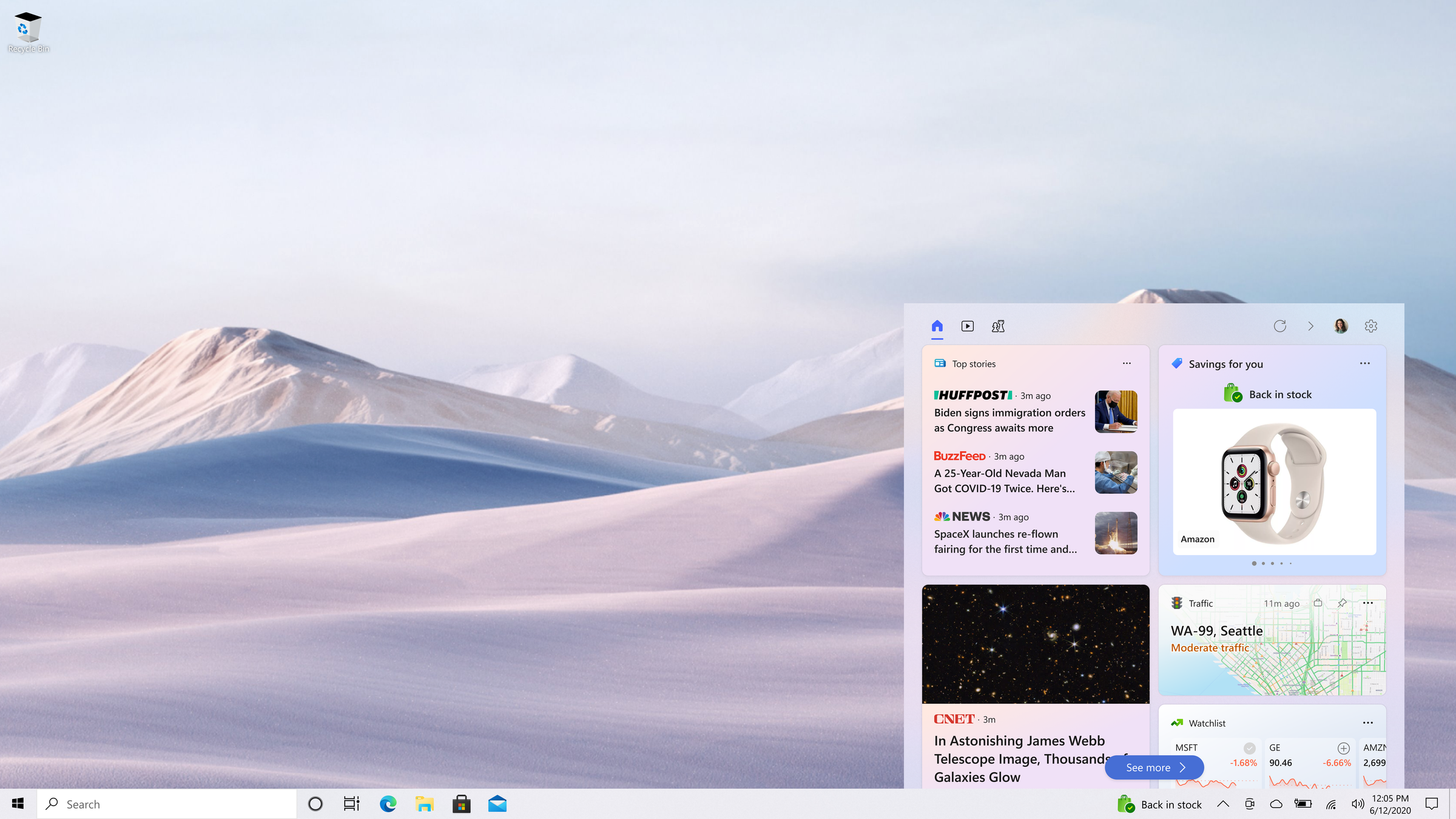
Commerce Notifications for Windows
Context
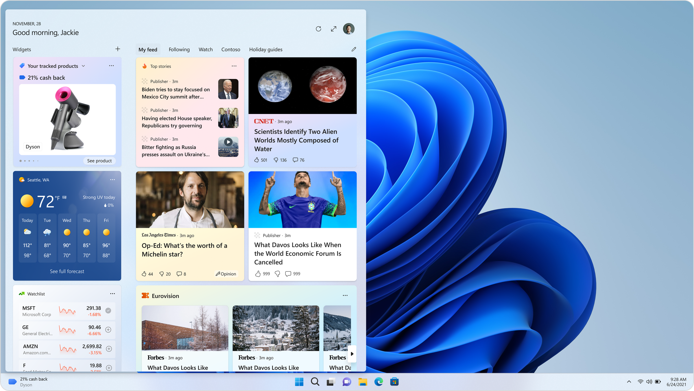
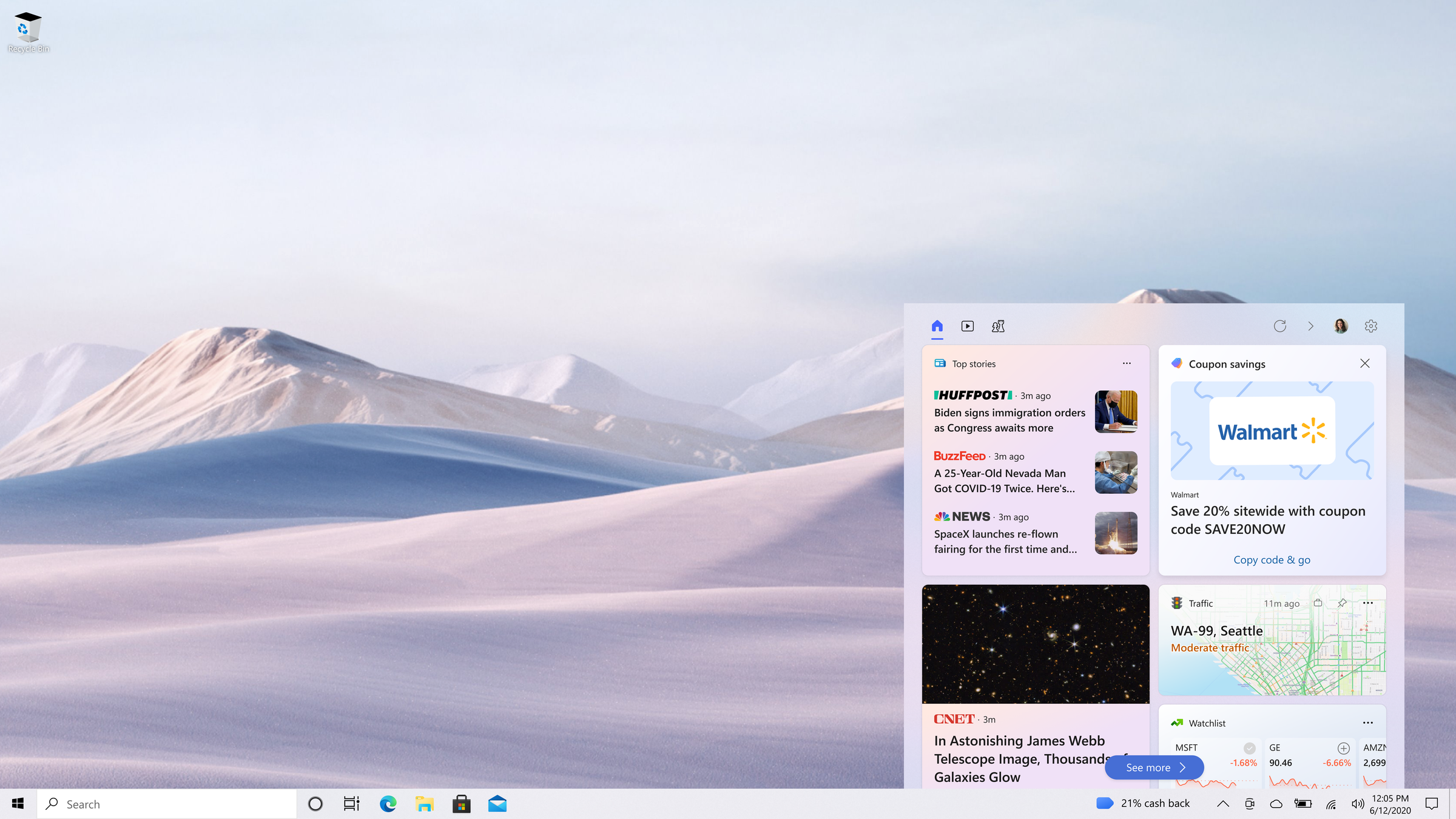
Bing and Edge Shopping give users several ways to signal explicit commerce intent: tracking a product's price, saving a coupon, favoriting a store, opting into cash back. Historically, the payoff for that intent (a price drop, a restock, a cash back bonus, a matching coupon) only surfaced back inside the browser. If the user wasn't in Edge when the event happened, they missed it.
The proposal was to move these moments up a layer, into Windows itself: the taskbar and notification surface every user sees regardless of what app they're in. That's a much higher-trust, much more scrutinized surface than a browser tab. Windows has its own governance for what's allowed to notify a user, and a low tolerance for anything that reads as advertising rather than utility. My job was to design four related experiences that could clear that bar.
The Four Experiences
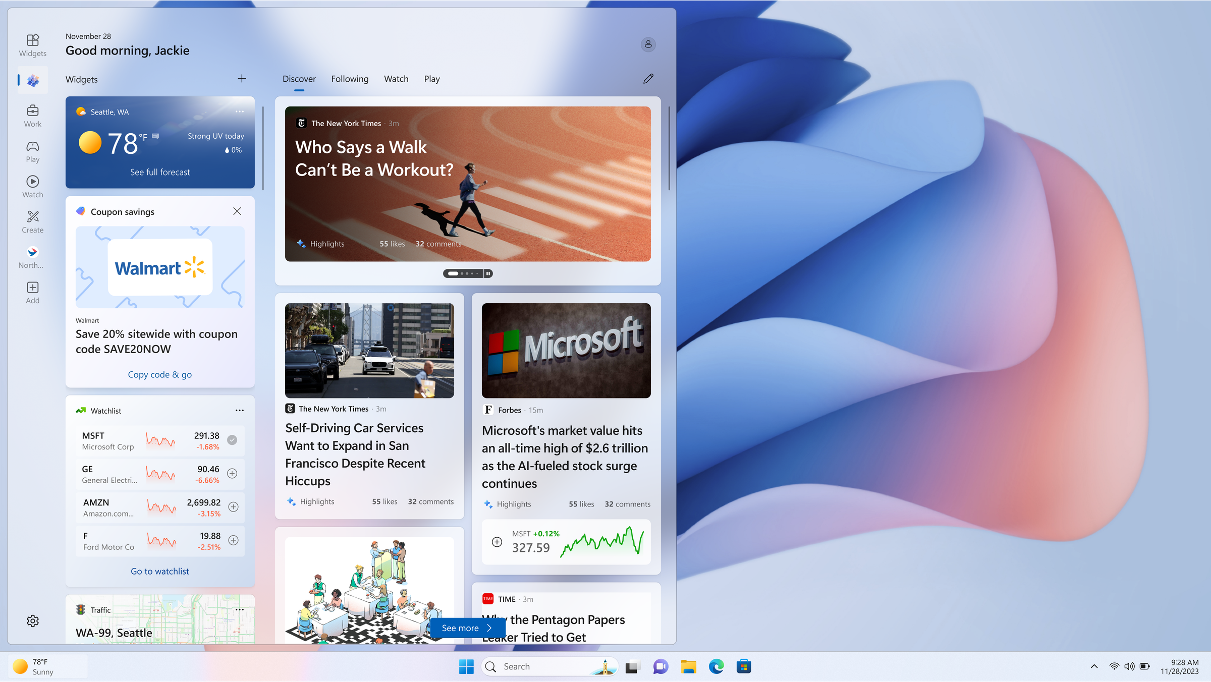
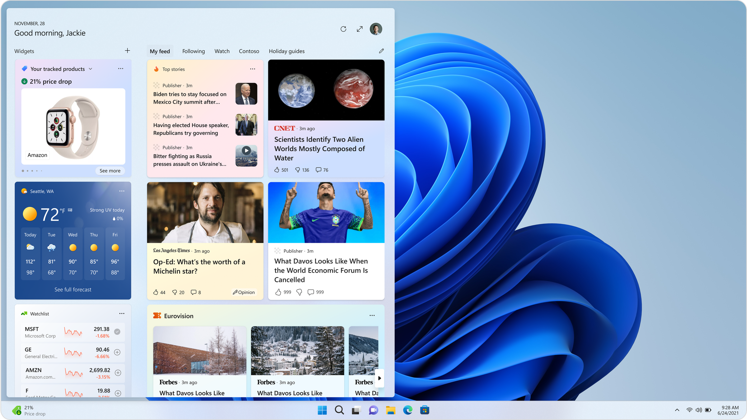
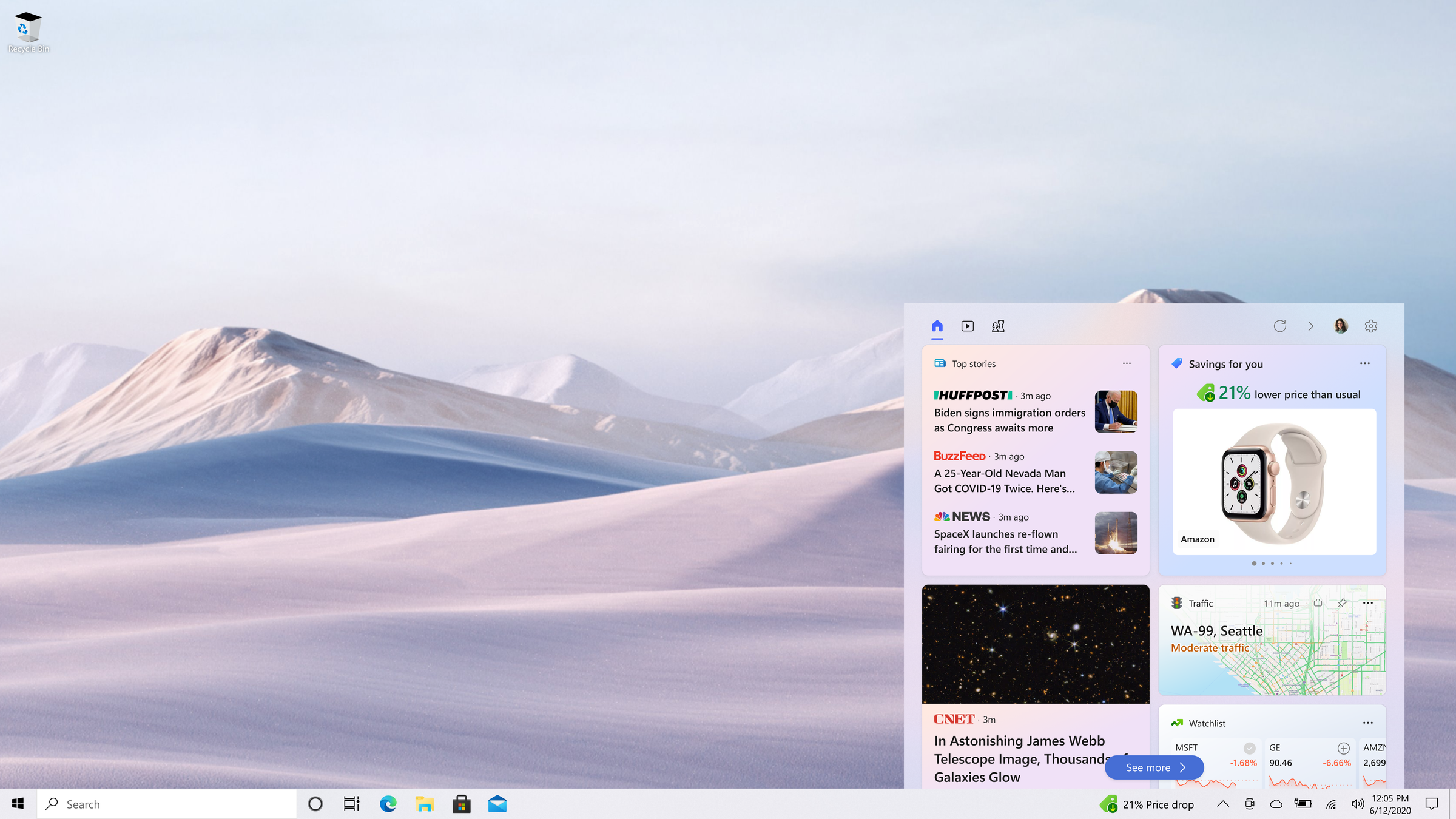
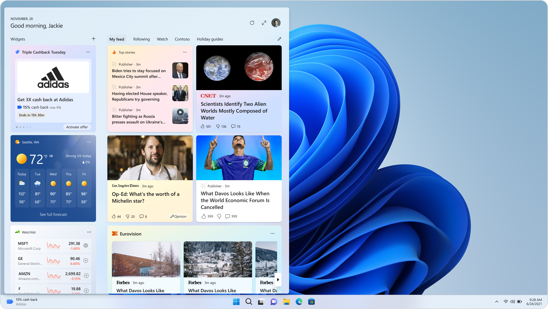
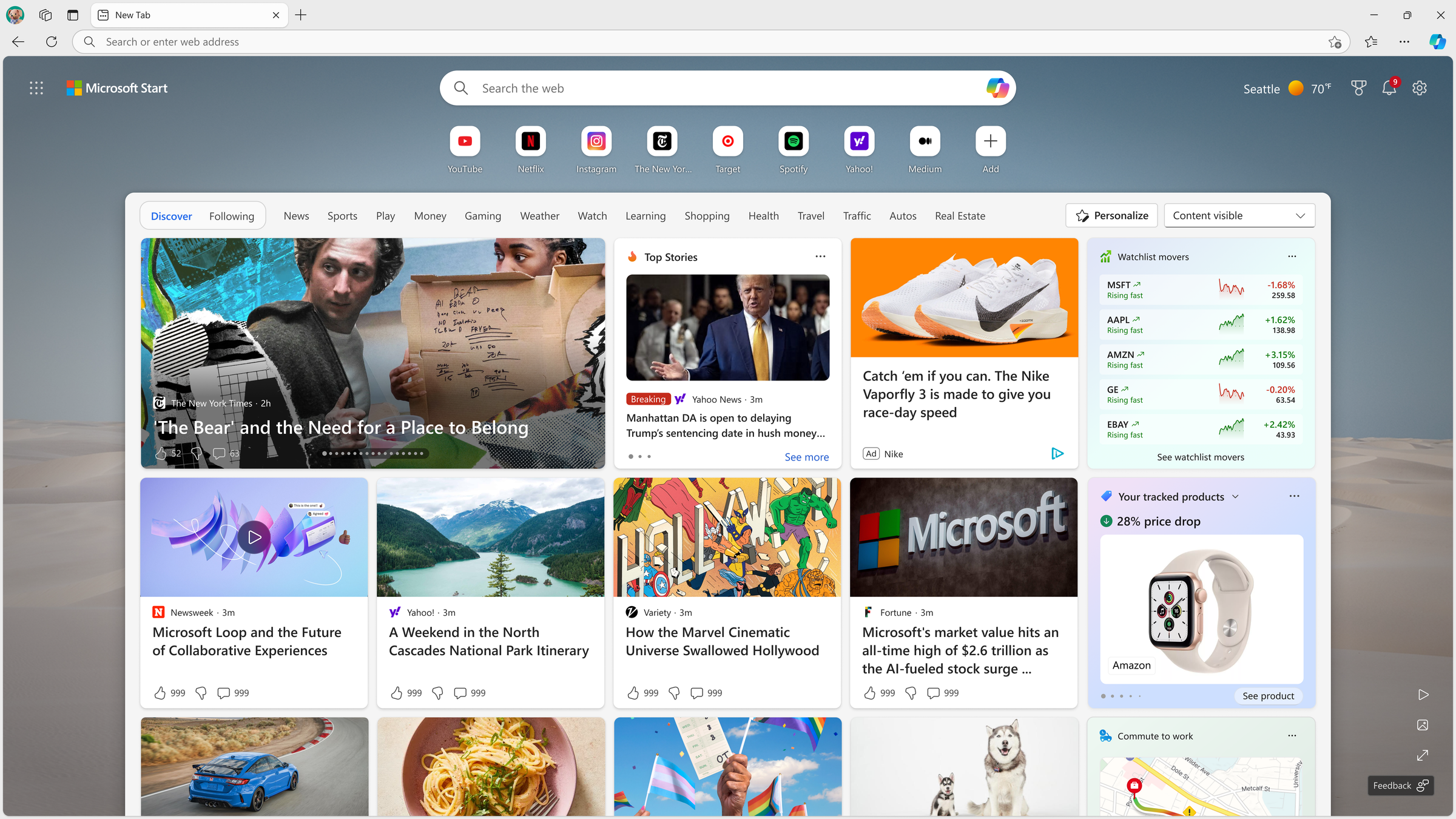
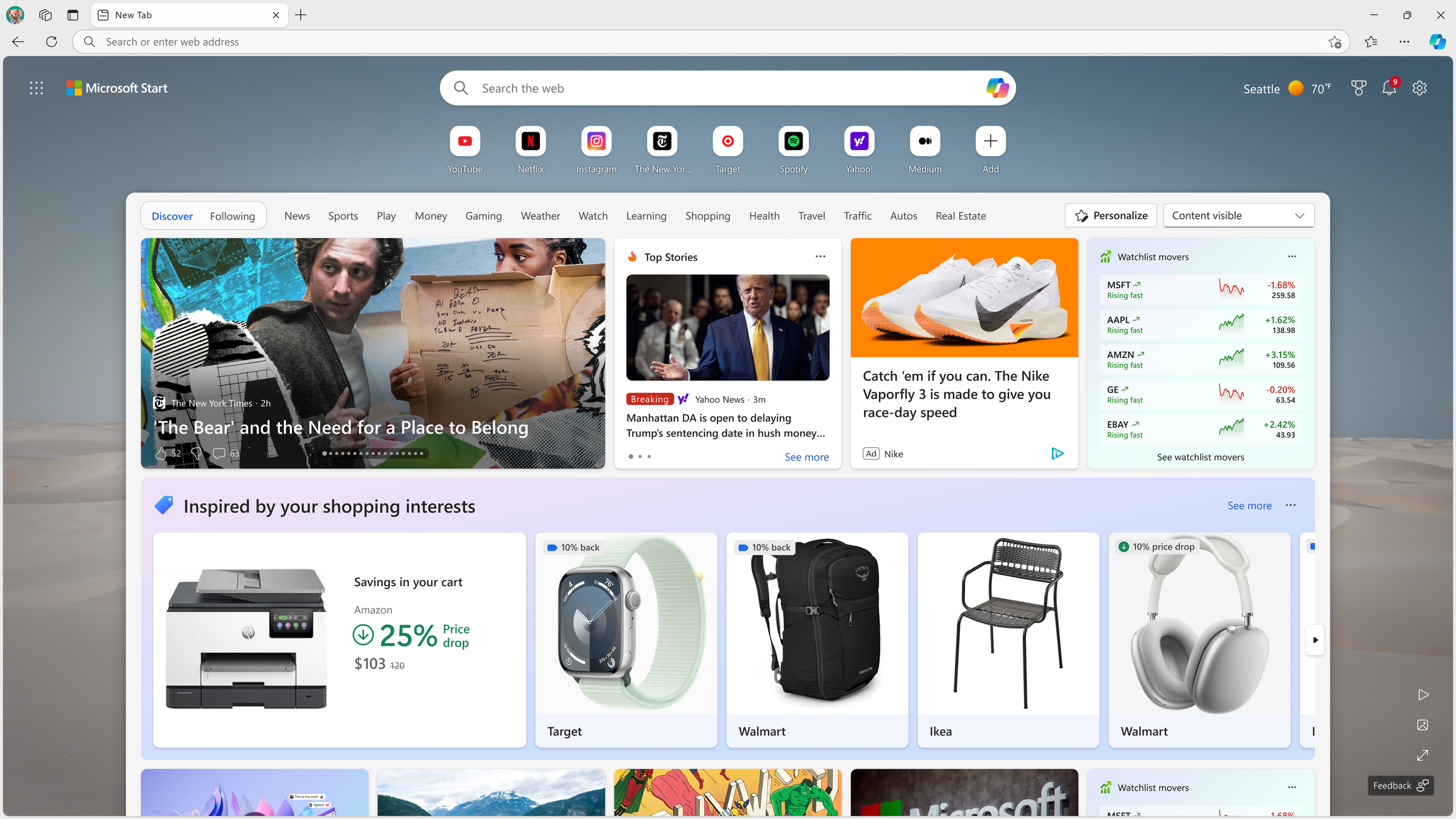
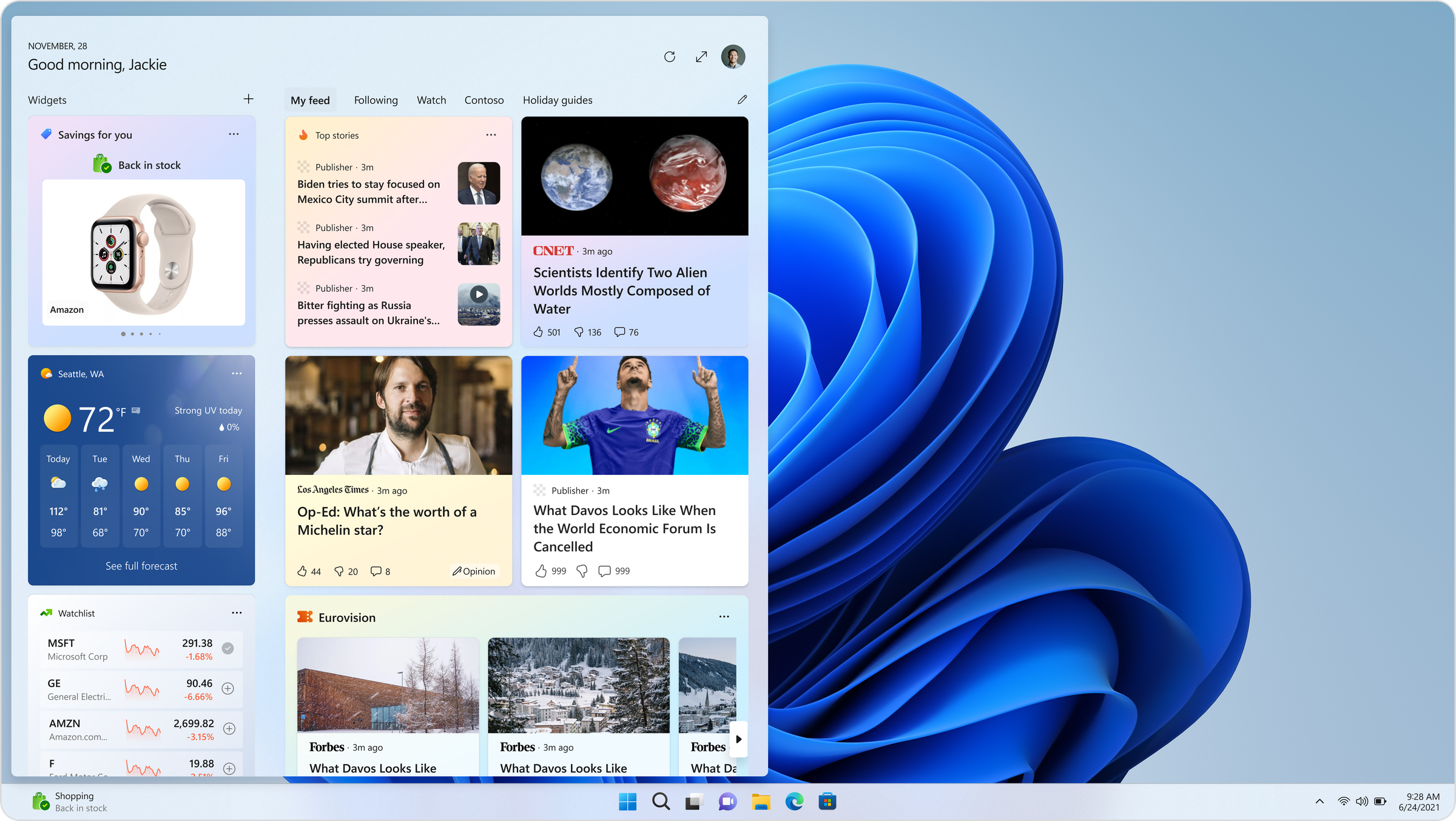
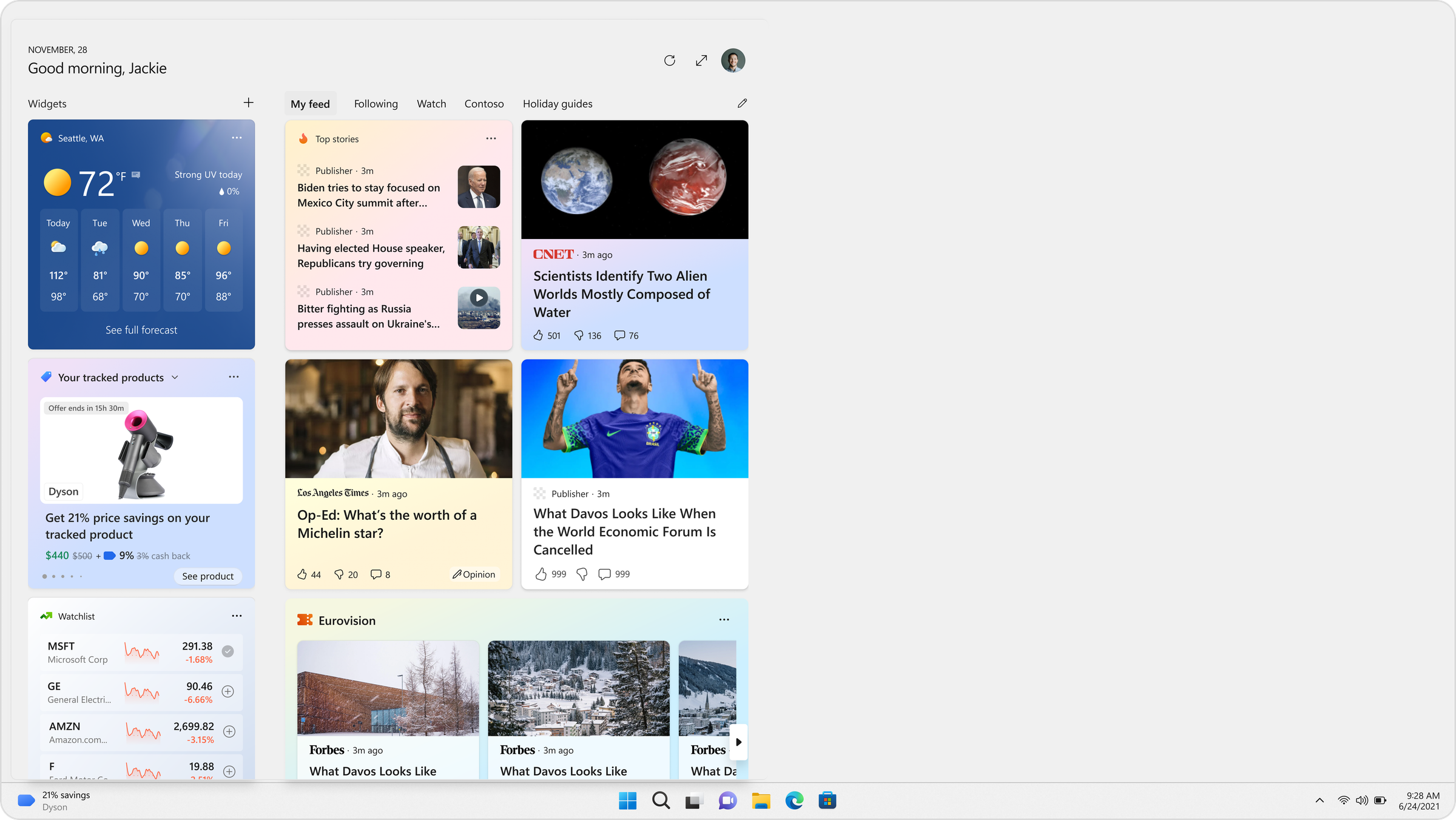
1. Price Drop Alerts: notify the user when a tracked product falls below a meaningful threshold.
2. Back-in-Stock Alerts: notify the user when a tracked, previously sold-out product is available again.
3. Cash Back: Microsoft pays users cash back on qualifying purchases. Periodically this ran as "Triple Cashback Tuesdays" offering 3x the standard rate. The highest-stakes design of the four, since the mechanic made it easy to justify promotional framing and easy to overstep into something that read as an ad for a specific retailer.
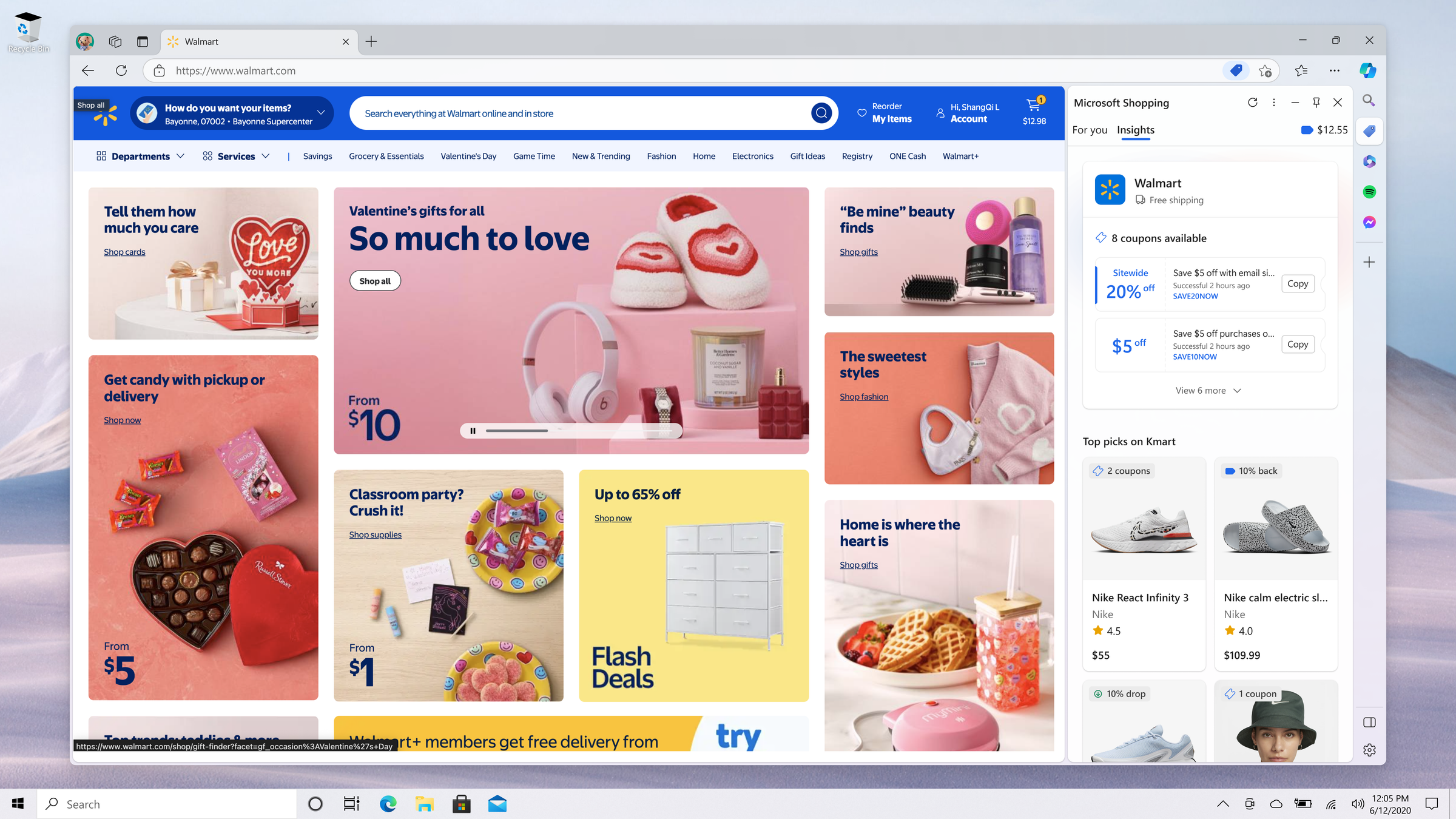
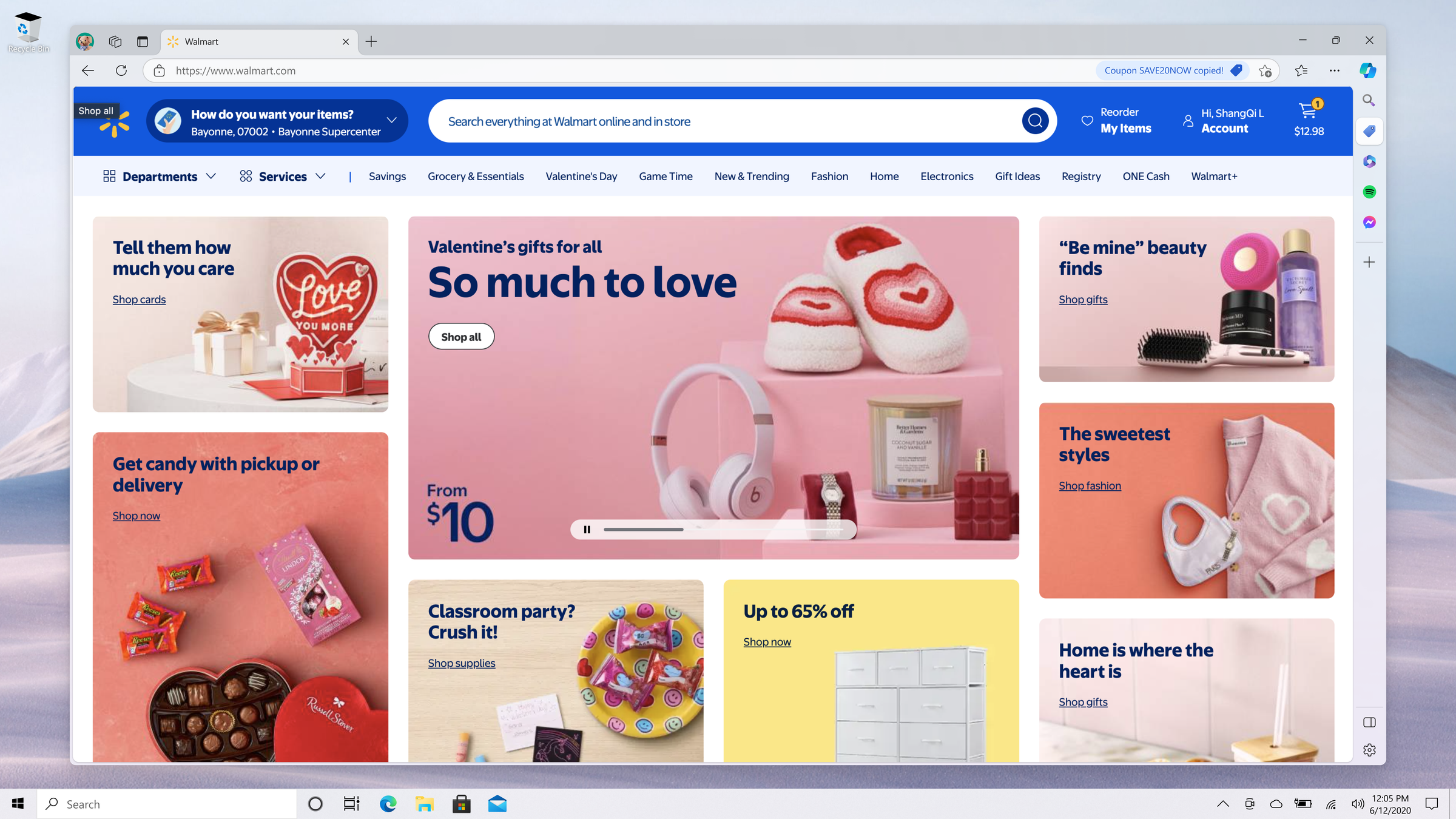
4. Coupons: personalized offers based on browsing history and saved deals. The most recommendation-like of the four, and the one most at risk of reading as promotional rather than useful.
All four went through design, Windows UX Labs validation, and flighting to a subset of Windows users. Price drop notifications shipped to production.
My Role
Owned end-to-end design for all four notification experiences. Proposed and aligned the taskbar icon treatment with Windows illustration standards. Designed notification UX across legacy and current Windows versions, including the expanded prong interaction and product/offer card layouts.
Designed and iterated the UX Labs test stimuli (copy, layout, color, imagery variants) for each round of Value/Ad perception testing. Presented findings and final designs to Windows review boards for flighting approval.
The Windows UX Labs Research Process
Any commerce-adjacent surface proposed for Windows goes through an existing Windows UX Labs process. This wasn't a framework I built, but one I designed against and iterated within as a design partner, across all four experiences.
Two studies run for every candidate design:
Ad Perception Test: participants rate a design on a 1-5 scale, where 5 means "feels highly like an ad" and 1 means "does not feel like an ad at all." Lower is better.
Value Perception Test: participants rate the same design on a 1-5 scale, where 5 means "high value to me" and 1 means "low value to me." Higher is better.
Both scores feed into a weighted formula that produces an overall rating. A design has to clear a minimum bar on that combined score before Windows will approve it for flighting. A high value score doesn't offset a poor ad-perception score, and vice versa. In practice this meant every visual and copy decision got tested, not just approved on taste.
A Worked Example: Triple Cashback Tuesdays
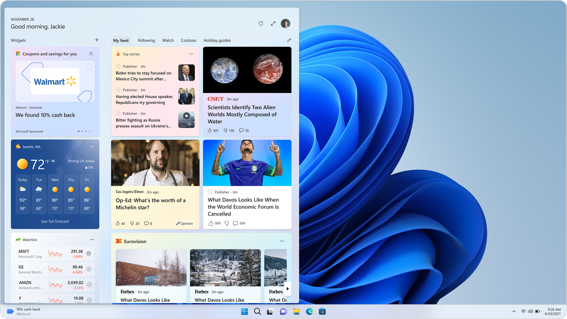
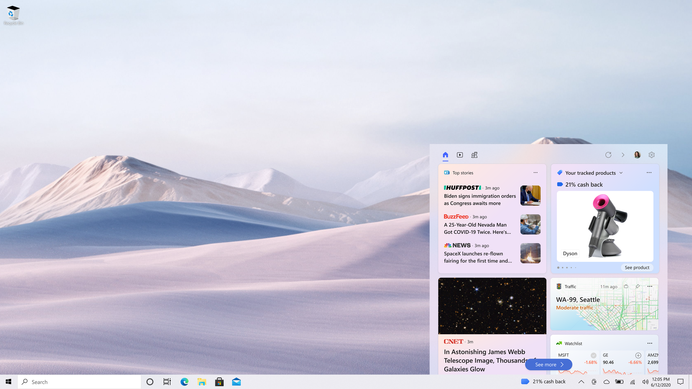
For the Triple Cashback Tuesday promotion, we tested several card treatments against each other. Variants differed by whether the card represented a single store or an aggregated "All Stores" view, by background treatment (gradient vs. solid blue), and by whether the card carried an additional title/headline treatment.
Findings
Single-store cards scored worse on ad perception than the "All Stores" card. Participants read a single-retailer treatment as advertising for that store specifically, even though the underlying offer (3x cash back) was identical. Aggregating across stores diluted that "this is an ad for Store X" read.
Among the single-store variants, the card with an added title scored best on ad perception at 2.61, meaningfully better than the plainer variants. Gradient and solid blue backgrounds performed roughly the same as each other.
On value perception, the title variant also scored noticeably higher than the other designs, even though it carried social proofing elements we'd expected might read as more promotional, not less.
Takeaway
A well-placed, clear title did double duty: it raised perceived value and lowered perceived ad-ness, which isn't always how these two axes move. It's a reminder that "less decoration = less ad-like" isn't a reliable design rule on its own. Framing and clarity can reduce ad perception even while adding an element.
Triple Cashback: Test Variants
Price Drop: Design Iterations
Design Challenges
1. OS-Level Governance Windows' threshold for "ad-like" is stricter than what's acceptable in-browser. Nearly every iteration cycle was a negotiation between business goals (surface the offer clearly enough to drive engagement) and platform trust (don't let it read as an ad). The Cash Back findings were the clearest evidence of how sensitive that line is: identical offer, different framing, meaningfully different trust read.
2. Brand vs. Platform Constraints Bing and Edge Shopping have their own color, iconography, and sizing conventions. Windows has stricter rules for taskbar icons and notification chrome. I worked directly with Windows illustrators to adapt the Bing/Edge visual system so it stayed recognizable as a Microsoft Shopping surface while conforming to OS-level constraints across all four experiences.
3. Multi-Version Support Legacy and current Windows versions handle prong sizing, icon placement, and interaction behavior differently. Every experience needed parallel prototypes and parallel UX Labs validation for both environments, effectively doubling the design and testing surface.
Outcome
All four experiences (price drop, back-in-stock, Cash Back including Triple Cashback Tuesdays, and coupons) were designed, validated through Windows UX Labs' Value/Ad Perception process, and flighted to a subset of Windows users. Price drop notifications shipped to production, making this one of the first sets of shopping features pushed from the browser into the Windows OS layer.
The larger contribution was methodological: proving that commerce notifications can exist responsibly at the OS level when every design decision (copy, layout, color, imagery, aggregation vs. specificity) is tested against a real perception bar rather than shipped on instinct. The Triple Cashback Tuesday findings in particular reframed how the team thought about "less is more": sometimes more clarity, not less content, is what reduces ad perception.
"We only surfaced alerts based on explicit user behavior: a tracked product, a saved coupon, cash back on a purchase they made. Every visual and microcopy decision was calibrated against Windows' Value and Ad Perception scoring model. One of the clearest findings was counterintuitive: adding a title to a Cash Back card didn't just increase perceived value, it also lowered ad perception. It forced us to design commerce as utility, not promotion, and to prove it with data, not just intent."
My projects
Microsoft
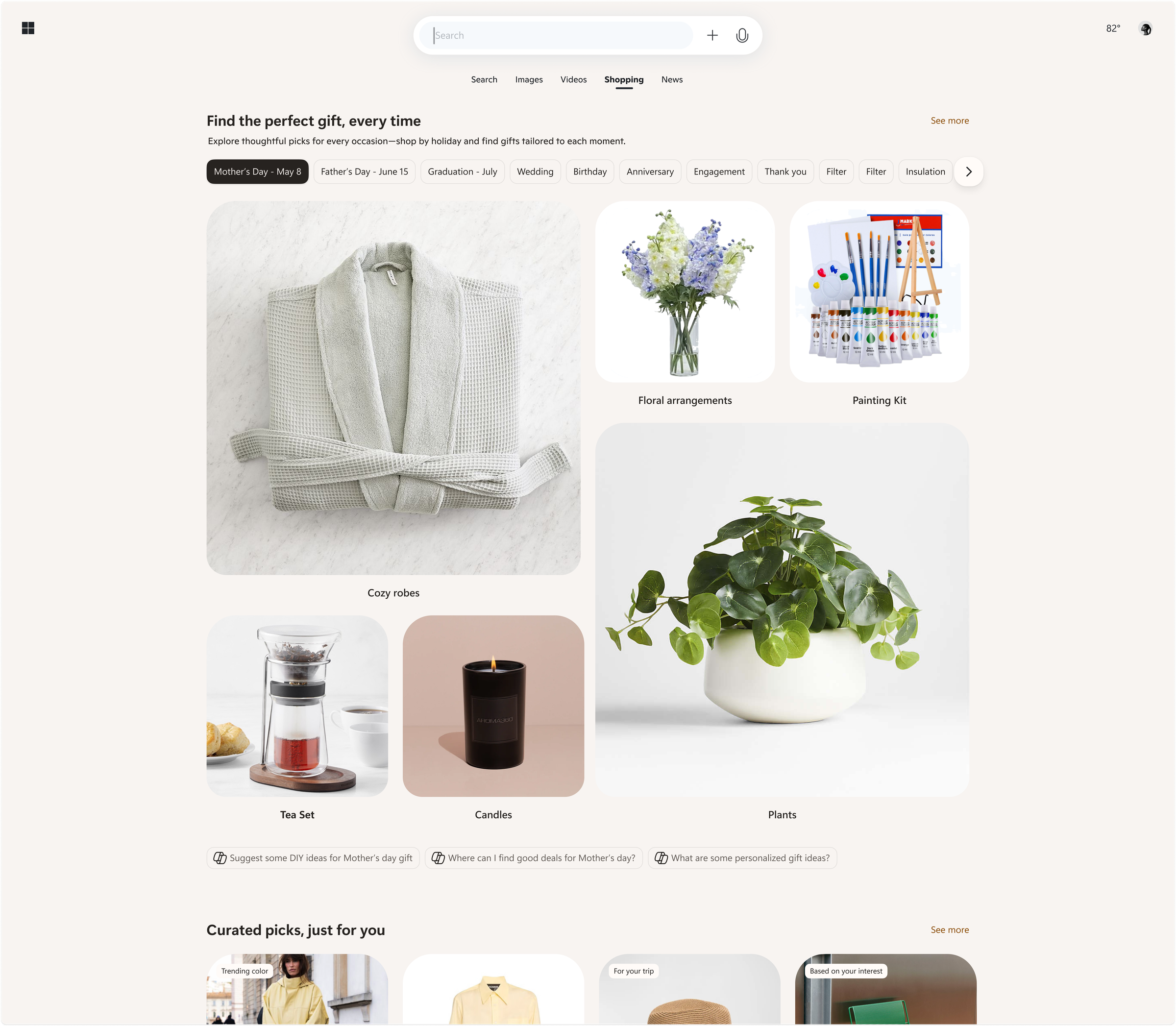
Shopping ecosystem across Bing, Copilot, Windows, Outlook
Leysi
Brand identity and iOS app for campus deals
ThreePillars
Recruiting site redesign and brand refresh
Piton
Product design and mobile interface work
Outsource
Commerce and editorial design across surfaces
Giga
Cross-platform product design and experiments
%20--%3e%3csvg%20version='1.1'%20id='Layer_1'%20xmlns='http://www.w3.org/2000/svg'%20xmlns:xlink='http://www.w3.org/1999/xlink'%20x='0px'%20y='0px'%20viewBox='0%200%2084.5%2084.5'%20style='enable-background:new%200%200%2084.5%2084.5;'%20xml:space='preserve'%3e%3cstyle%20type='text/css'%3e%20.st0{fill:%23A6D1CA;}%20%3c/style%3e%3cpath%20class='st0'%20d='M42.3,0C19,0,0,19,0,42.3s19,42.3,42.3,42.3s42.3-19,42.3-42.3S65.6,0,42.3,0z%20M42.3,7c8.9,0,17,3.4,23.2,8.8%20c-0.7,0.9-1.6,2-3,3.4c-3,2.9-7.8,6.4-15.2,9.1c-5-9.2-9.9-16.1-13.1-20.5C36.8,7.3,39.5,7,42.3,7z%20M27.3,10.3%20c2.9,3.8,8,10.8,13.2,20.1C26.2,34.3,13,34.8,7.8,34.8C10.2,23.9,17.5,14.9,27.3,10.3z%20M70.3,21c4.3,5.7,7,12.7,7.2,20.4%20c-3.1-0.7-7.8-1.4-13.8-1.4c-3.1,0-6.7,0.2-10.5,0.7c-0.9-2-1.8-3.9-2.8-5.8c7.9-3,13.3-7,16.8-10.5C68.6,23.1,69.5,22.1,70.3,21z%20M43.7,36.9c0.8,1.6,1.6,3.3,2.4,5.1c-15.1,4.2-25.9,16.9-30.5,23.3C10.3,59.1,7,51.1,7,42.3c0-0.2,0-0.3,0-0.4%20C11.8,41.9,26.9,41.5,43.7,36.9z%20M63.7,46.9c6.3,0,10.6,0.9,13.2,1.5c-1.6,9.4-6.9,17.4-14.4,22.7c-1.4-8.4-3.7-16.4-6.5-23.8%20C58.8,47.1,61.4,46.9,63.7,46.9z%20M48.9,48.5c3.2,8,5.8,16.9,7.2,26.2c-4.2,1.8-8.9,2.8-13.8,2.8c-8.1,0-15.5-2.7-21.5-7.3%20C24.4,65.3,35.1,52.1,48.9,48.5z'/%3e%3c/svg%3e)
%20--%3e%3csvg%20version='1.1'%20id='Layer_1'%20xmlns='http://www.w3.org/2000/svg'%20xmlns:xlink='http://www.w3.org/1999/xlink'%20x='0px'%20y='0px'%20viewBox='0%200%2081.2%2081.2'%20style='enable-background:new%200%200%2081.2%2081.2;'%20xml:space='preserve'%3e%3cstyle%20type='text/css'%3e%20.st0{fill:%23A6D1CA;}%20%3c/style%3e%3cpath%20class='st0'%20d='M22.6,0C10.1,0,0,10.1,0,22.6v36.1c0,12.4,10.1,22.6,22.6,22.6h36.1c12.4,0,22.6-10.1,22.6-22.6V22.6%20C81.2,10.1,71.1,0,58.6,0H22.6z%20M22.6,9h36.1c7.5,0,13.5,6.1,13.5,13.5v36.1c0,7.5-6.1,13.5-13.5,13.5H22.6C15.1,72.2,9,66.1,9,58.6%20V22.6C9,15.1,15.1,9,22.6,9z%20M63.1,13.5c-2.5,0-4.5,2-4.5,4.5s2,4.5,4.5,4.5c2.5,0,4.5-2,4.5-4.5S65.6,13.5,63.1,13.5z%20M40.6,18%20C28.2,18,18,28.2,18,40.6s10.1,22.6,22.6,22.6S63.1,53,63.1,40.6S53,18,40.6,18z%20M40.6,27.1c7.5,0,13.5,6.1,13.5,13.5%20s-6.1,13.5-13.5,13.5s-13.5-6.1-13.5-13.5S33.1,27.1,40.6,27.1z'/%3e%3c/svg%3e)
%20--%3e%3csvg%20version='1.1'%20id='Layer_1'%20xmlns='http://www.w3.org/2000/svg'%20xmlns:xlink='http://www.w3.org/1999/xlink'%20x='0px'%20y='0px'%20viewBox='0%200%2079.1%2079.1'%20style='enable-background:new%200%200%2079.1%2079.1;'%20xml:space='preserve'%3e%3cstyle%20type='text/css'%3e%20.st0{fill:%23A6D1CA;}%20%3c/style%3e%3cpath%20class='st0'%20d='M12.1,0C5.5,0,0,5.5,0,12.1V67c0,6.6,5.5,12.1,12.1,12.1H67c6.6,0,12.1-5.5,12.1-12.1V12.1%20C79.1,5.5,73.7,0,67,0H12.1z%20M12.1,6.6H67c3.1,0,5.5,2.4,5.5,5.5V67c0,3.1-2.4,5.5-5.5,5.5H12.1c-3.1,0-5.5-2.4-5.5-5.5V12.1%20C6.6,9,9,6.6,12.1,6.6z%20M20.9,15.4c-3,0-5.5,2.5-5.5,5.5s2.5,5.5,5.5,5.5s5.5-2.5,5.5-5.5S23.9,15.4,20.9,15.4z%20M17.6,30.8%20c-1.2,0-2.2,1-2.2,2.2v28.6c0,1.2,1,2.2,2.2,2.2h6.6c1.2,0,2.2-1,2.2-2.2V33c0-1.2-1-2.2-2.2-2.2H17.6z%20M33,30.8%20c-1.2,0-2.2,1-2.2,2.2v28.6c0,1.2,1,2.2,2.2,2.2h6.6c1.2,0,2.2-1,2.2-2.2V45.1c0-3,2.5-5.5,5.5-5.5c3,0,5.5,2.5,5.5,5.5v16.5%20c0,1.2,1,2.2,2.2,2.2h6.6c1.2,0,2.2-1,2.2-2.2V44c0-7.3-5.9-13.2-13.2-13.2c-3.4,0-6.5,1.3-8.8,3.4V33c0-1.2-1-2.2-2.2-2.2H33z'/%3e%3c/svg%3e)
%20--%3e%3csvg%20version='1.1'%20id='Layer_1'%20xmlns='http://www.w3.org/2000/svg'%20xmlns:xlink='http://www.w3.org/1999/xlink'%20x='0px'%20y='0px'%20viewBox='0%200%2083.7%2083.7'%20style='enable-background:new%200%200%2083.7%2083.7;'%20xml:space='preserve'%3e%3cstyle%20type='text/css'%3e%20.st0{fill:%23A6D1CA;}%20%3c/style%3e%3cpath%20class='st0'%20d='M41.9,0C18.8,0,0,18.8,0,41.9s18.8,41.9,41.9,41.9s41.9-18.8,41.9-41.9S64.9,0,41.9,0z%20M41.9,6.3%20c19.7,0,35.6,15.9,35.6,35.6c0,16-10.6,29.6-25.1,34V65.2c0-4-2.3-7.4-5.6-9.1c11.2-2.2,18.2-11.2,15.5-20.2c-0.5-1.8-1.4-3.5-2.7-5%20c0.9-2.9,2-7.9-0.5-11.8c-4.8,0-7.8,3.3-9.3,5.3c-2.5-0.8-5.2-1.2-7.9-1.3c-2.7,0-5.4,0.4-7.9,1.2c-1.5-2-4.5-5.3-9.3-5.3%20c-2.8,4.5-1.1,9.4-0.1,11.4c-6.5,7.7-4,18.1,5.6,23.3c2.1,1.1,4.4,1.9,6.9,2.4c-2.7,1.4-4.8,4-5.4,7.1h-2.8c-2.7,0-3.8-1.1-5.2-3%20c-1.4-1.9-3-3.1-4.9-3.6c-1-0.1-1.7,0.7-0.8,1.3c3,2,3.2,5.3,4.4,7.5c1.1,2,3.3,3.7,5.8,3.7h3.3v6.8c-14.6-4.5-25.1-18-25.1-34%20C6.3,22.2,22.2,6.3,41.9,6.3z'/%3e%3c/svg%3e)
%20--%3e%3csvg%20version='1.1'%20id='Layer_1'%20xmlns='http://www.w3.org/2000/svg'%20xmlns:xlink='http://www.w3.org/1999/xlink'%20x='0px'%20y='0px'%20viewBox='0%200%2084.5%2048'%20style='enable-background:new%200%200%2084.5%2048;'%20xml:space='preserve'%3e%3cstyle%20type='text/css'%3e%20.st0{fill:%23A6D1CA;}%20%3c/style%3e%3cg%3e%3cpath%20class='st0'%20d='M23.8,0C37,0,47.7,10.7,47.7,24S37,48,23.8,48S0,37.2,0,24S10.7,0,23.8,0z%20M61.9,1.4%20c6.6,0,11.9,10.1,11.9,22.6h0c0,12.5-5.3,22.6-11.9,22.6S50,36.5,50,24S55.3,1.4,61.9,1.4z%20M80.3,3.8c2.3,0,4.2,9.1,4.2,20.2%20c0,11.2-1.9,20.2-4.2,20.2s-4.2-9.1-4.2-20.2S78,3.8,80.3,3.8z'/%3e%3c/g%3e%3c/svg%3e)