ZACHARY MACTAVISH.
Client
Giga Intelligence
Role
Lead Designer to UX Consultant: Brand & Web App
Timeline
1.5 years (ongoing)
Platform
Brand / Web App
Designing at the frontier of AI product design: where the agent is the product
Overview
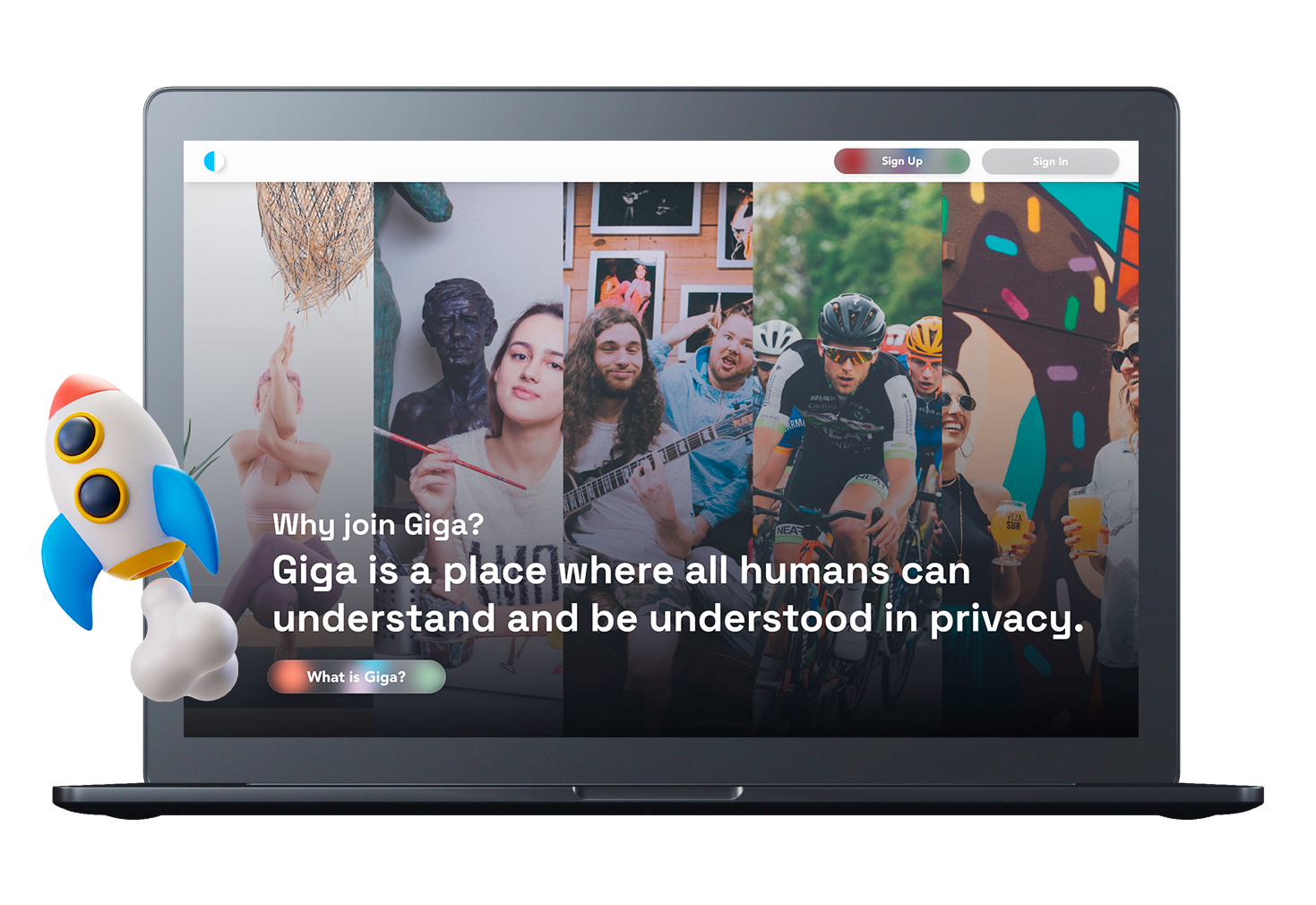
Giga Intelligence is a platform with an evolving thesis. In its first version, it was a privacy-first social media and content creation site, a direct response to the data practices of mainstream platforms, built around the idea that users should own and control their information. In its second, AI-native iteration, Giga has become something more ambitious: a platform where users create AI bots, engage in AI-powered research, and publish short and long-form content with the help of an intelligent agent that helps them go deep on any topic. The closest analogy is Facebook meets Wikipedia, rebuilt from the ground up with AI at the center.
Founder Richard Devlin brought me on as the lead designer from the earliest stages of the product. Over a year and a half I designed the brand identity and the full web app experience across both versions of the platform. As Giga has matured, my role has shifted from primary designer to UX consultant, an evolution that reflects the depth of the working relationship we've built.
My Role
Across the Giga engagement I was responsible for:
Brand strategy and identity design: icon, wordmark, and full visual system
UX architecture and interaction design for the full web app
Visual design across all core product surfaces
Designing onboarding, social feed, content creation, AI chat, and bot creation flows
Ongoing UX consulting as the product evolves into its AI-native version
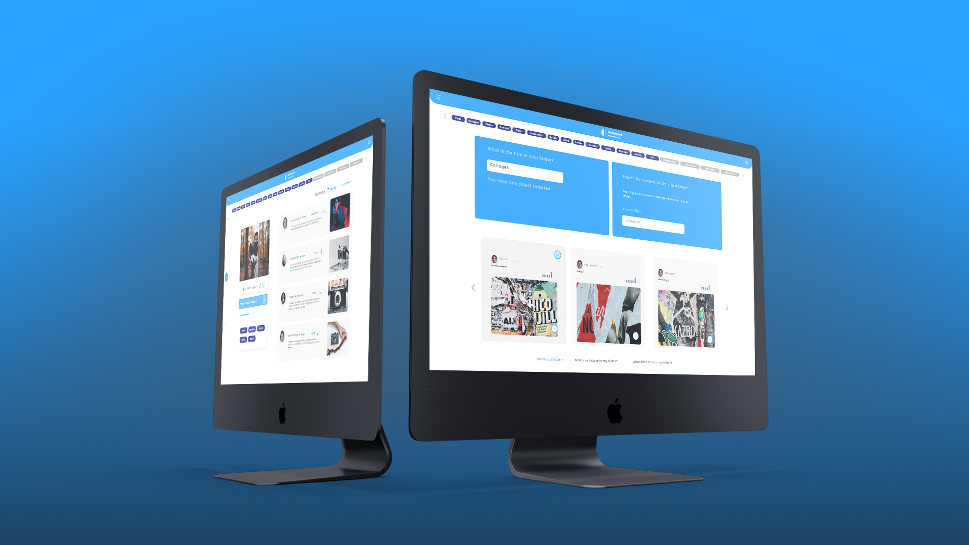
Giga brought to life: the social and content platform, designed for a calm, content-first experience across desktop.
Design Goals
The goals shifted meaningfully between V1 and V2, but the brand foundation needed to hold across both.
For V1, the priorities were to establish a trustworthy, clean visual identity that communicated privacy and user ownership; to design a social and content creation experience familiar enough to onboard users quickly but distinct enough to signal something new; and to build a design system flexible enough to grow with the product.
For V2, the priorities expanded: evolve the UX to support AI-native interactions including chat, bot creation, and agent-assisted writing, without losing the social and content creation core; maintain visual continuity with V1 so the brand felt like it had grown, not pivoted; and design interfaces that made AI feel useful and accessible rather than complex or intimidating.
The Brand Identity
The Giga logo is an icon and wordmark combination, a mark designed to work across the full range of contexts a digital platform occupies: browser tabs, app icons, marketing materials, and UI headers. The icon and wordmark were designed to function together and independently, giving the brand flexibility without sacrificing cohesion.
The visual language landed on clean white and light blues, a deliberate choice that set Giga apart from the dark, dense aesthetic of many AI products and the loud, high-contrast energy of mainstream social platforms. The palette reads as professional and focused, with a lightness that makes the interface feel open and readable. For a platform built around knowledge creation and deep thinking, that tone felt right: approachable intelligence, not intimidating complexity.
Critically, the brand was designed from the start to carry across both versions of the product. When the strategic pivot from privacy-first to AI-native came, the visual identity didn't need to be rebuilt. It needed to be extended. The same icon, the same palette, the same typographic sensibility moved into V2 with continuity intact.
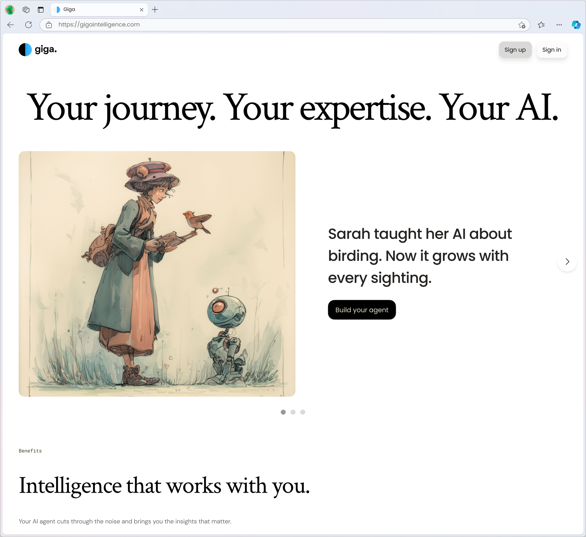
Brand Identity in Practice
The identity comes together in the live marketing site: the dual-tone logo mark, an editorial serif paired with Poppins across the UI, and a palette built on clean whites and Giga's signature blues. That combination set Giga apart from the dark, dense aesthetic of most AI products, reading as professional and approachable rather than intimidating. Because the system was codified early, it carried from V1 straight into the AI-native V2 without a rebuild.
V1: Privacy-First Social Platform
The first version of Giga was built around a clear and timely proposition: a social and content creation platform where users controlled their data. In a landscape dominated by platforms that monetize user information, Giga offered private channels, user-owned content, and a more intentional experience.
Designing for this required balancing familiarity with differentiation. Users needed to understand how to use Giga quickly, since the mental models of social feeds and content creation are well established, but the experience needed to feel meaningfully different from what they were leaving behind. The design leaned into clarity and calm: clean layouts, deliberate information hierarchy, and an interface that didn't compete with the content it was presenting.
I designed the full system: onboarding flows that communicated the privacy proposition clearly, a social feed built for content discovery, profile and channel management, and content creation tools for both short and long-form publishing.
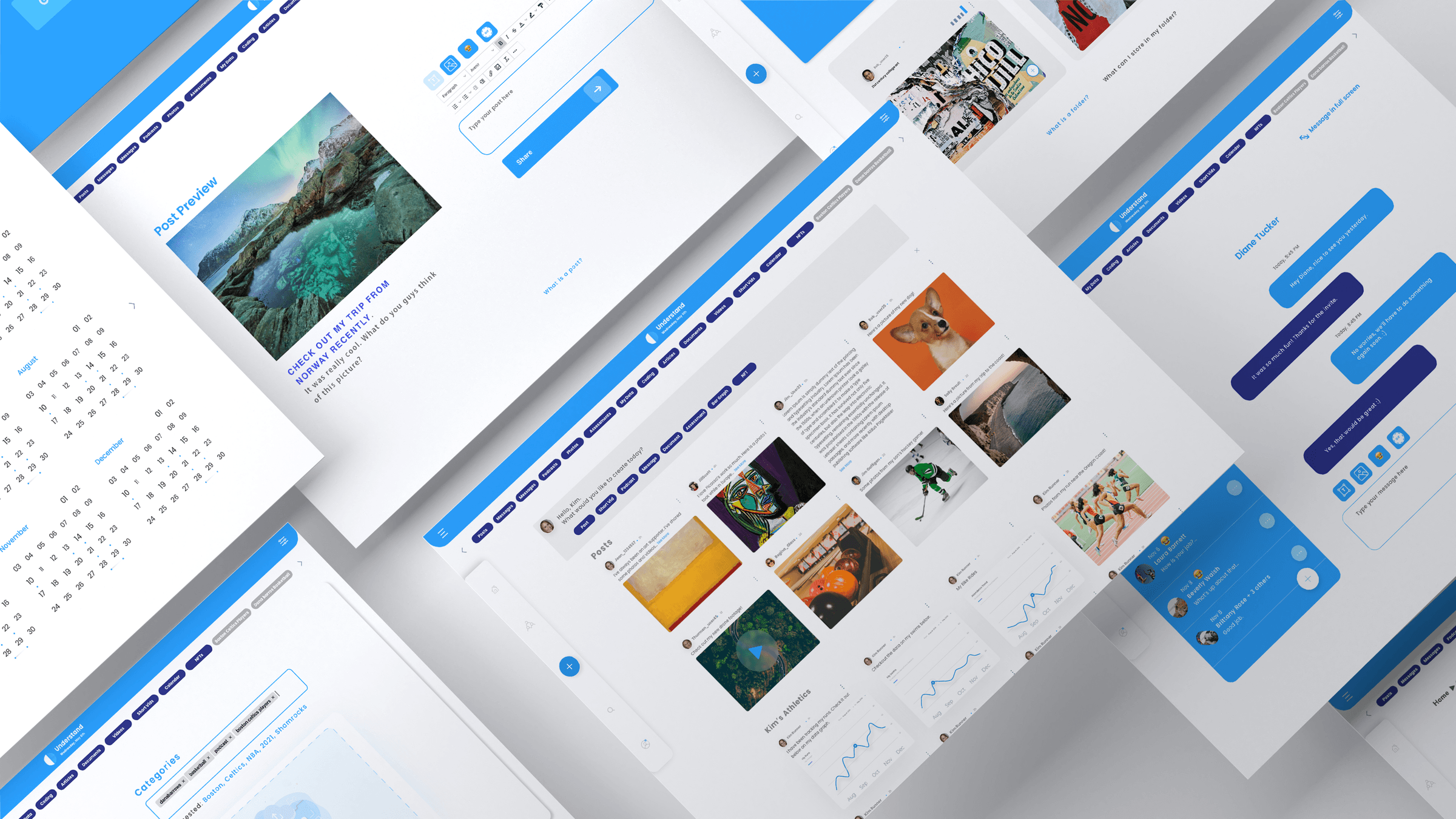
The V1 system: a privacy-first social and content platform built around user-owned data and private channels.
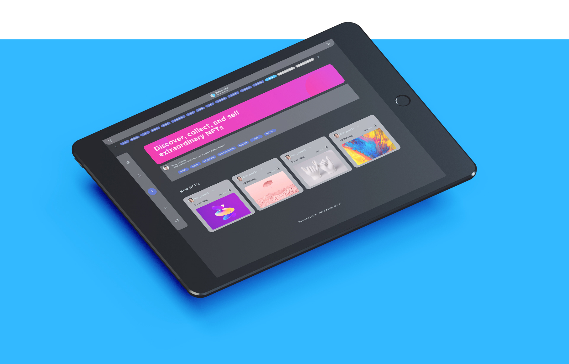
The same content-first system, translated cleanly to tablet.
Light & Dark, Across Devices
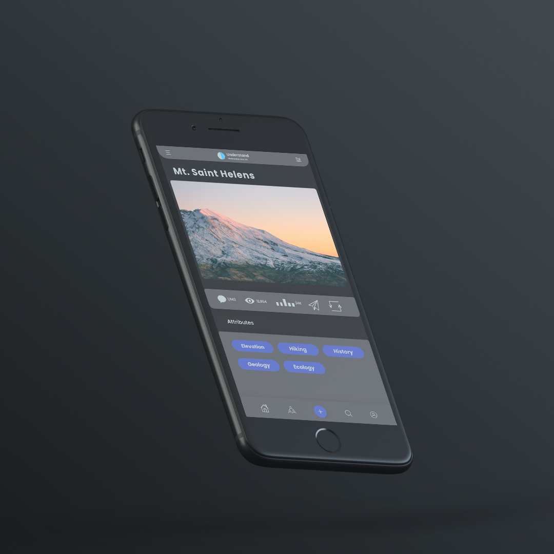
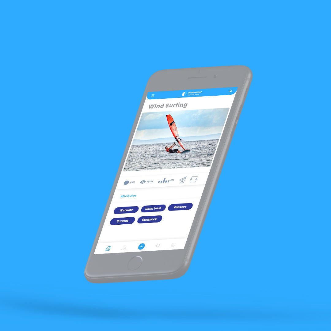
V2: AI-Native Platform
The evolution to an AI-native product introduced a new layer of design challenges and a more expansive product vision. Giga V2 is built around an agent model: a user identifies a topic they want to explore, the AI helps them research it deeply, and the platform supports publishing what they've learned in both short and long-form content. The social layer remains, but the intelligence layer is now the primary differentiator.
Designing the AI-Native Flows
AI Chat Interface. A conversational interface where users interact with Giga's AI and custom bots. The design challenge was making the chat feel like a capable research partner, not a generic chatbot. Visual hierarchy, response formatting, and the way the interface handles long-form AI output all required careful thought.
Bot Creation. Users can build their own AI bots within Giga, a feature that required designing a creation flow accessible to non-technical users while surfacing enough control for power users. The flow needed to feel like building something useful, not configuring a system.
Agent-Assisted Content Creation. The flagship workflow of V2: a user explores a topic with AI assistance and moves fluidly from research into writing and publishing. This required designing a flow that connected the AI chat experience to the content editor without friction, keeping the user in a state of productive momentum rather than context-switching between tools.
Feed and Publishing. The social layer of the platform, where content gets published, discovered, and engaged with, was redesigned for V2 to surface AI-generated and AI-assisted content alongside user-generated posts, maintaining the social dynamic while integrating the new AI content creation capabilities.
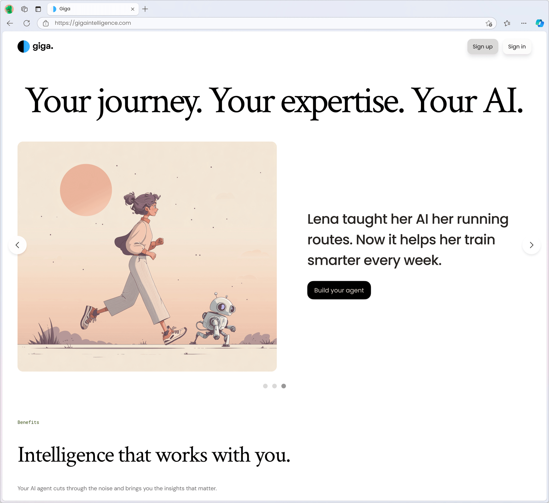
Personalized intelligence: each user shapes an agent around their own expertise and goals, so the AI works the way they think.
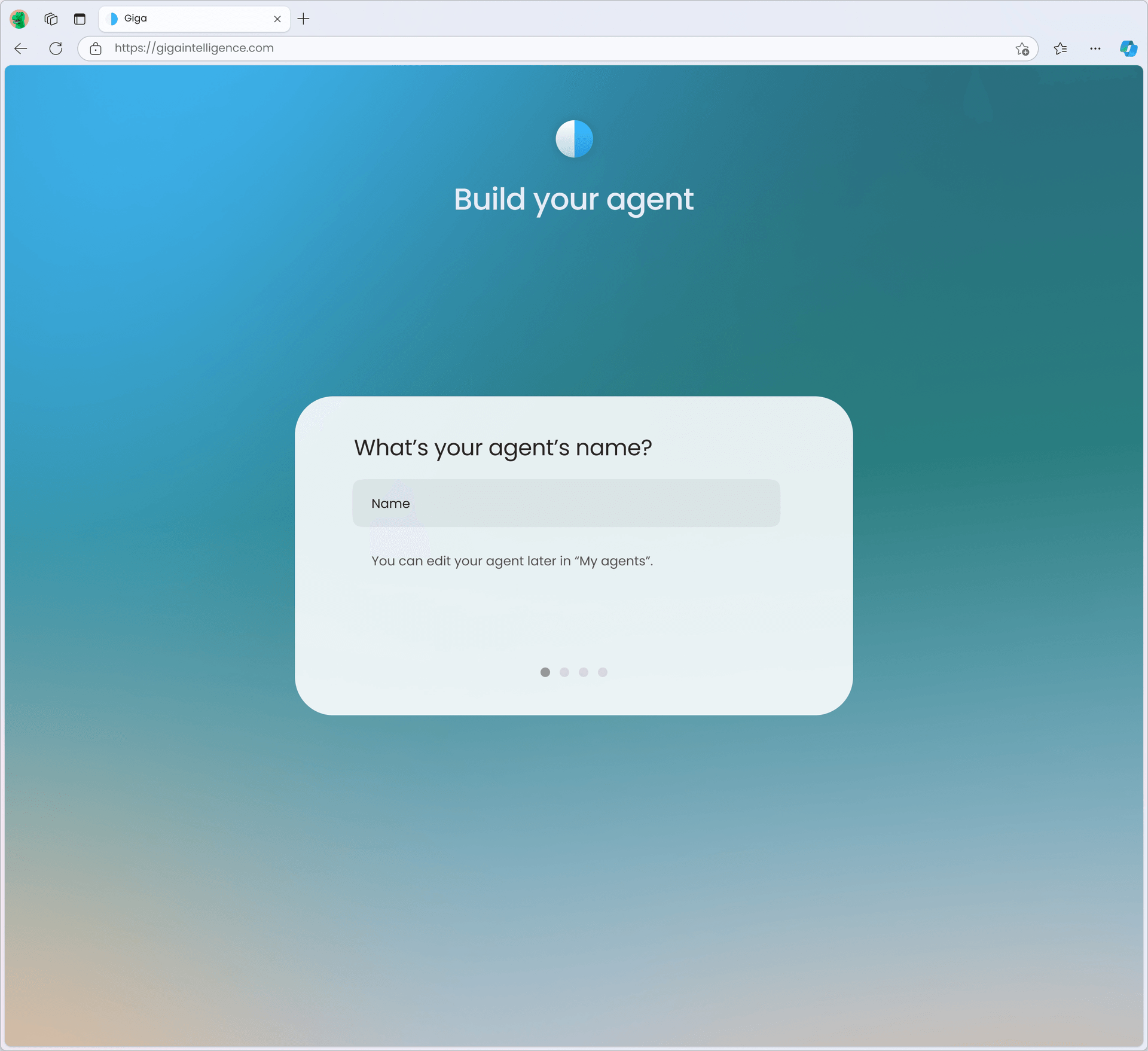
Bot creation: a flow built so non-technical users can stand up their own AI agent in minutes, while still surfacing control for power users.
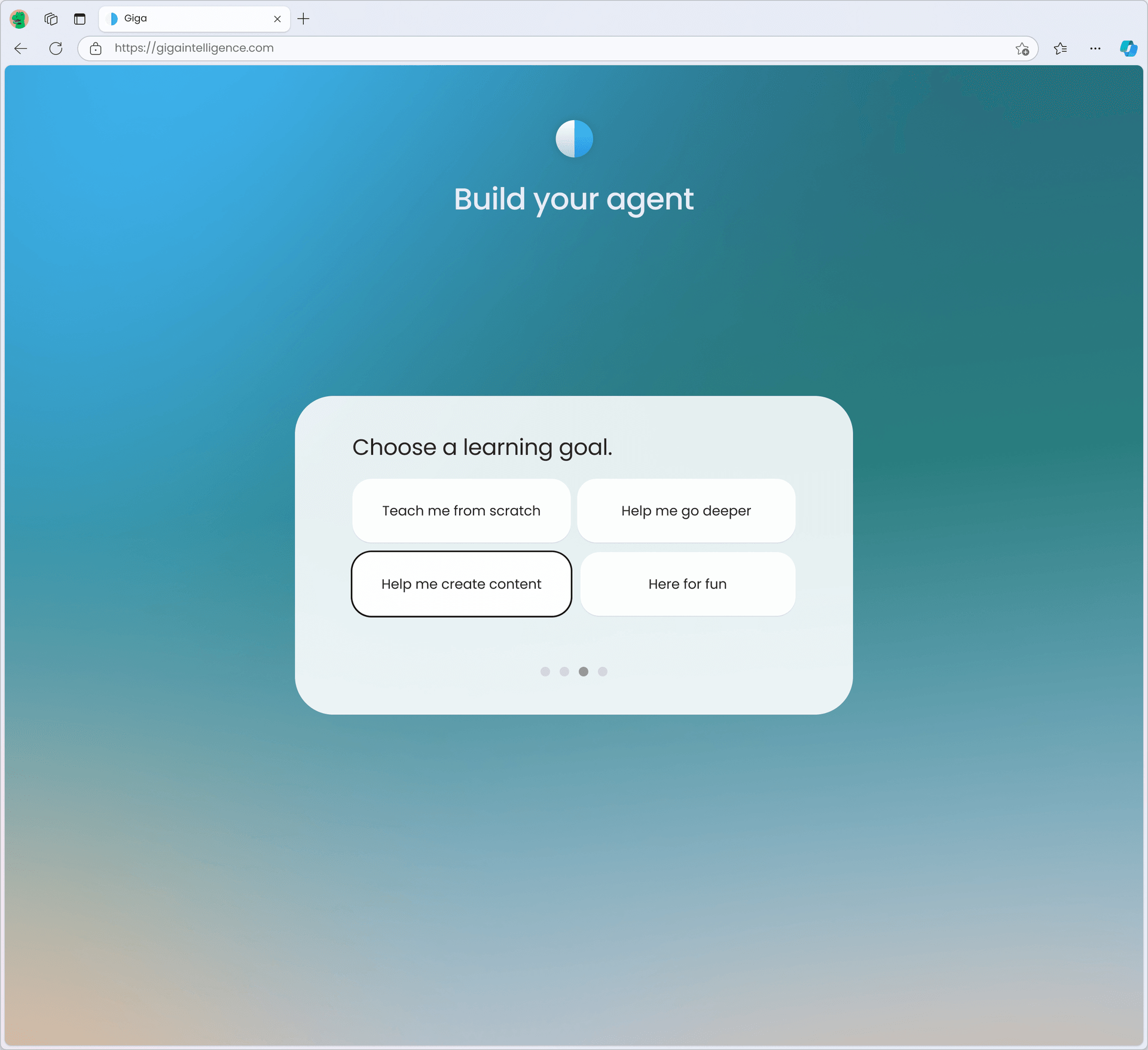
Bot creation, continued: a guided flow that gets non-technical users to a working, purpose-built agent in a few simple choices.
Collaboration
Throughout the project I worked closely with Richard Devlin, whose technical depth and product vision shaped many of the design decisions. Front-end development was handled by Xing Yi and Joel Fernando, and my designs were built to be implementable, grounded in the technical realities of the stack rather than aspirational only on canvas. The long-term nature of the engagement meant that design decisions were made with full awareness of engineering constraints, and the relationship between design and development was genuinely collaborative rather than sequential.
Challenges
The most significant design challenge across Giga was maintaining coherence across a product that was fundamentally changing its strategic premise. V1 and V2 are not the same product. The core value proposition shifted from privacy to AI. Designing a brand and visual system that could hold across that evolution, without feeling either stale or discontinuous, required foresight in the original design decisions and discipline in how the system was extended.
The AI interaction design in V2 also presented challenges specific to the current moment in AI product design. Conventions for AI chat, bot creation, and agent-assisted workflows are still forming. Designing them required balancing emerging patterns with Giga's specific context and user base, building interfaces that felt native to AI without simply copying what larger platforms were doing.

Intelligence that works with you: the brand storytelling that frames every agent as personal, shaped by the user's own expertise.
Outcome
Both versions of Giga are live and active. The platform continues to grow and evolve, and my engagement has matured from hands-on designer to UX consultant, contributing strategic and experiential guidance as new features are conceived and built. The brand identity has held across both versions of the product, proving the durability of the original design decisions.
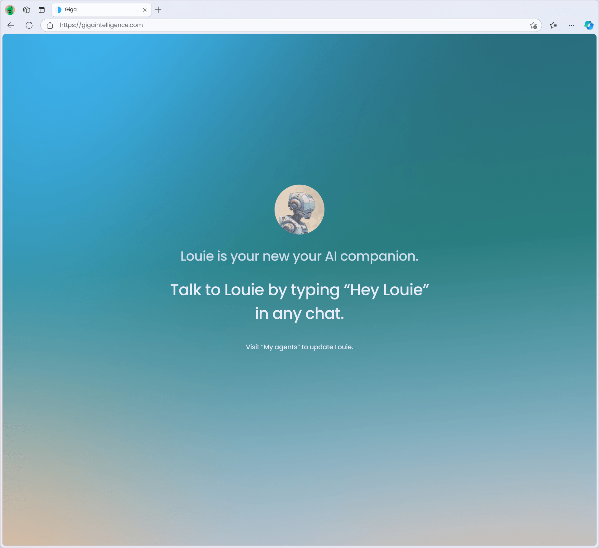
The payoff: a personal AI companion that lives across the platform, ready whenever the user calls on it.
Reflection
Giga has been one of the projects that pushed me deepest into designing for AI as a core architecture rather than a feature. Designing for a platform where the agent is the product, not an add-on, required rethinking interaction models that most design education and practice hasn't caught up to yet.
What I've taken from it is a conviction that the most important thing in AI product design right now is making intelligence feel useful rather than impressive. Users don't want to be amazed by the AI. They want to get something done. Every flow I designed for Giga was evaluated against that standard: does this help the user think more clearly, write more confidently, or learn more deeply? If yes, it earned its place. If it was just showcasing the technology, it didn't.
That standard, useful over impressive, is one I carry into every product I work on now.
Team
Founder: Richard Devlin
Lead Designer & UX Consultant: Zachary MacTavish
Front-End Development: Xing Yi, Joel Fernando
Back-End Development: Richard Devlin
My projects
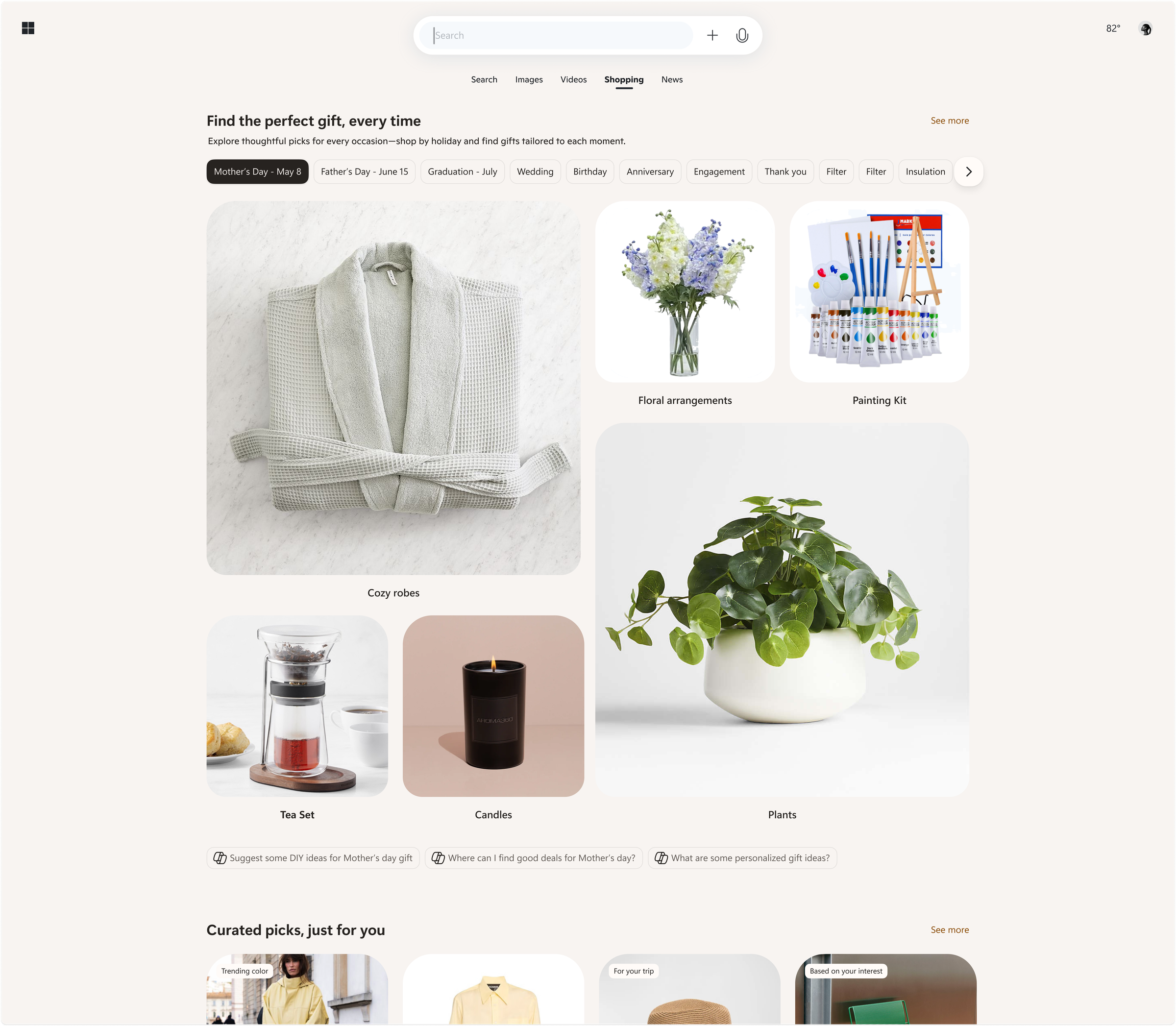
Microsoft
Shopping ecosystem across Bing, Copilot, Windows, Outlook
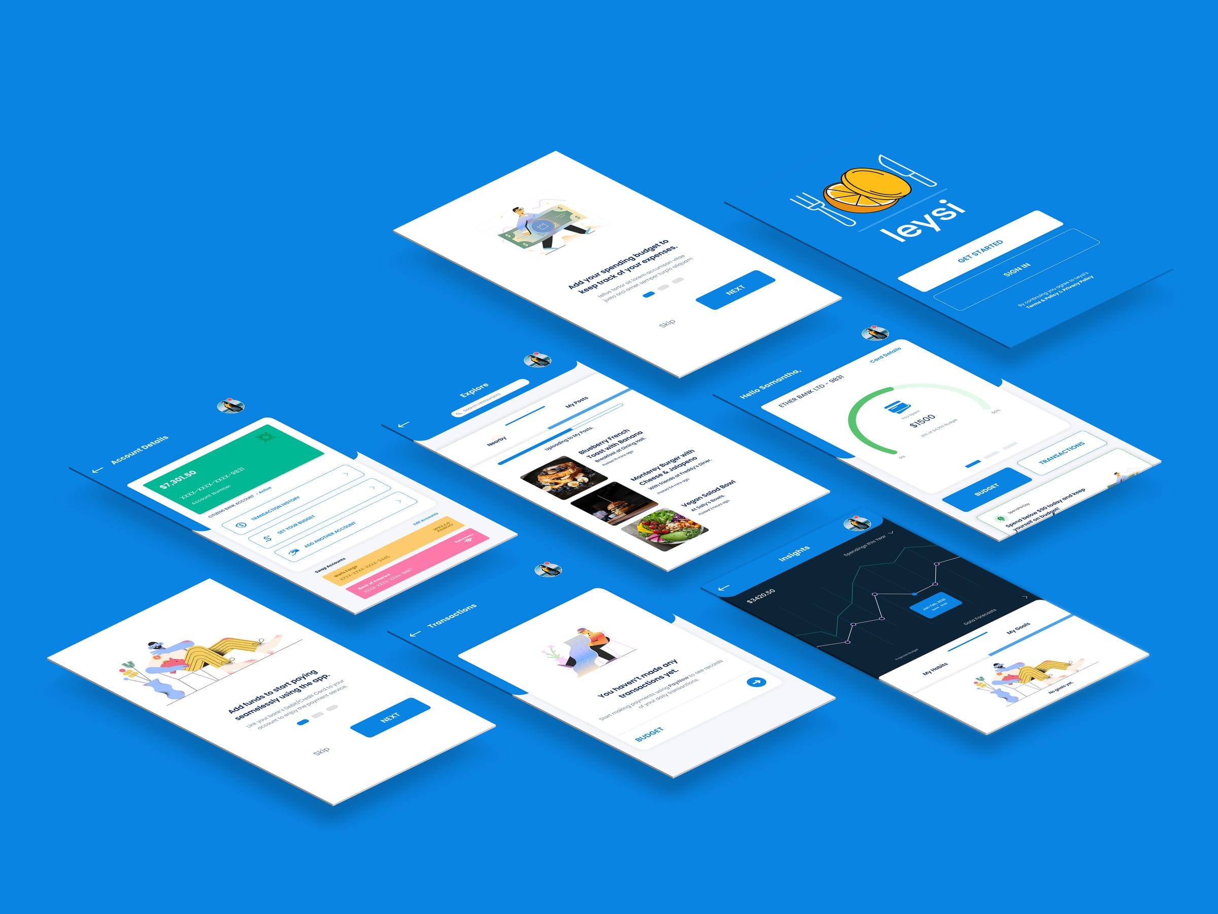
Leysi
Brand identity and iOS app for campus deals
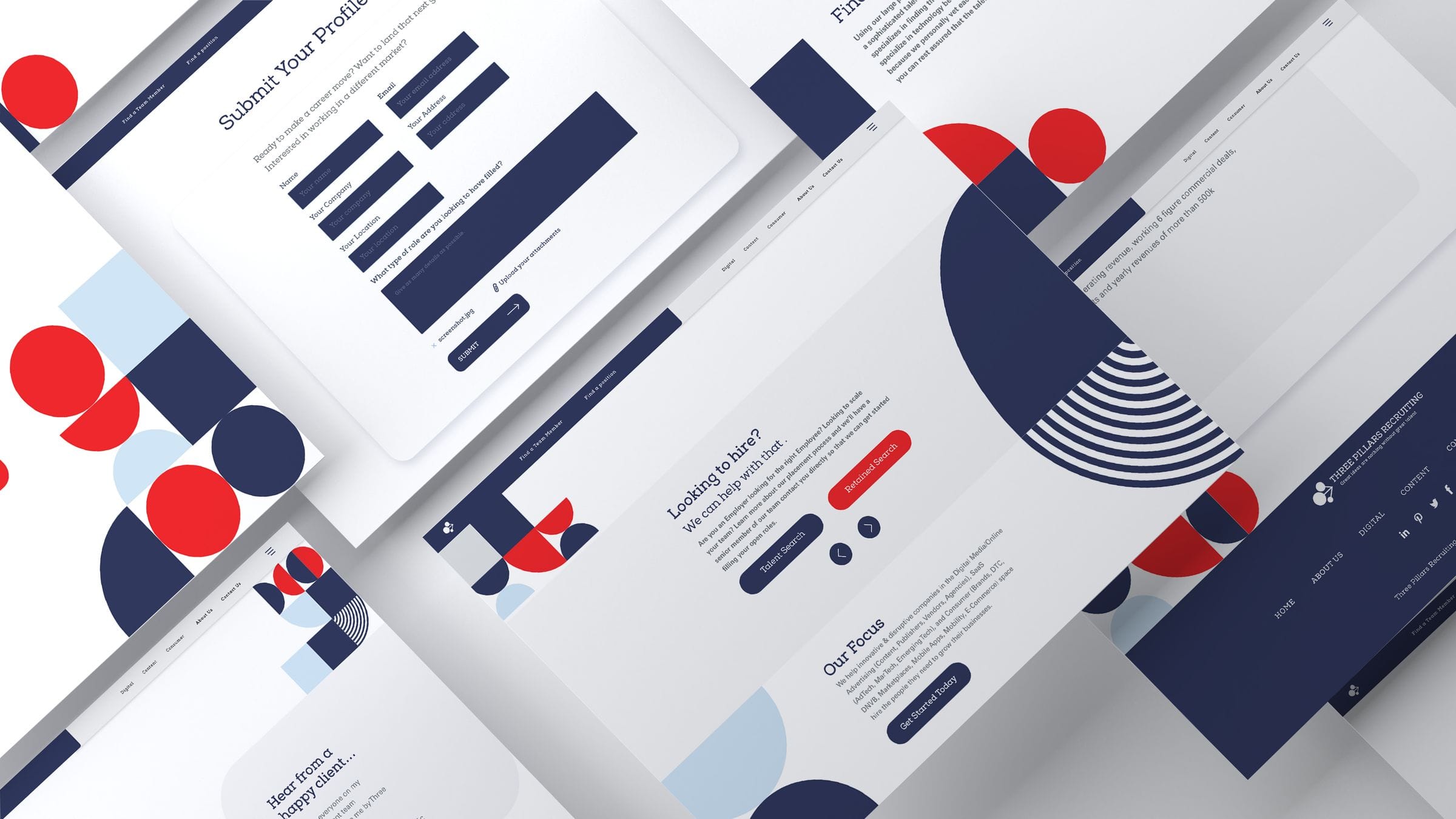
ThreePillars
Recruiting site redesign and brand refresh
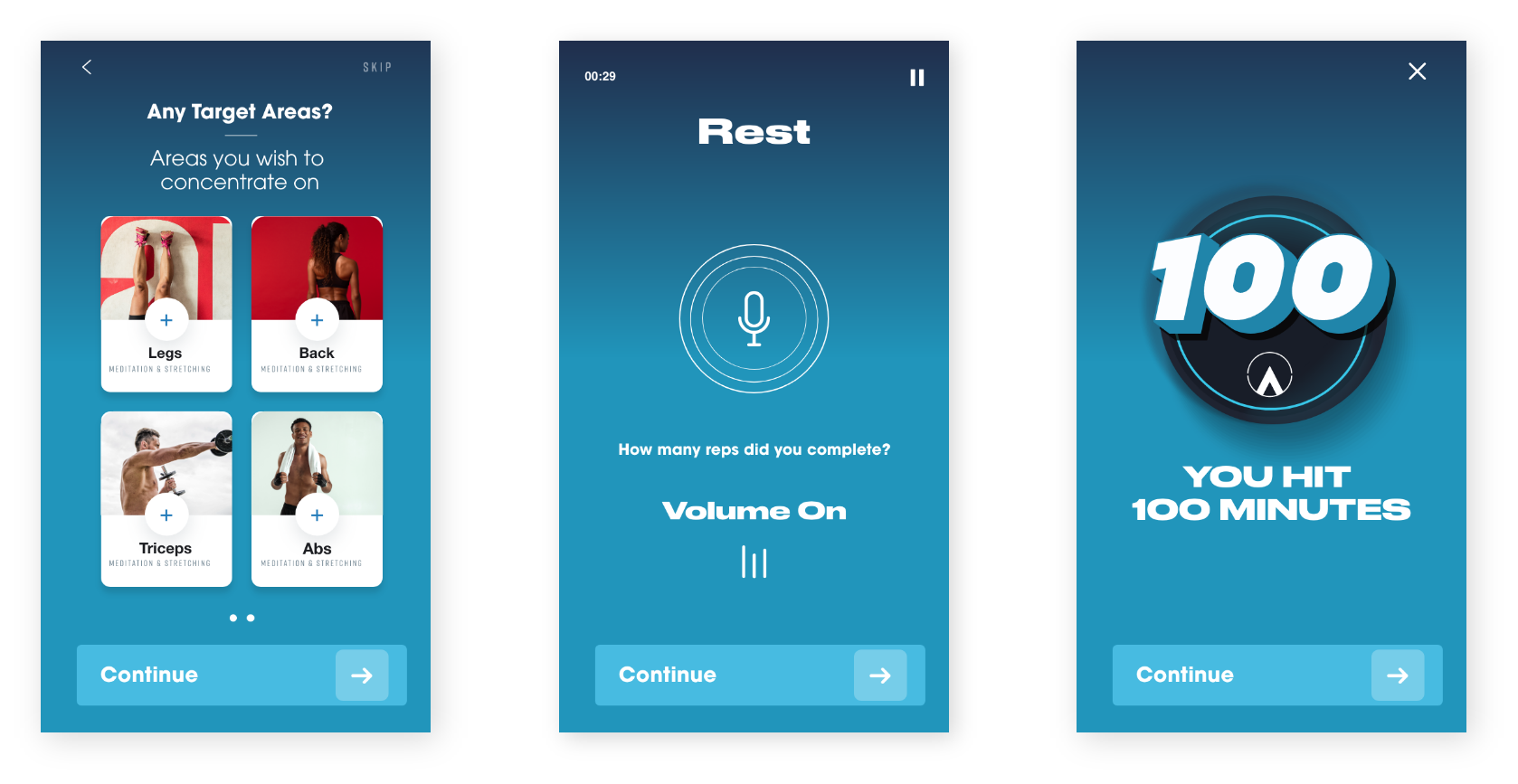
Piton
Product design and mobile interface work
Outsource
Commerce and editorial design across surfaces
Giga
Cross-platform product design and experiments
%20--%3e%3csvg%20version='1.1'%20id='Layer_1'%20xmlns='http://www.w3.org/2000/svg'%20xmlns:xlink='http://www.w3.org/1999/xlink'%20x='0px'%20y='0px'%20viewBox='0%200%2084.5%2084.5'%20style='enable-background:new%200%200%2084.5%2084.5;'%20xml:space='preserve'%3e%3cstyle%20type='text/css'%3e%20.st0{fill:%23A6D1CA;}%20%3c/style%3e%3cpath%20class='st0'%20d='M42.3,0C19,0,0,19,0,42.3s19,42.3,42.3,42.3s42.3-19,42.3-42.3S65.6,0,42.3,0z%20M42.3,7c8.9,0,17,3.4,23.2,8.8%20c-0.7,0.9-1.6,2-3,3.4c-3,2.9-7.8,6.4-15.2,9.1c-5-9.2-9.9-16.1-13.1-20.5C36.8,7.3,39.5,7,42.3,7z%20M27.3,10.3%20c2.9,3.8,8,10.8,13.2,20.1C26.2,34.3,13,34.8,7.8,34.8C10.2,23.9,17.5,14.9,27.3,10.3z%20M70.3,21c4.3,5.7,7,12.7,7.2,20.4%20c-3.1-0.7-7.8-1.4-13.8-1.4c-3.1,0-6.7,0.2-10.5,0.7c-0.9-2-1.8-3.9-2.8-5.8c7.9-3,13.3-7,16.8-10.5C68.6,23.1,69.5,22.1,70.3,21z%20M43.7,36.9c0.8,1.6,1.6,3.3,2.4,5.1c-15.1,4.2-25.9,16.9-30.5,23.3C10.3,59.1,7,51.1,7,42.3c0-0.2,0-0.3,0-0.4%20C11.8,41.9,26.9,41.5,43.7,36.9z%20M63.7,46.9c6.3,0,10.6,0.9,13.2,1.5c-1.6,9.4-6.9,17.4-14.4,22.7c-1.4-8.4-3.7-16.4-6.5-23.8%20C58.8,47.1,61.4,46.9,63.7,46.9z%20M48.9,48.5c3.2,8,5.8,16.9,7.2,26.2c-4.2,1.8-8.9,2.8-13.8,2.8c-8.1,0-15.5-2.7-21.5-7.3%20C24.4,65.3,35.1,52.1,48.9,48.5z'/%3e%3c/svg%3e)
%20--%3e%3csvg%20version='1.1'%20id='Layer_1'%20xmlns='http://www.w3.org/2000/svg'%20xmlns:xlink='http://www.w3.org/1999/xlink'%20x='0px'%20y='0px'%20viewBox='0%200%2081.2%2081.2'%20style='enable-background:new%200%200%2081.2%2081.2;'%20xml:space='preserve'%3e%3cstyle%20type='text/css'%3e%20.st0{fill:%23A6D1CA;}%20%3c/style%3e%3cpath%20class='st0'%20d='M22.6,0C10.1,0,0,10.1,0,22.6v36.1c0,12.4,10.1,22.6,22.6,22.6h36.1c12.4,0,22.6-10.1,22.6-22.6V22.6%20C81.2,10.1,71.1,0,58.6,0H22.6z%20M22.6,9h36.1c7.5,0,13.5,6.1,13.5,13.5v36.1c0,7.5-6.1,13.5-13.5,13.5H22.6C15.1,72.2,9,66.1,9,58.6%20V22.6C9,15.1,15.1,9,22.6,9z%20M63.1,13.5c-2.5,0-4.5,2-4.5,4.5s2,4.5,4.5,4.5c2.5,0,4.5-2,4.5-4.5S65.6,13.5,63.1,13.5z%20M40.6,18%20C28.2,18,18,28.2,18,40.6s10.1,22.6,22.6,22.6S63.1,53,63.1,40.6S53,18,40.6,18z%20M40.6,27.1c7.5,0,13.5,6.1,13.5,13.5%20s-6.1,13.5-13.5,13.5s-13.5-6.1-13.5-13.5S33.1,27.1,40.6,27.1z'/%3e%3c/svg%3e)
%20--%3e%3csvg%20version='1.1'%20id='Layer_1'%20xmlns='http://www.w3.org/2000/svg'%20xmlns:xlink='http://www.w3.org/1999/xlink'%20x='0px'%20y='0px'%20viewBox='0%200%2079.1%2079.1'%20style='enable-background:new%200%200%2079.1%2079.1;'%20xml:space='preserve'%3e%3cstyle%20type='text/css'%3e%20.st0{fill:%23A6D1CA;}%20%3c/style%3e%3cpath%20class='st0'%20d='M12.1,0C5.5,0,0,5.5,0,12.1V67c0,6.6,5.5,12.1,12.1,12.1H67c6.6,0,12.1-5.5,12.1-12.1V12.1%20C79.1,5.5,73.7,0,67,0H12.1z%20M12.1,6.6H67c3.1,0,5.5,2.4,5.5,5.5V67c0,3.1-2.4,5.5-5.5,5.5H12.1c-3.1,0-5.5-2.4-5.5-5.5V12.1%20C6.6,9,9,6.6,12.1,6.6z%20M20.9,15.4c-3,0-5.5,2.5-5.5,5.5s2.5,5.5,5.5,5.5s5.5-2.5,5.5-5.5S23.9,15.4,20.9,15.4z%20M17.6,30.8%20c-1.2,0-2.2,1-2.2,2.2v28.6c0,1.2,1,2.2,2.2,2.2h6.6c1.2,0,2.2-1,2.2-2.2V33c0-1.2-1-2.2-2.2-2.2H17.6z%20M33,30.8%20c-1.2,0-2.2,1-2.2,2.2v28.6c0,1.2,1,2.2,2.2,2.2h6.6c1.2,0,2.2-1,2.2-2.2V45.1c0-3,2.5-5.5,5.5-5.5c3,0,5.5,2.5,5.5,5.5v16.5%20c0,1.2,1,2.2,2.2,2.2h6.6c1.2,0,2.2-1,2.2-2.2V44c0-7.3-5.9-13.2-13.2-13.2c-3.4,0-6.5,1.3-8.8,3.4V33c0-1.2-1-2.2-2.2-2.2H33z'/%3e%3c/svg%3e)
%20--%3e%3csvg%20version='1.1'%20id='Layer_1'%20xmlns='http://www.w3.org/2000/svg'%20xmlns:xlink='http://www.w3.org/1999/xlink'%20x='0px'%20y='0px'%20viewBox='0%200%2083.7%2083.7'%20style='enable-background:new%200%200%2083.7%2083.7;'%20xml:space='preserve'%3e%3cstyle%20type='text/css'%3e%20.st0{fill:%23A6D1CA;}%20%3c/style%3e%3cpath%20class='st0'%20d='M41.9,0C18.8,0,0,18.8,0,41.9s18.8,41.9,41.9,41.9s41.9-18.8,41.9-41.9S64.9,0,41.9,0z%20M41.9,6.3%20c19.7,0,35.6,15.9,35.6,35.6c0,16-10.6,29.6-25.1,34V65.2c0-4-2.3-7.4-5.6-9.1c11.2-2.2,18.2-11.2,15.5-20.2c-0.5-1.8-1.4-3.5-2.7-5%20c0.9-2.9,2-7.9-0.5-11.8c-4.8,0-7.8,3.3-9.3,5.3c-2.5-0.8-5.2-1.2-7.9-1.3c-2.7,0-5.4,0.4-7.9,1.2c-1.5-2-4.5-5.3-9.3-5.3%20c-2.8,4.5-1.1,9.4-0.1,11.4c-6.5,7.7-4,18.1,5.6,23.3c2.1,1.1,4.4,1.9,6.9,2.4c-2.7,1.4-4.8,4-5.4,7.1h-2.8c-2.7,0-3.8-1.1-5.2-3%20c-1.4-1.9-3-3.1-4.9-3.6c-1-0.1-1.7,0.7-0.8,1.3c3,2,3.2,5.3,4.4,7.5c1.1,2,3.3,3.7,5.8,3.7h3.3v6.8c-14.6-4.5-25.1-18-25.1-34%20C6.3,22.2,22.2,6.3,41.9,6.3z'/%3e%3c/svg%3e)
%20--%3e%3csvg%20version='1.1'%20id='Layer_1'%20xmlns='http://www.w3.org/2000/svg'%20xmlns:xlink='http://www.w3.org/1999/xlink'%20x='0px'%20y='0px'%20viewBox='0%200%2084.5%2048'%20style='enable-background:new%200%200%2084.5%2048;'%20xml:space='preserve'%3e%3cstyle%20type='text/css'%3e%20.st0{fill:%23A6D1CA;}%20%3c/style%3e%3cg%3e%3cpath%20class='st0'%20d='M23.8,0C37,0,47.7,10.7,47.7,24S37,48,23.8,48S0,37.2,0,24S10.7,0,23.8,0z%20M61.9,1.4%20c6.6,0,11.9,10.1,11.9,22.6h0c0,12.5-5.3,22.6-11.9,22.6S50,36.5,50,24S55.3,1.4,61.9,1.4z%20M80.3,3.8c2.3,0,4.2,9.1,4.2,20.2%20c0,11.2-1.9,20.2-4.2,20.2s-4.2-9.1-4.2-20.2S78,3.8,80.3,3.8z'/%3e%3c/g%3e%3c/svg%3e)