%20--%3e%3csvg%20version='1.1'%20id='Layer_1'%20xmlns='http://www.w3.org/2000/svg'%20xmlns:xlink='http://www.w3.org/1999/xlink'%20x='0px'%20y='0px'%20viewBox='0%200%20236.2%20238.3'%20style='enable-background:new%200%200%20236.2%20238.3;'%20xml:space='preserve'%3e%3cstyle%20type='text/css'%3e%20.st0{fill:%23FFFFFF;}%20.st1{fill:%23678983;}%20.st2{fill:%2395C4BC;}%20%3c/style%3e%3cpath%20class='st0'%20d='M236,124.2c-0.1-0.2-0.2-0.4-0.4-0.5L236,124.2L236,124.2z'/%3e%3cpath%20class='st1'%20d='M208.3,93c0.7-0.8,1.8-1.1,2.8-1c3.1,0.4,6,1.5,8.6,3.1c2.6,1.5,4.9,3.4,6.9,5.7c1.8,2.1,2.6,3.8,2.5,5%20c-0.1,0.9-0.4,1.7-0.8,2.5c-0.4,0.8-0.9,1.1-1.5,1c-0.7-0.1-1.4-0.4-2.1-0.8c-0.3-0.2-1.2-0.6-2.6-1.4c-1.7-0.9-3.5-1.6-5.3-2.1%20c-2.3-0.7-4.7-1.2-7.2-1.5c-2.4-0.3-3.4-2.1-3-5.4l0.2-1.6C206.9,95.3,207.4,94,208.3,93z'/%3e%3cpath%20class='st2'%20d='M176.6,117.4c-1.7,0.9-3.9,0.3-4.8-1.4c-0.9-1.7-0.3-3.9,1.4-4.8c0,0,0.1-0.1,0.1-0.1%20c6.8-3.5,14.3-5.7,21.9-6.4l6.5-41.1c0.9-5.5,1.7-11.2,0.9-16.7c-0.8-5.6-3.6-11.1-8.6-13.8c-4.9-2.7-10.9-2.2-15.8,0.1%20s-8.9,6.4-12.2,10.8c-20,26.3-19.4,48.4-28.4,94.2h-5.2c0-0.3,0.1-0.6,0.1-0.9l13.1-81.7c1.1-6.7,2.1-13.5,0.9-20.1%20c-1.2-6.6-5.2-13.2-11.5-15.6c-5.7-2.2-12.4-0.6-17.4,3s-8.7,8.7-11.7,14C99.3,48.2,95,60.6,91.8,73.4c0.2-22.7-4.4-40.6-13.8-53.5%20C70.3,9.2,58.5,2.1,45.4,0.4h-0.3C24.5-2.4,5.6,12.1,2.8,32.8s11.7,39.6,32.4,42.3c18.1,2.4,35.4-8.5,40.9-26%20c-0.5-2.1-1.2-4.3-2-6.3c-4.6-11.7-13.8-21.1-25.3-26c-1.8-0.8-2.6-3-1.7-4.7c0.8-1.7,2.8-2.5,4.5-1.8c19,8.1,30.8,25.9,32.7,46.2%20c1.4,14.8,0,30.4-2.1,45c-1.1,7.6-2.6,15.1-4.3,22.6c-0.4,2-6.1,21.7-5.6,22c3.5,1.9,6.9,4.1,10.1,6.6c1.6,1.2,1.8,3.5,0.6,5%20c-1.2,1.6-3.5,1.8-5,0.6l0,0c-23.6-18.3-49.2-15.5-66.9,7.2c-17.4,22.4-14,54.5,7.7,72.8l55.3-20.7c0.6-0.4,1.2-0.9,1.7-1.3%20c5.4-4.8,6.9-12.5,8.1-19.7l17.1-103c0.4-2.2,0.8-4.5,2.2-6.2c1.4-1.7,4.1-2.6,5.9-1.3c1.8,1.3,1.7,4.1,1.4,6.4L95.2,209%20c12.7-3.9,25.2-8.2,37.5-13c3.4-1.3,6.8-2.7,9.3-5.4c3-3.3,3.9-8,4.7-12.4l14.4-83.1c0.2-1.9,0.8-3.8,1.9-5.4%20c1.2-1.5,3.5-2.3,5.1-1.3c1.8,1.2,1.7,3.8,1.5,6l-7.7,60.9c-0.8,6.7-1.7,13.6-0.3,20.2c1.2,5.4,4.1,10.6,8.6,13.6%20c1,0.7,2.2,1.3,3.4,1.7c7.1,2.5,14.9-0.5,21.3-4.4c21.8-13.2,36.9-35.2,41.3-60.3c0-0.2,0.1-0.3,0.1-0.5%20C220.1,110.6,196.2,107.2,176.6,117.4z'/%3e%3c/svg%3e)
Client
Piton Fitness
Role
Lead Designer: Brand Identity, UX/UI & Strategy
Timeline
2019 (1 year)
Platform
Brand / iOS / Apparel
Designing an AI-native fitness product before the AI was ready

Overview
Piton is a fitness startup built around two ideas that don't usually share the same brand: performance and purpose. Founded by Jemir Martinez, a fitness instructor and Microsoft employee now focused on AI, Piton was conceived as an athleisure clothing line with an accompanying iOS app, unified by a brand ethos centered on social change and environmentalism. The product ambition was high: a registered clothing brand, a workout app with a genuinely novel interaction model, and a visual identity strong enough to carry both.
I was brought on as the sole designer for the full engagement, one year covering everything from logo creation through iOS app wireframes.
My Role
Across the Piton project I was responsible for:
Brand strategy and visual identity development
Logo design and trademark preparation
Color system and design language definition
iOS app UX architecture and wireframing using Apple's Human Interface Guidelines
Collaboration with Jemir throughout concepting, iteration, and refinement
The Piton app concept, a workout companion designed to be used hands-free, mid-set.
Design Goals
The brief asked for a brand that could live in two very different worlds simultaneously: on a piece of clothing someone wears to the gym or the street, and on a mobile screen someone uses mid-workout. Those are different contexts with different demands, and the design system needed to hold up in both.
More specifically, the goals were to:
Create a bold, ownable logo mark that could be registered as a trademark and applied across apparel and digital surfaces
Establish a visual identity that communicated athletic credibility, social consciousness, and environmental values without feeling like any of them were an afterthought
Design an iOS app that made workout logging effortless through a voice-first interaction model
Build on Apple's Human Interface Guidelines to ensure the V1 wireframes were grounded in platform best practices from day one
The Logo & Brand Identity
The Piton name carries weight on its own. A piton is the metal spike a rock climber drives into a cliff face to anchor their next move: it's about grip, progress, and not letting go. That's a strong brand idea, and I wanted the logo to carry that energy without being too literal about it.
The mark I designed is abstract and geometric: bold shapes, high contrast, built to be immediately recognizable at any size. It reads as athletic without being generic, and it scales cleanly from a small app icon to apparel embroidery to large-format graphics. The forms are strong and deliberate, reflecting the physical discipline that sits at the core of what Piton is.
The color system followed the same logic: dark, high-contrast tones as the foundation, with accents that could carry across both digital interfaces and clothing colorways. The palette needed to feel premium and intentional. This wasn't a pastel wellness brand or a neon performance brand. Piton was something in between: serious about fitness, serious about its values, with a streetwear sensibility layered on top.
Following the design process, Jemir officially registered the logo as a trademark, a concrete validation of the mark's distinctiveness and longevity.

The Piton mark across its core colorways, built to hold up on both digital UI and apparel.
The iOS App: Voice-First Workout Logging
The app concept Jemir brought to the table was genuinely ahead of its time. The core frustration it was solving is one every serious gym-goer knows: you're in the middle of a set, your hands are occupied, and logging what you just did means stopping, picking up your phone, and tapping through a manual entry flow. It breaks rhythm, breaks focus, and most people just stop bothering.
Jemir's solution was to remove the hands entirely. The app would pair with your headphones and listen. You finish a set, you say what you did, and the app logs it. You keep moving. On top of that, the app could deliver real-time coaching cues, turning it into something closer to an audio personal trainer than a simple tracking tool.
In 2019, the voice AI infrastructure to fully support this wasn't mature enough to ship. The accuracy, latency, and offline capability needed for a gym environment weren't reliably there yet. But the design intent was sound, and I approached the wireframes as if the technology would catch up, because it has. What Piton was conceptualizing in 2019 is what AI-powered fitness apps are beginning to deliver now.
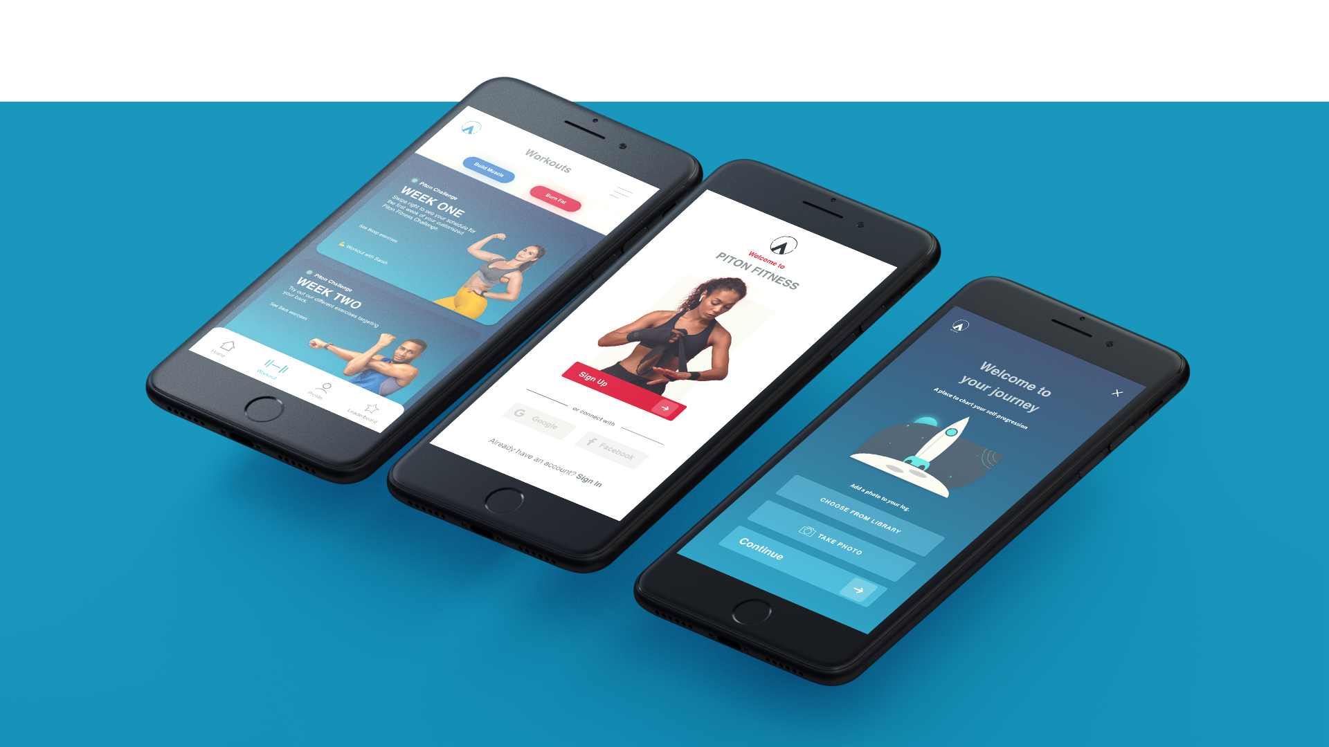
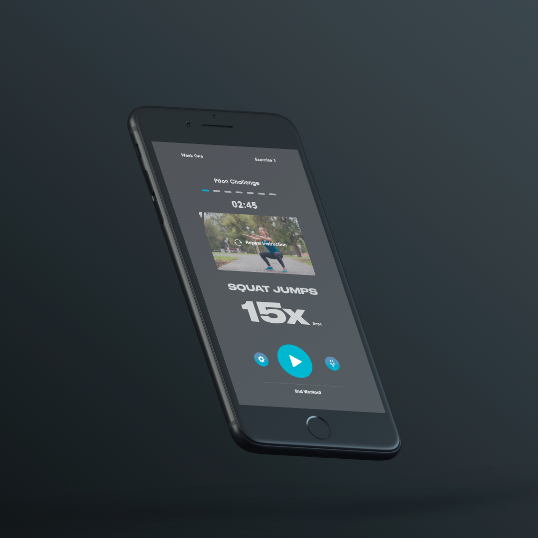
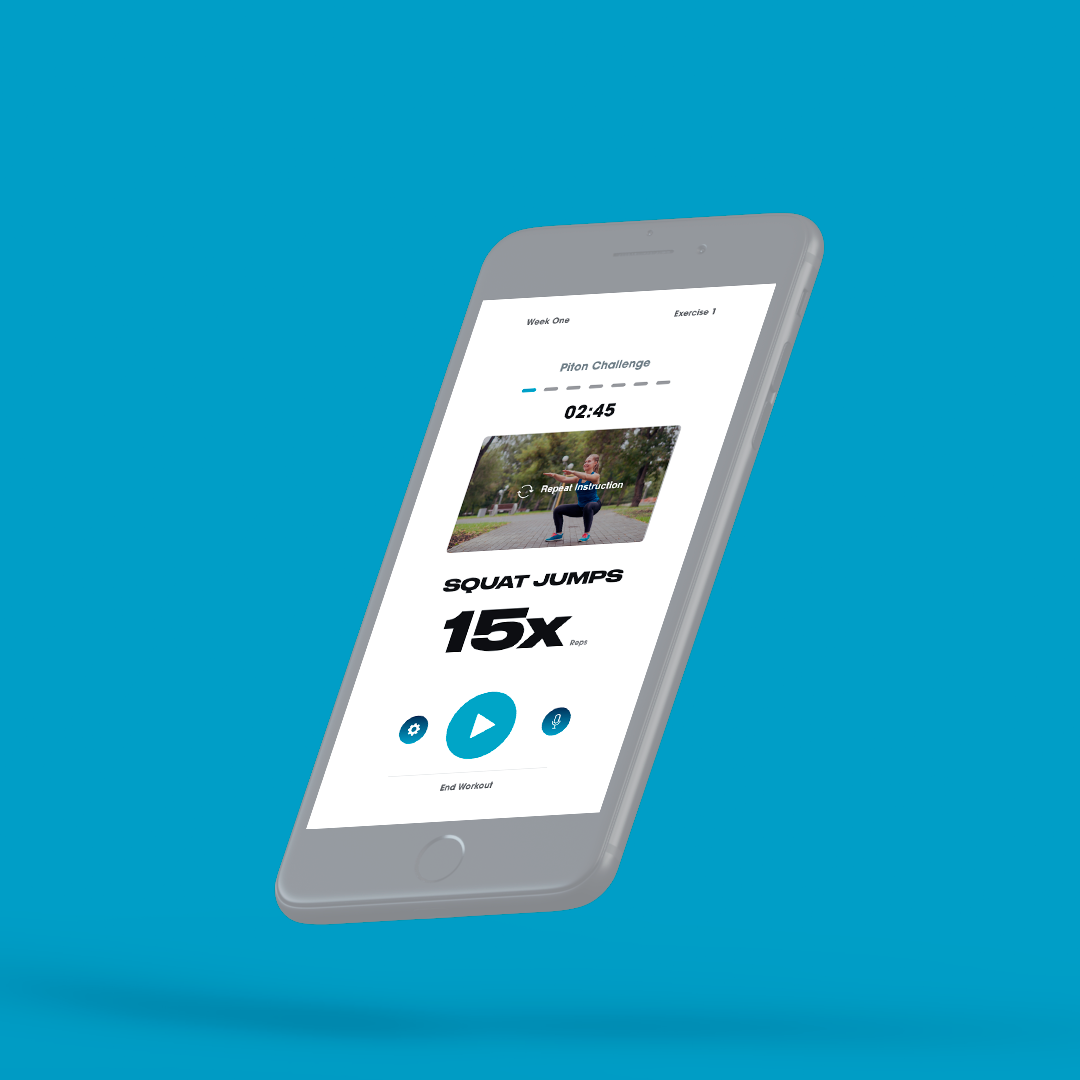
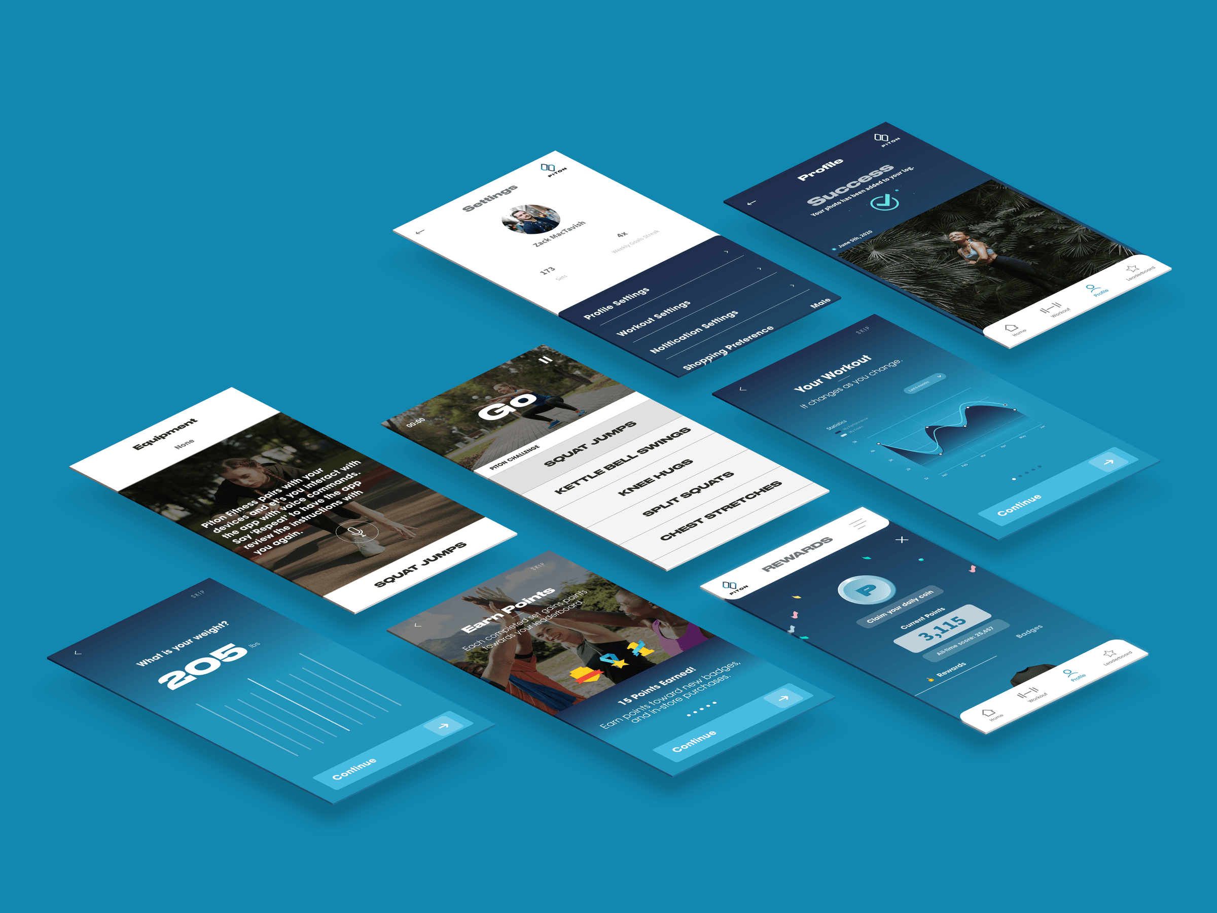
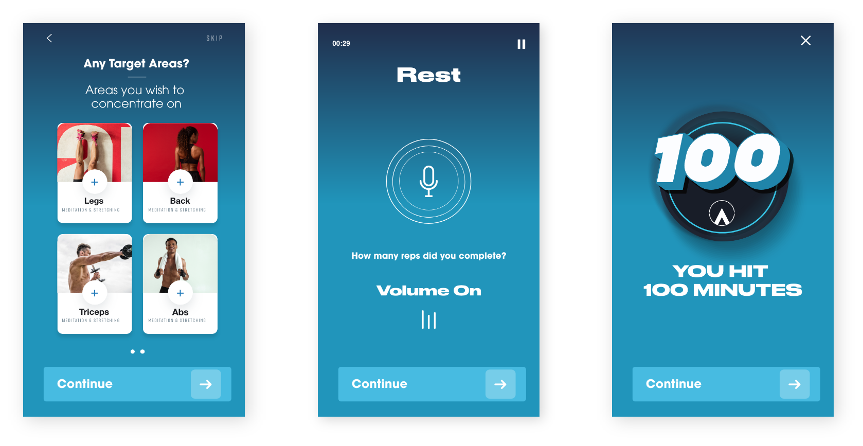
I designed the V1 wireframes across the core flows using Apple's Human Interface Guidelines as the structural foundation, spanning workout logging, the voice interaction model, plan browsing, and both light and dark modes. The overall UI carried the brand's bold, high-contrast aesthetic into the digital product. This wasn't a soft, minimalist wellness app. It was designed to feel like the workout itself: focused, direct, and energetic.
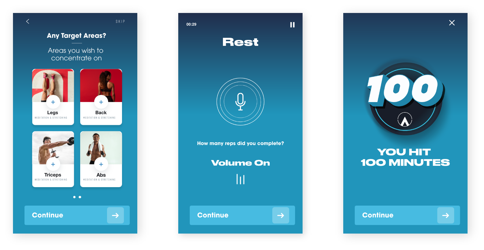
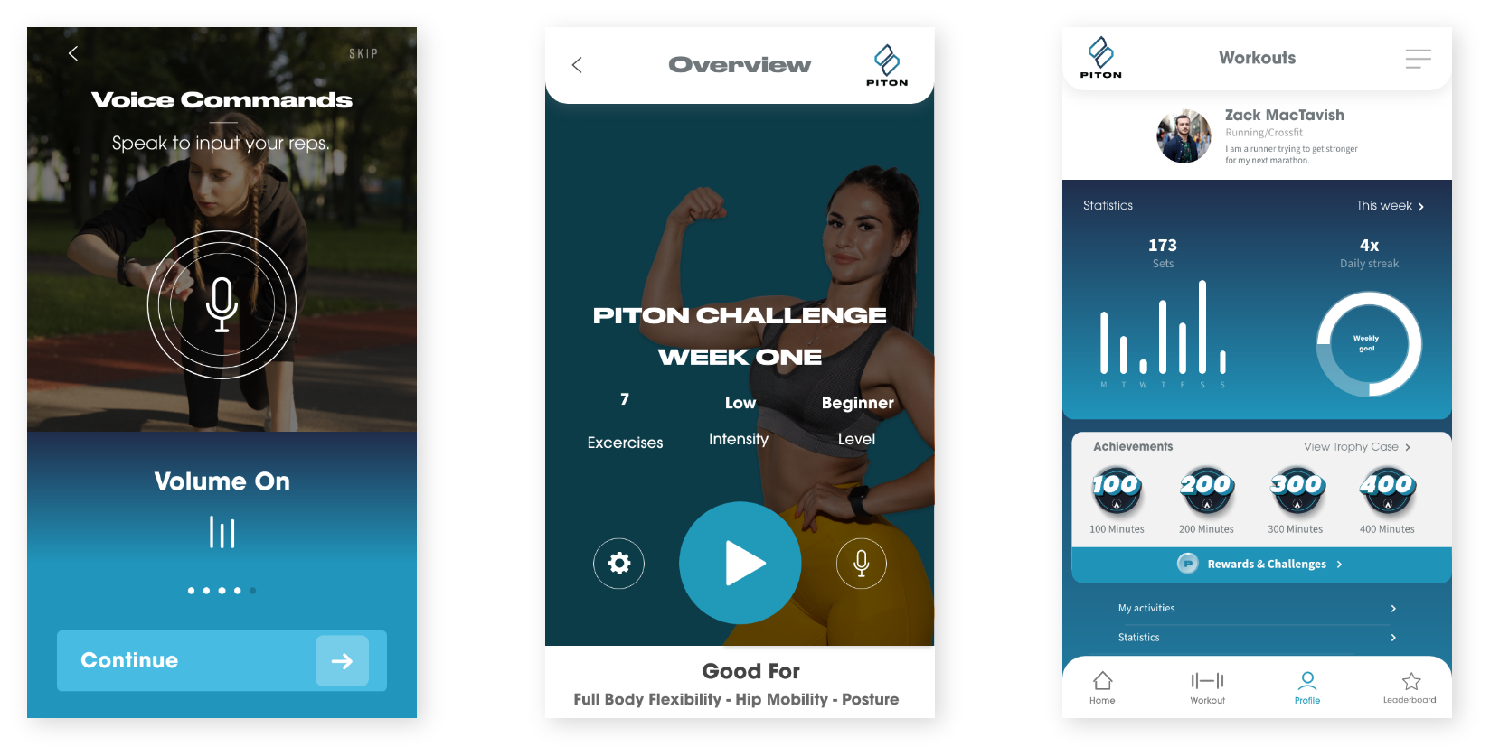
Voice commands, curated workout plans, and progress tracking, designed across the core app flows.
Light & Dark Modes
Collaboration
The year-long engagement with Jemir was built on ongoing conversation. Brand direction, product strategy, and design decisions were developed iteratively. Jemir brought deep knowledge of the fitness industry and a clear point of view on what he wanted Piton to stand for, and I translated that into visual and product decisions. The clothing brand and the app were always conceived together, which meant every design choice had to work across both contexts.
Challenges
The most significant challenge was designing around a technology gap. The voice AI feature was the heart of the app's value proposition, but the tools available in 2019 couldn't fully deliver the experience we were designing toward. This required finding the right balance: building wireframes that were honest about the interaction model, designing the supporting UI and feedback states thoroughly, while being realistic with Jemir about what a V1 launch could credibly include versus what would need to wait for the technology to mature.
The dual-surface problem, designing for both apparel and a digital product simultaneously, was the other core tension. A logo or color decision that works beautifully on screen may behave differently on fabric, under different lighting, at embroidery scale. Keeping both contexts active in every design decision required discipline and regular pressure-testing of the system across both applications.
Outcome
The Piton logo was officially registered as a trademark, the clearest possible signal that the mark was distinctive, defensible, and built to last. The iOS app V1 wireframes established the full design foundation for the product, with the voice interaction model documented and ready for development when the technology catches up. The clothing brand concept was developed in parallel, with the visual identity ready to translate into apparel.
Reflection
Piton is one of the projects I think about most when it comes to the relationship between design and timing. We were designing an AI-native product interaction before AI could support it. That's a strange position to be in: you know the idea is right, but the tools aren't there yet. What it taught me was to design for the vision, not the constraint. The wireframes we built weren't a compromise around 2019 voice AI limitations. They were a clear articulation of what the product should be, so that when the technology arrived, the design was already waiting for it.
It also reinforced something I believe strongly about brand work: the best logos aren't just aesthetically successful. They're semantically right. Piton's mark works because it's rooted in something true about what the brand is: grip, forward motion, holding ground. That's not decoration. That's a foundation.
Team
Founder: Jemir Martinez
Designer: Zachary MacTavish
My projects
Microsoft
Shopping ecosystem across Bing, Copilot, Windows, Outlook
Leysi
Brand identity and iOS app for campus deals
ThreePillars
Recruiting site redesign and brand refresh
Piton
Product design and mobile interface work
Outsource
Commerce and editorial design across surfaces
Giga
Cross-platform product design and experiments
%20--%3e%3csvg%20version='1.1'%20id='Layer_1'%20xmlns='http://www.w3.org/2000/svg'%20xmlns:xlink='http://www.w3.org/1999/xlink'%20x='0px'%20y='0px'%20viewBox='0%200%2084.5%2084.5'%20style='enable-background:new%200%200%2084.5%2084.5;'%20xml:space='preserve'%3e%3cstyle%20type='text/css'%3e%20.st0{fill:%23A6D1CA;}%20%3c/style%3e%3cpath%20class='st0'%20d='M42.3,0C19,0,0,19,0,42.3s19,42.3,42.3,42.3s42.3-19,42.3-42.3S65.6,0,42.3,0z%20M42.3,7c8.9,0,17,3.4,23.2,8.8%20c-0.7,0.9-1.6,2-3,3.4c-3,2.9-7.8,6.4-15.2,9.1c-5-9.2-9.9-16.1-13.1-20.5C36.8,7.3,39.5,7,42.3,7z%20M27.3,10.3%20c2.9,3.8,8,10.8,13.2,20.1C26.2,34.3,13,34.8,7.8,34.8C10.2,23.9,17.5,14.9,27.3,10.3z%20M70.3,21c4.3,5.7,7,12.7,7.2,20.4%20c-3.1-0.7-7.8-1.4-13.8-1.4c-3.1,0-6.7,0.2-10.5,0.7c-0.9-2-1.8-3.9-2.8-5.8c7.9-3,13.3-7,16.8-10.5C68.6,23.1,69.5,22.1,70.3,21z%20M43.7,36.9c0.8,1.6,1.6,3.3,2.4,5.1c-15.1,4.2-25.9,16.9-30.5,23.3C10.3,59.1,7,51.1,7,42.3c0-0.2,0-0.3,0-0.4%20C11.8,41.9,26.9,41.5,43.7,36.9z%20M63.7,46.9c6.3,0,10.6,0.9,13.2,1.5c-1.6,9.4-6.9,17.4-14.4,22.7c-1.4-8.4-3.7-16.4-6.5-23.8%20C58.8,47.1,61.4,46.9,63.7,46.9z%20M48.9,48.5c3.2,8,5.8,16.9,7.2,26.2c-4.2,1.8-8.9,2.8-13.8,2.8c-8.1,0-15.5-2.7-21.5-7.3%20C24.4,65.3,35.1,52.1,48.9,48.5z'/%3e%3c/svg%3e)
%20--%3e%3csvg%20version='1.1'%20id='Layer_1'%20xmlns='http://www.w3.org/2000/svg'%20xmlns:xlink='http://www.w3.org/1999/xlink'%20x='0px'%20y='0px'%20viewBox='0%200%2081.2%2081.2'%20style='enable-background:new%200%200%2081.2%2081.2;'%20xml:space='preserve'%3e%3cstyle%20type='text/css'%3e%20.st0{fill:%23A6D1CA;}%20%3c/style%3e%3cpath%20class='st0'%20d='M22.6,0C10.1,0,0,10.1,0,22.6v36.1c0,12.4,10.1,22.6,22.6,22.6h36.1c12.4,0,22.6-10.1,22.6-22.6V22.6%20C81.2,10.1,71.1,0,58.6,0H22.6z%20M22.6,9h36.1c7.5,0,13.5,6.1,13.5,13.5v36.1c0,7.5-6.1,13.5-13.5,13.5H22.6C15.1,72.2,9,66.1,9,58.6%20V22.6C9,15.1,15.1,9,22.6,9z%20M63.1,13.5c-2.5,0-4.5,2-4.5,4.5s2,4.5,4.5,4.5c2.5,0,4.5-2,4.5-4.5S65.6,13.5,63.1,13.5z%20M40.6,18%20C28.2,18,18,28.2,18,40.6s10.1,22.6,22.6,22.6S63.1,53,63.1,40.6S53,18,40.6,18z%20M40.6,27.1c7.5,0,13.5,6.1,13.5,13.5%20s-6.1,13.5-13.5,13.5s-13.5-6.1-13.5-13.5S33.1,27.1,40.6,27.1z'/%3e%3c/svg%3e)
%20--%3e%3csvg%20version='1.1'%20id='Layer_1'%20xmlns='http://www.w3.org/2000/svg'%20xmlns:xlink='http://www.w3.org/1999/xlink'%20x='0px'%20y='0px'%20viewBox='0%200%2079.1%2079.1'%20style='enable-background:new%200%200%2079.1%2079.1;'%20xml:space='preserve'%3e%3cstyle%20type='text/css'%3e%20.st0{fill:%23A6D1CA;}%20%3c/style%3e%3cpath%20class='st0'%20d='M12.1,0C5.5,0,0,5.5,0,12.1V67c0,6.6,5.5,12.1,12.1,12.1H67c6.6,0,12.1-5.5,12.1-12.1V12.1%20C79.1,5.5,73.7,0,67,0H12.1z%20M12.1,6.6H67c3.1,0,5.5,2.4,5.5,5.5V67c0,3.1-2.4,5.5-5.5,5.5H12.1c-3.1,0-5.5-2.4-5.5-5.5V12.1%20C6.6,9,9,6.6,12.1,6.6z%20M20.9,15.4c-3,0-5.5,2.5-5.5,5.5s2.5,5.5,5.5,5.5s5.5-2.5,5.5-5.5S23.9,15.4,20.9,15.4z%20M17.6,30.8%20c-1.2,0-2.2,1-2.2,2.2v28.6c0,1.2,1,2.2,2.2,2.2h6.6c1.2,0,2.2-1,2.2-2.2V33c0-1.2-1-2.2-2.2-2.2H17.6z%20M33,30.8%20c-1.2,0-2.2,1-2.2,2.2v28.6c0,1.2,1,2.2,2.2,2.2h6.6c1.2,0,2.2-1,2.2-2.2V45.1c0-3,2.5-5.5,5.5-5.5c3,0,5.5,2.5,5.5,5.5v16.5%20c0,1.2,1,2.2,2.2,2.2h6.6c1.2,0,2.2-1,2.2-2.2V44c0-7.3-5.9-13.2-13.2-13.2c-3.4,0-6.5,1.3-8.8,3.4V33c0-1.2-1-2.2-2.2-2.2H33z'/%3e%3c/svg%3e)
%20--%3e%3csvg%20version='1.1'%20id='Layer_1'%20xmlns='http://www.w3.org/2000/svg'%20xmlns:xlink='http://www.w3.org/1999/xlink'%20x='0px'%20y='0px'%20viewBox='0%200%2083.7%2083.7'%20style='enable-background:new%200%200%2083.7%2083.7;'%20xml:space='preserve'%3e%3cstyle%20type='text/css'%3e%20.st0{fill:%23A6D1CA;}%20%3c/style%3e%3cpath%20class='st0'%20d='M41.9,0C18.8,0,0,18.8,0,41.9s18.8,41.9,41.9,41.9s41.9-18.8,41.9-41.9S64.9,0,41.9,0z%20M41.9,6.3%20c19.7,0,35.6,15.9,35.6,35.6c0,16-10.6,29.6-25.1,34V65.2c0-4-2.3-7.4-5.6-9.1c11.2-2.2,18.2-11.2,15.5-20.2c-0.5-1.8-1.4-3.5-2.7-5%20c0.9-2.9,2-7.9-0.5-11.8c-4.8,0-7.8,3.3-9.3,5.3c-2.5-0.8-5.2-1.2-7.9-1.3c-2.7,0-5.4,0.4-7.9,1.2c-1.5-2-4.5-5.3-9.3-5.3%20c-2.8,4.5-1.1,9.4-0.1,11.4c-6.5,7.7-4,18.1,5.6,23.3c2.1,1.1,4.4,1.9,6.9,2.4c-2.7,1.4-4.8,4-5.4,7.1h-2.8c-2.7,0-3.8-1.1-5.2-3%20c-1.4-1.9-3-3.1-4.9-3.6c-1-0.1-1.7,0.7-0.8,1.3c3,2,3.2,5.3,4.4,7.5c1.1,2,3.3,3.7,5.8,3.7h3.3v6.8c-14.6-4.5-25.1-18-25.1-34%20C6.3,22.2,22.2,6.3,41.9,6.3z'/%3e%3c/svg%3e)
%20--%3e%3csvg%20version='1.1'%20id='Layer_1'%20xmlns='http://www.w3.org/2000/svg'%20xmlns:xlink='http://www.w3.org/1999/xlink'%20x='0px'%20y='0px'%20viewBox='0%200%2084.5%2048'%20style='enable-background:new%200%200%2084.5%2048;'%20xml:space='preserve'%3e%3cstyle%20type='text/css'%3e%20.st0{fill:%23A6D1CA;}%20%3c/style%3e%3cg%3e%3cpath%20class='st0'%20d='M23.8,0C37,0,47.7,10.7,47.7,24S37,48,23.8,48S0,37.2,0,24S10.7,0,23.8,0z%20M61.9,1.4%20c6.6,0,11.9,10.1,11.9,22.6h0c0,12.5-5.3,22.6-11.9,22.6S50,36.5,50,24S55.3,1.4,61.9,1.4z%20M80.3,3.8c2.3,0,4.2,9.1,4.2,20.2%20c0,11.2-1.9,20.2-4.2,20.2s-4.2-9.1-4.2-20.2S78,3.8,80.3,3.8z'/%3e%3c/g%3e%3c/svg%3e)