%20--%3e%3csvg%20version='1.1'%20id='Layer_1'%20xmlns='http://www.w3.org/2000/svg'%20xmlns:xlink='http://www.w3.org/1999/xlink'%20x='0px'%20y='0px'%20viewBox='0%200%20236.2%20238.3'%20style='enable-background:new%200%200%20236.2%20238.3;'%20xml:space='preserve'%3e%3cstyle%20type='text/css'%3e%20.st0{fill:%23FFFFFF;}%20.st1{fill:%23678983;}%20.st2{fill:%2395C4BC;}%20%3c/style%3e%3cpath%20class='st0'%20d='M236,124.2c-0.1-0.2-0.2-0.4-0.4-0.5L236,124.2L236,124.2z'/%3e%3cpath%20class='st1'%20d='M208.3,93c0.7-0.8,1.8-1.1,2.8-1c3.1,0.4,6,1.5,8.6,3.1c2.6,1.5,4.9,3.4,6.9,5.7c1.8,2.1,2.6,3.8,2.5,5%20c-0.1,0.9-0.4,1.7-0.8,2.5c-0.4,0.8-0.9,1.1-1.5,1c-0.7-0.1-1.4-0.4-2.1-0.8c-0.3-0.2-1.2-0.6-2.6-1.4c-1.7-0.9-3.5-1.6-5.3-2.1%20c-2.3-0.7-4.7-1.2-7.2-1.5c-2.4-0.3-3.4-2.1-3-5.4l0.2-1.6C206.9,95.3,207.4,94,208.3,93z'/%3e%3cpath%20class='st2'%20d='M176.6,117.4c-1.7,0.9-3.9,0.3-4.8-1.4c-0.9-1.7-0.3-3.9,1.4-4.8c0,0,0.1-0.1,0.1-0.1%20c6.8-3.5,14.3-5.7,21.9-6.4l6.5-41.1c0.9-5.5,1.7-11.2,0.9-16.7c-0.8-5.6-3.6-11.1-8.6-13.8c-4.9-2.7-10.9-2.2-15.8,0.1%20s-8.9,6.4-12.2,10.8c-20,26.3-19.4,48.4-28.4,94.2h-5.2c0-0.3,0.1-0.6,0.1-0.9l13.1-81.7c1.1-6.7,2.1-13.5,0.9-20.1%20c-1.2-6.6-5.2-13.2-11.5-15.6c-5.7-2.2-12.4-0.6-17.4,3s-8.7,8.7-11.7,14C99.3,48.2,95,60.6,91.8,73.4c0.2-22.7-4.4-40.6-13.8-53.5%20C70.3,9.2,58.5,2.1,45.4,0.4h-0.3C24.5-2.4,5.6,12.1,2.8,32.8s11.7,39.6,32.4,42.3c18.1,2.4,35.4-8.5,40.9-26%20c-0.5-2.1-1.2-4.3-2-6.3c-4.6-11.7-13.8-21.1-25.3-26c-1.8-0.8-2.6-3-1.7-4.7c0.8-1.7,2.8-2.5,4.5-1.8c19,8.1,30.8,25.9,32.7,46.2%20c1.4,14.8,0,30.4-2.1,45c-1.1,7.6-2.6,15.1-4.3,22.6c-0.4,2-6.1,21.7-5.6,22c3.5,1.9,6.9,4.1,10.1,6.6c1.6,1.2,1.8,3.5,0.6,5%20c-1.2,1.6-3.5,1.8-5,0.6l0,0c-23.6-18.3-49.2-15.5-66.9,7.2c-17.4,22.4-14,54.5,7.7,72.8l55.3-20.7c0.6-0.4,1.2-0.9,1.7-1.3%20c5.4-4.8,6.9-12.5,8.1-19.7l17.1-103c0.4-2.2,0.8-4.5,2.2-6.2c1.4-1.7,4.1-2.6,5.9-1.3c1.8,1.3,1.7,4.1,1.4,6.4L95.2,209%20c12.7-3.9,25.2-8.2,37.5-13c3.4-1.3,6.8-2.7,9.3-5.4c3-3.3,3.9-8,4.7-12.4l14.4-83.1c0.2-1.9,0.8-3.8,1.9-5.4%20c1.2-1.5,3.5-2.3,5.1-1.3c1.8,1.2,1.7,3.8,1.5,6l-7.7,60.9c-0.8,6.7-1.7,13.6-0.3,20.2c1.2,5.4,4.1,10.6,8.6,13.6%20c1,0.7,2.2,1.3,3.4,1.7c7.1,2.5,14.9-0.5,21.3-4.4c21.8-13.2,36.9-35.2,41.3-60.3c0-0.2,0.1-0.3,0.1-0.5%20C220.1,110.6,196.2,107.2,176.6,117.4z'/%3e%3c/svg%3e)
Client
Three Pillars Recruiting
Role
Lead Designer: Brand Strategy, Identity & Web
Timeline
2018 (3 months)
Platform
Brand / Web
Modernist geometry as metaphor: a brand and website built on structure, strength, and purpose

Overview
Three Pillars Recruiting connects visionary companies and disruptive startups with the extraordinary people who drive them forward. By 2018, the firm had built a formidable track record of over 2,100 placements across 14 years in business, serving clients across AdTech, Media, SaaS, and Consulting. Despite that depth of experience, their digital presence didn't reflect it. The existing website was visually outdated, lacked a coherent brand identity, and wasn't designed to clearly serve the agency's two distinct audiences: employers looking to build high-impact teams, and candidates seeking their next career opportunity.
Engaged through Varfaj Partners, I was brought on to reimagine Three Pillars from the ground up, covering brand strategy, visual identity, and a fully redesigned website, in a three-month engagement.
My Role
I served as the lead designer across all phases of the project, responsible for:
Brand strategy and visual identity development
UX architecture and information design
UI design and final visual execution
Collaboration with the Varfaj Partners team throughout the process
Design handoff to their developer for implementation
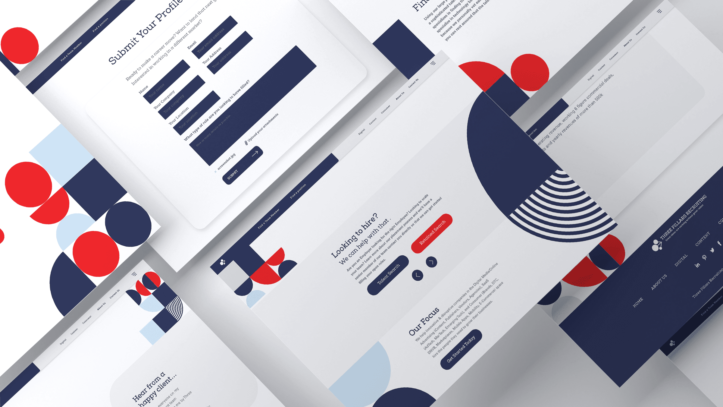
The redesigned site, built on a system of stacked modernist geometry: circles, squares, and pedestals working as both decoration and structure.
Design Goals
The brief was clear but ambitious: give Three Pillars a brand identity and website worthy of the agency they had become. More specifically, the goals were to:
Establish a bold, credible visual identity that reflected Three Pillars' seniority and expertise in the market
Create a site architecture that clearly served two distinct user types, employers and job seekers, without friction
Build a design system rooted in the brand name itself, giving the visual language meaning and staying power
Deliver a production-ready design within a three-month timeline
The Design Concept: Modernist Geometry as Metaphor
Every strong brand has an idea at its center. For Three Pillars, that idea was embedded in the name: structure, strength, and the notion of things built deliberately, stacked with purpose.
I translated this into a visual language rooted in modernist geometry. Circles, squares, and pedestals, stacked and layered, became the defining motif of the redesign. These weren't arbitrary shapes pulled from a trend board. They were a direct visual expression of the "Three Pillars" concept: forms that suggest solidity, elevation, and order.
Critically, the shapes served a dual function throughout the site. They were decorative where tone called for it, appearing as bold graphic elements in hero sections and transitions, but also structural, used to frame content, create visual hierarchy, and organize information on the page. This gave the design a sense of internal logic: every element felt like it belonged to the same system.
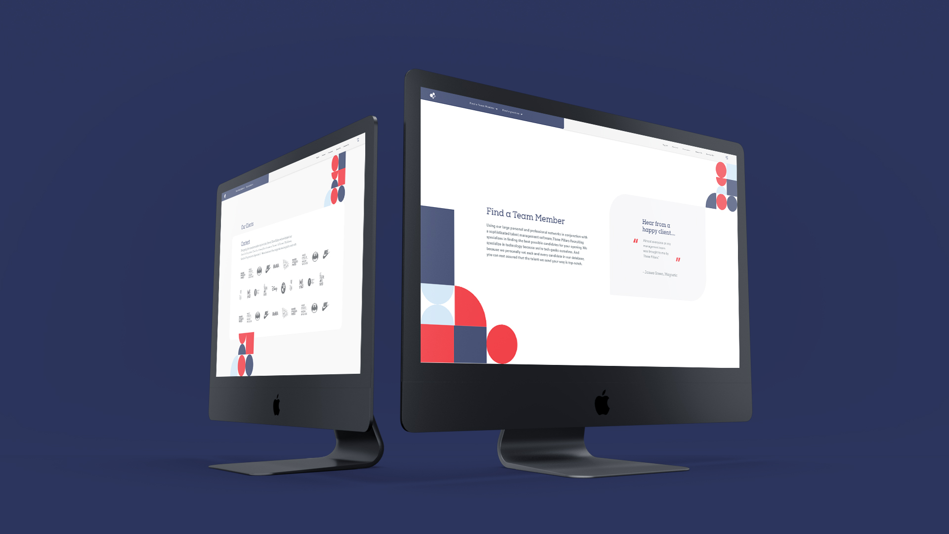
Palette & Typography
The palette carried over from Three Pillars' existing brand: a deep, professional foundation with enough warmth to feel human rather than cold. Paired with bold, geometric typography, the overall aesthetic landed where it needed to: authoritative without being stiff, modern without being trendy.
UX Architecture: Designing for Two Audiences
Three Pillars operates at the intersection of two very different needs. Employers come to the site looking to understand what kind of talent they can access and how to engage the agency for a search. Job seekers come looking for open roles, credibility signals, and a reason to trust Three Pillars with their career. These are not the same journey, and treating them as such would have created friction for both.
The site architecture was built around a clear bifurcation from the start. Rather than routing everyone through a single unified navigation and hoping they'd self-sort, I designed distinct entry points and content paths for each audience. Employers were guided toward the agency's search services, process, and track record. Job seekers were directed toward open positions and a profile submission flow. The homepage served as the shared front door, establishing brand credibility and then directing visitors toward whichever path applied to them.
This dual-path structure reduced cognitive load for both user types and allowed the content on each path to speak directly to that audience's specific motivations and questions.
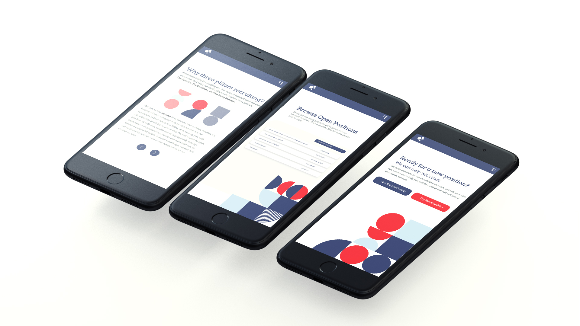
A mobile experience that carried the same geometric system across screens.
Collaboration
Throughout the project I worked closely with the Varfaj Partners team, using their knowledge of Three Pillars' business, clients, and competitive positioning to inform design decisions. Design reviews were iterative, presenting directions, refining based on feedback, and stress-testing ideas against the real-world contexts in which the site would be used.
Once designs were finalized, I coordinated the handoff to Varfaj's developer, ensuring the visual intent translated cleanly into the built product. The entire process, from initial concept through developer-ready designs, was completed in three months.
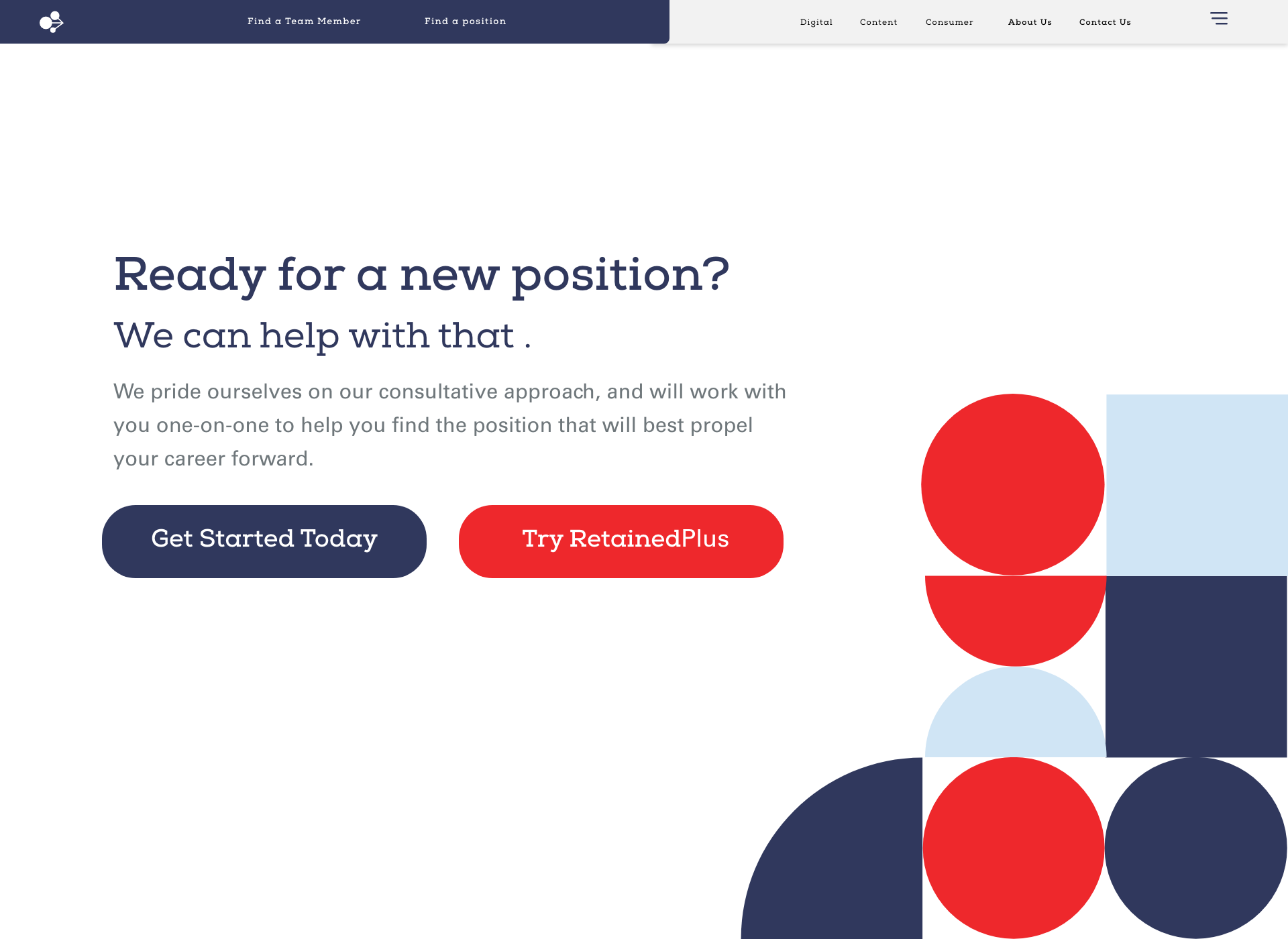
The job-seeker path: open roles and a clear route into the agency, distinct from the employer experience.
Challenges
Balancing boldness with professionalism. A recruiting agency's brand needs to carry credibility with C-suite decision-makers at major companies. Going too experimental would undermine trust. Going too safe would disappear into the crowd. The geometric concept threaded this needle: it was distinctive and visually confident without feeling like a risk.
Making abstract concepts tangible. "Three Pillars" is a conceptual brand name; it doesn't describe a product or service literally. Turning that abstraction into a visual system that felt inevitable rather than forced required finding the right level of metaphorical translation. The stacked geometric forms worked precisely because they were literal enough to be understood and refined enough not to be heavy-handed.
Serving two audiences within one coherent visual world. The split-path UX solution addressed the navigational challenge, but both paths still needed to feel like the same brand: same visual language, same tone, same level of craft. The design system held that together.
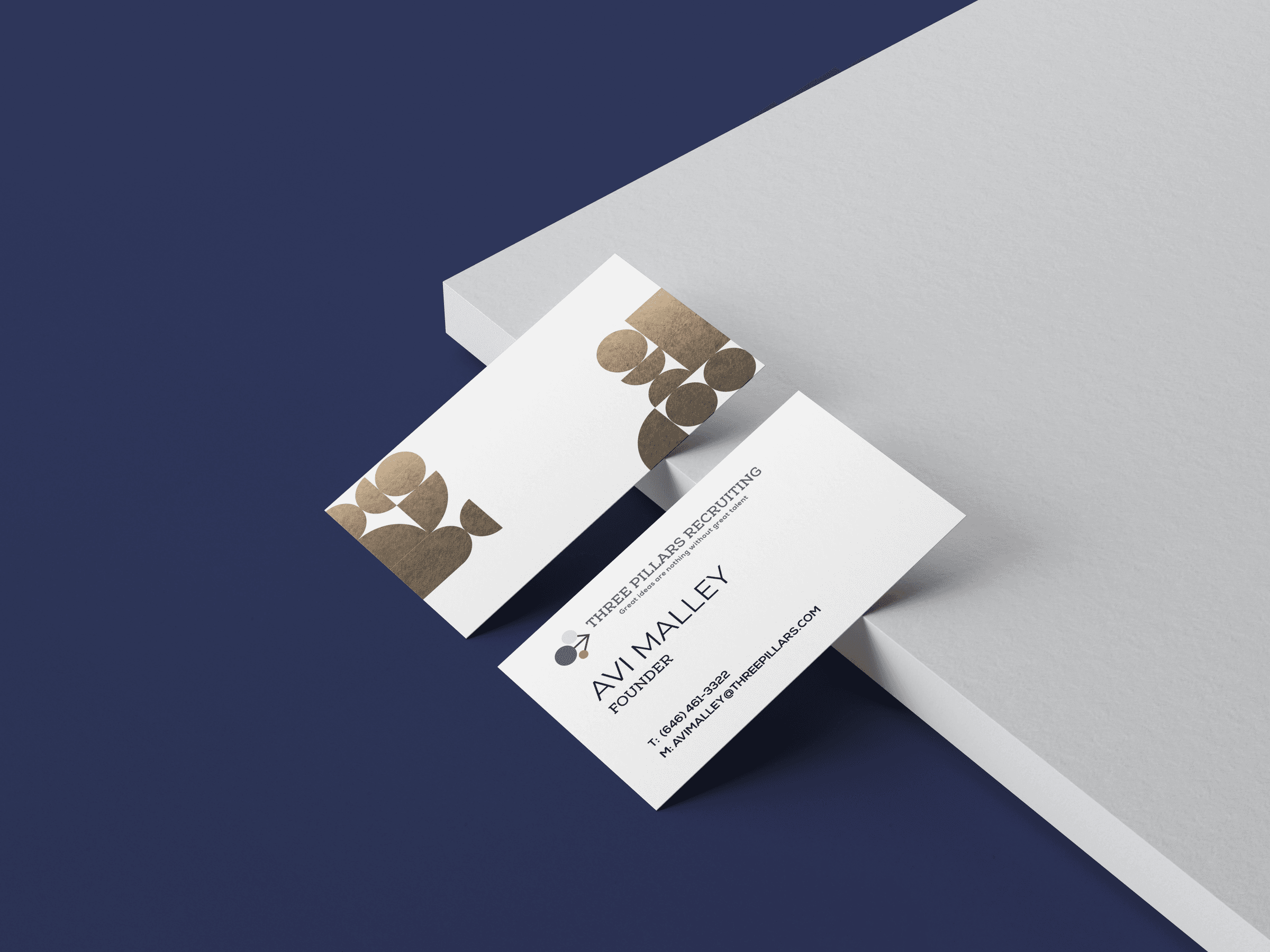
The brand identity system applied across the experience, from web to collateral.
Outcome
The redesigned Three Pillars website launched following the three-month engagement and remained the agency's primary digital presence for approximately two years. During that window, Three Pillars continued to grow, expanding its client roster, deepening relationships with leading VC and PE-backed companies, and building toward the track record it carries today: 3,150+ placements and over $500M in salary negotiated on behalf of candidates.
The project gave Three Pillars a brand foundation that matched the quality of work they were doing behind the scenes: a visual identity built to be taken seriously.
Reflection
What I valued most about this project was the clarity of the design problem. Three Pillars had a strong business with a weak visual voice. The opportunity was to close that gap, and to do it through a concept that had real meaning, not just visual decoration.
The modernist geometry approach worked because it wasn't imposed on the brand from the outside. It came from the name, the idea, the structure of what Three Pillars actually does: building something strong, layer by layer, for the companies and people they serve. When a visual language is rooted in that kind of genuine logic, it holds up: in execution, over time, and across the many contexts a brand actually lives in.
Team
Founders: Three Pillars Team
Designers: Zachary MacTavish & Varfaj Partners
Development: Varfaj Partners
My projects
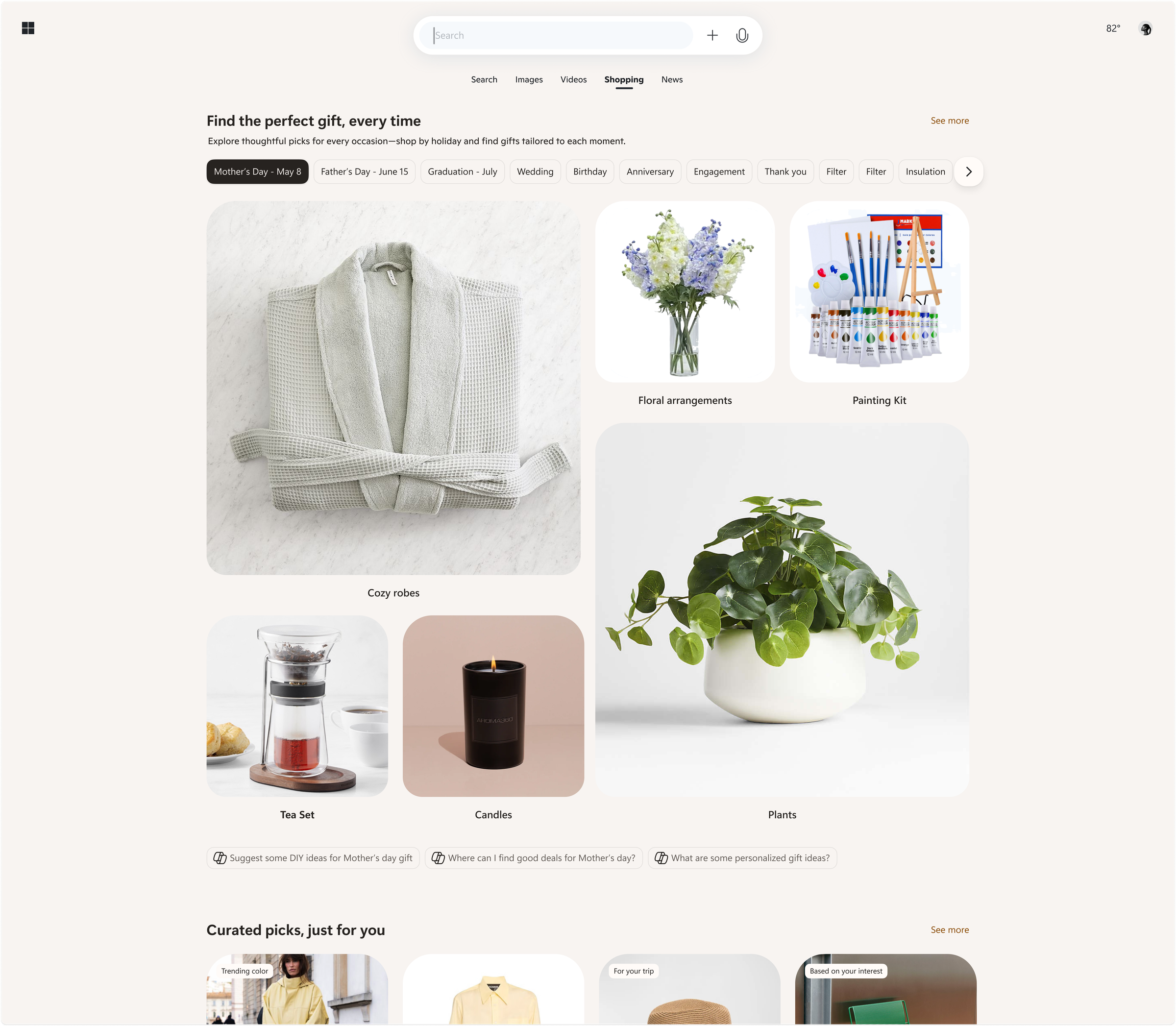
Microsoft
Shopping ecosystem across Bing, Copilot, Windows, Outlook
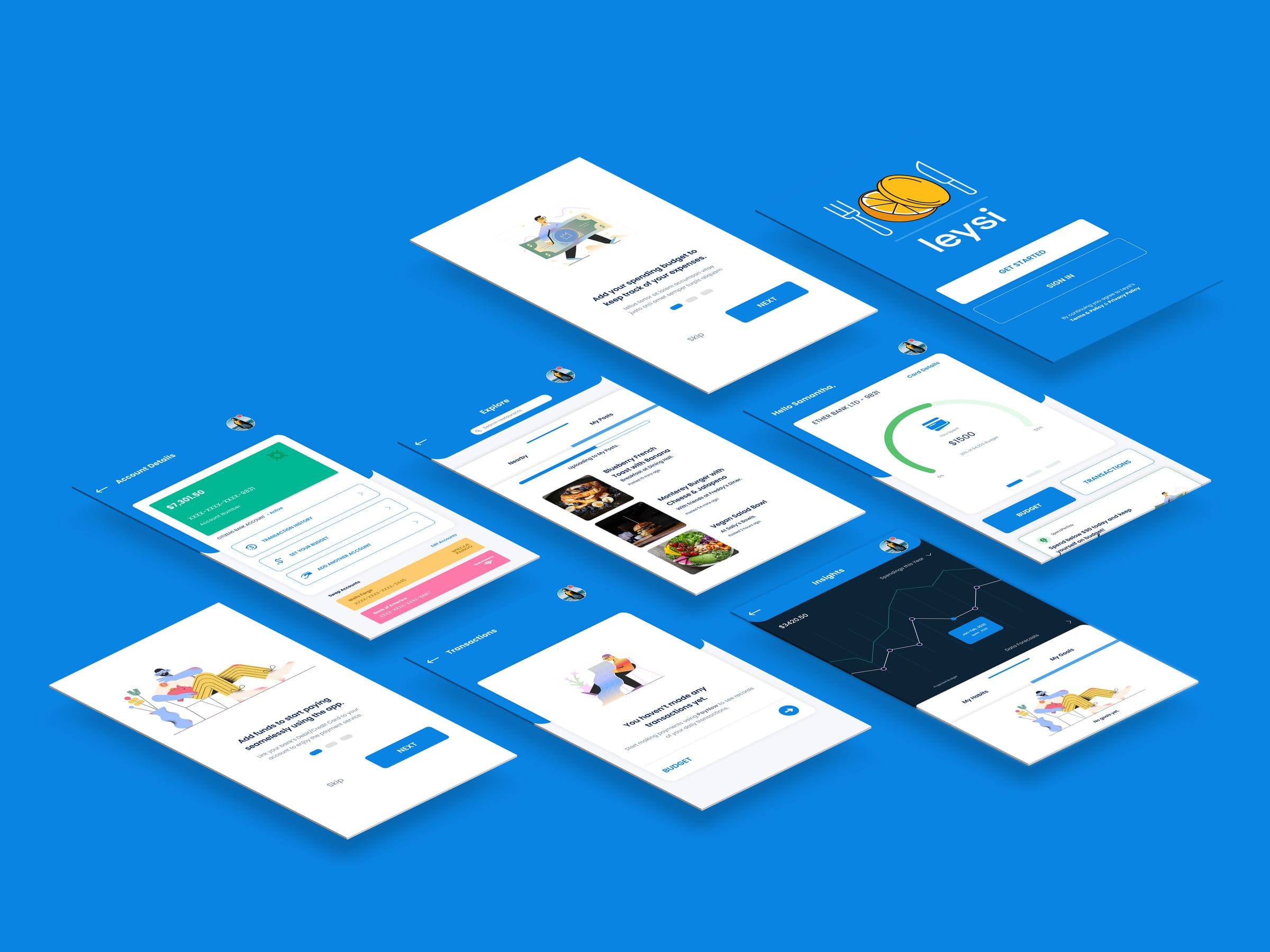
Leysi
Brand identity and iOS app for campus deals
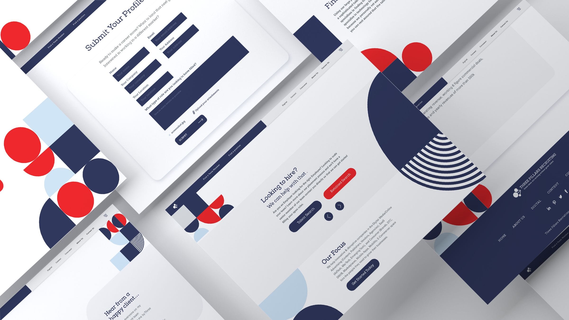
ThreePillars
Recruiting site redesign and brand refresh
Piton
Product design and mobile interface work
Outsource
Commerce and editorial design across surfaces

Giga
Cross-platform product design and experiments
%20--%3e%3csvg%20version='1.1'%20id='Layer_1'%20xmlns='http://www.w3.org/2000/svg'%20xmlns:xlink='http://www.w3.org/1999/xlink'%20x='0px'%20y='0px'%20viewBox='0%200%2084.5%2084.5'%20style='enable-background:new%200%200%2084.5%2084.5;'%20xml:space='preserve'%3e%3cstyle%20type='text/css'%3e%20.st0{fill:%23A6D1CA;}%20%3c/style%3e%3cpath%20class='st0'%20d='M42.3,0C19,0,0,19,0,42.3s19,42.3,42.3,42.3s42.3-19,42.3-42.3S65.6,0,42.3,0z%20M42.3,7c8.9,0,17,3.4,23.2,8.8%20c-0.7,0.9-1.6,2-3,3.4c-3,2.9-7.8,6.4-15.2,9.1c-5-9.2-9.9-16.1-13.1-20.5C36.8,7.3,39.5,7,42.3,7z%20M27.3,10.3%20c2.9,3.8,8,10.8,13.2,20.1C26.2,34.3,13,34.8,7.8,34.8C10.2,23.9,17.5,14.9,27.3,10.3z%20M70.3,21c4.3,5.7,7,12.7,7.2,20.4%20c-3.1-0.7-7.8-1.4-13.8-1.4c-3.1,0-6.7,0.2-10.5,0.7c-0.9-2-1.8-3.9-2.8-5.8c7.9-3,13.3-7,16.8-10.5C68.6,23.1,69.5,22.1,70.3,21z%20M43.7,36.9c0.8,1.6,1.6,3.3,2.4,5.1c-15.1,4.2-25.9,16.9-30.5,23.3C10.3,59.1,7,51.1,7,42.3c0-0.2,0-0.3,0-0.4%20C11.8,41.9,26.9,41.5,43.7,36.9z%20M63.7,46.9c6.3,0,10.6,0.9,13.2,1.5c-1.6,9.4-6.9,17.4-14.4,22.7c-1.4-8.4-3.7-16.4-6.5-23.8%20C58.8,47.1,61.4,46.9,63.7,46.9z%20M48.9,48.5c3.2,8,5.8,16.9,7.2,26.2c-4.2,1.8-8.9,2.8-13.8,2.8c-8.1,0-15.5-2.7-21.5-7.3%20C24.4,65.3,35.1,52.1,48.9,48.5z'/%3e%3c/svg%3e)
%20--%3e%3csvg%20version='1.1'%20id='Layer_1'%20xmlns='http://www.w3.org/2000/svg'%20xmlns:xlink='http://www.w3.org/1999/xlink'%20x='0px'%20y='0px'%20viewBox='0%200%2081.2%2081.2'%20style='enable-background:new%200%200%2081.2%2081.2;'%20xml:space='preserve'%3e%3cstyle%20type='text/css'%3e%20.st0{fill:%23A6D1CA;}%20%3c/style%3e%3cpath%20class='st0'%20d='M22.6,0C10.1,0,0,10.1,0,22.6v36.1c0,12.4,10.1,22.6,22.6,22.6h36.1c12.4,0,22.6-10.1,22.6-22.6V22.6%20C81.2,10.1,71.1,0,58.6,0H22.6z%20M22.6,9h36.1c7.5,0,13.5,6.1,13.5,13.5v36.1c0,7.5-6.1,13.5-13.5,13.5H22.6C15.1,72.2,9,66.1,9,58.6%20V22.6C9,15.1,15.1,9,22.6,9z%20M63.1,13.5c-2.5,0-4.5,2-4.5,4.5s2,4.5,4.5,4.5c2.5,0,4.5-2,4.5-4.5S65.6,13.5,63.1,13.5z%20M40.6,18%20C28.2,18,18,28.2,18,40.6s10.1,22.6,22.6,22.6S63.1,53,63.1,40.6S53,18,40.6,18z%20M40.6,27.1c7.5,0,13.5,6.1,13.5,13.5%20s-6.1,13.5-13.5,13.5s-13.5-6.1-13.5-13.5S33.1,27.1,40.6,27.1z'/%3e%3c/svg%3e)
%20--%3e%3csvg%20version='1.1'%20id='Layer_1'%20xmlns='http://www.w3.org/2000/svg'%20xmlns:xlink='http://www.w3.org/1999/xlink'%20x='0px'%20y='0px'%20viewBox='0%200%2079.1%2079.1'%20style='enable-background:new%200%200%2079.1%2079.1;'%20xml:space='preserve'%3e%3cstyle%20type='text/css'%3e%20.st0{fill:%23A6D1CA;}%20%3c/style%3e%3cpath%20class='st0'%20d='M12.1,0C5.5,0,0,5.5,0,12.1V67c0,6.6,5.5,12.1,12.1,12.1H67c6.6,0,12.1-5.5,12.1-12.1V12.1%20C79.1,5.5,73.7,0,67,0H12.1z%20M12.1,6.6H67c3.1,0,5.5,2.4,5.5,5.5V67c0,3.1-2.4,5.5-5.5,5.5H12.1c-3.1,0-5.5-2.4-5.5-5.5V12.1%20C6.6,9,9,6.6,12.1,6.6z%20M20.9,15.4c-3,0-5.5,2.5-5.5,5.5s2.5,5.5,5.5,5.5s5.5-2.5,5.5-5.5S23.9,15.4,20.9,15.4z%20M17.6,30.8%20c-1.2,0-2.2,1-2.2,2.2v28.6c0,1.2,1,2.2,2.2,2.2h6.6c1.2,0,2.2-1,2.2-2.2V33c0-1.2-1-2.2-2.2-2.2H17.6z%20M33,30.8%20c-1.2,0-2.2,1-2.2,2.2v28.6c0,1.2,1,2.2,2.2,2.2h6.6c1.2,0,2.2-1,2.2-2.2V45.1c0-3,2.5-5.5,5.5-5.5c3,0,5.5,2.5,5.5,5.5v16.5%20c0,1.2,1,2.2,2.2,2.2h6.6c1.2,0,2.2-1,2.2-2.2V44c0-7.3-5.9-13.2-13.2-13.2c-3.4,0-6.5,1.3-8.8,3.4V33c0-1.2-1-2.2-2.2-2.2H33z'/%3e%3c/svg%3e)
%20--%3e%3csvg%20version='1.1'%20id='Layer_1'%20xmlns='http://www.w3.org/2000/svg'%20xmlns:xlink='http://www.w3.org/1999/xlink'%20x='0px'%20y='0px'%20viewBox='0%200%2083.7%2083.7'%20style='enable-background:new%200%200%2083.7%2083.7;'%20xml:space='preserve'%3e%3cstyle%20type='text/css'%3e%20.st0{fill:%23A6D1CA;}%20%3c/style%3e%3cpath%20class='st0'%20d='M41.9,0C18.8,0,0,18.8,0,41.9s18.8,41.9,41.9,41.9s41.9-18.8,41.9-41.9S64.9,0,41.9,0z%20M41.9,6.3%20c19.7,0,35.6,15.9,35.6,35.6c0,16-10.6,29.6-25.1,34V65.2c0-4-2.3-7.4-5.6-9.1c11.2-2.2,18.2-11.2,15.5-20.2c-0.5-1.8-1.4-3.5-2.7-5%20c0.9-2.9,2-7.9-0.5-11.8c-4.8,0-7.8,3.3-9.3,5.3c-2.5-0.8-5.2-1.2-7.9-1.3c-2.7,0-5.4,0.4-7.9,1.2c-1.5-2-4.5-5.3-9.3-5.3%20c-2.8,4.5-1.1,9.4-0.1,11.4c-6.5,7.7-4,18.1,5.6,23.3c2.1,1.1,4.4,1.9,6.9,2.4c-2.7,1.4-4.8,4-5.4,7.1h-2.8c-2.7,0-3.8-1.1-5.2-3%20c-1.4-1.9-3-3.1-4.9-3.6c-1-0.1-1.7,0.7-0.8,1.3c3,2,3.2,5.3,4.4,7.5c1.1,2,3.3,3.7,5.8,3.7h3.3v6.8c-14.6-4.5-25.1-18-25.1-34%20C6.3,22.2,22.2,6.3,41.9,6.3z'/%3e%3c/svg%3e)
%20--%3e%3csvg%20version='1.1'%20id='Layer_1'%20xmlns='http://www.w3.org/2000/svg'%20xmlns:xlink='http://www.w3.org/1999/xlink'%20x='0px'%20y='0px'%20viewBox='0%200%2084.5%2048'%20style='enable-background:new%200%200%2084.5%2048;'%20xml:space='preserve'%3e%3cstyle%20type='text/css'%3e%20.st0{fill:%23A6D1CA;}%20%3c/style%3e%3cg%3e%3cpath%20class='st0'%20d='M23.8,0C37,0,47.7,10.7,47.7,24S37,48,23.8,48S0,37.2,0,24S10.7,0,23.8,0z%20M61.9,1.4%20c6.6,0,11.9,10.1,11.9,22.6h0c0,12.5-5.3,22.6-11.9,22.6S50,36.5,50,24S55.3,1.4,61.9,1.4z%20M80.3,3.8c2.3,0,4.2,9.1,4.2,20.2%20c0,11.2-1.9,20.2-4.2,20.2s-4.2-9.1-4.2-20.2S78,3.8,80.3,3.8z'/%3e%3c/g%3e%3c/svg%3e)