%20--%3e%3csvg%20version='1.1'%20id='Layer_1'%20xmlns='http://www.w3.org/2000/svg'%20xmlns:xlink='http://www.w3.org/1999/xlink'%20x='0px'%20y='0px'%20viewBox='0%200%20236.2%20238.3'%20style='enable-background:new%200%200%20236.2%20238.3;'%20xml:space='preserve'%3e%3cstyle%20type='text/css'%3e%20.st0{fill:%23FFFFFF;}%20.st1{fill:%23678983;}%20.st2{fill:%2395C4BC;}%20%3c/style%3e%3cpath%20class='st0'%20d='M236,124.2c-0.1-0.2-0.2-0.4-0.4-0.5L236,124.2L236,124.2z'/%3e%3cpath%20class='st1'%20d='M208.3,93c0.7-0.8,1.8-1.1,2.8-1c3.1,0.4,6,1.5,8.6,3.1c2.6,1.5,4.9,3.4,6.9,5.7c1.8,2.1,2.6,3.8,2.5,5%20c-0.1,0.9-0.4,1.7-0.8,2.5c-0.4,0.8-0.9,1.1-1.5,1c-0.7-0.1-1.4-0.4-2.1-0.8c-0.3-0.2-1.2-0.6-2.6-1.4c-1.7-0.9-3.5-1.6-5.3-2.1%20c-2.3-0.7-4.7-1.2-7.2-1.5c-2.4-0.3-3.4-2.1-3-5.4l0.2-1.6C206.9,95.3,207.4,94,208.3,93z'/%3e%3cpath%20class='st2'%20d='M176.6,117.4c-1.7,0.9-3.9,0.3-4.8-1.4c-0.9-1.7-0.3-3.9,1.4-4.8c0,0,0.1-0.1,0.1-0.1%20c6.8-3.5,14.3-5.7,21.9-6.4l6.5-41.1c0.9-5.5,1.7-11.2,0.9-16.7c-0.8-5.6-3.6-11.1-8.6-13.8c-4.9-2.7-10.9-2.2-15.8,0.1%20s-8.9,6.4-12.2,10.8c-20,26.3-19.4,48.4-28.4,94.2h-5.2c0-0.3,0.1-0.6,0.1-0.9l13.1-81.7c1.1-6.7,2.1-13.5,0.9-20.1%20c-1.2-6.6-5.2-13.2-11.5-15.6c-5.7-2.2-12.4-0.6-17.4,3s-8.7,8.7-11.7,14C99.3,48.2,95,60.6,91.8,73.4c0.2-22.7-4.4-40.6-13.8-53.5%20C70.3,9.2,58.5,2.1,45.4,0.4h-0.3C24.5-2.4,5.6,12.1,2.8,32.8s11.7,39.6,32.4,42.3c18.1,2.4,35.4-8.5,40.9-26%20c-0.5-2.1-1.2-4.3-2-6.3c-4.6-11.7-13.8-21.1-25.3-26c-1.8-0.8-2.6-3-1.7-4.7c0.8-1.7,2.8-2.5,4.5-1.8c19,8.1,30.8,25.9,32.7,46.2%20c1.4,14.8,0,30.4-2.1,45c-1.1,7.6-2.6,15.1-4.3,22.6c-0.4,2-6.1,21.7-5.6,22c3.5,1.9,6.9,4.1,10.1,6.6c1.6,1.2,1.8,3.5,0.6,5%20c-1.2,1.6-3.5,1.8-5,0.6l0,0c-23.6-18.3-49.2-15.5-66.9,7.2c-17.4,22.4-14,54.5,7.7,72.8l55.3-20.7c0.6-0.4,1.2-0.9,1.7-1.3%20c5.4-4.8,6.9-12.5,8.1-19.7l17.1-103c0.4-2.2,0.8-4.5,2.2-6.2c1.4-1.7,4.1-2.6,5.9-1.3c1.8,1.3,1.7,4.1,1.4,6.4L95.2,209%20c12.7-3.9,25.2-8.2,37.5-13c3.4-1.3,6.8-2.7,9.3-5.4c3-3.3,3.9-8,4.7-12.4l14.4-83.1c0.2-1.9,0.8-3.8,1.9-5.4%20c1.2-1.5,3.5-2.3,5.1-1.3c1.8,1.2,1.7,3.8,1.5,6l-7.7,60.9c-0.8,6.7-1.7,13.6-0.3,20.2c1.2,5.4,4.1,10.6,8.6,13.6%20c1,0.7,2.2,1.3,3.4,1.7c7.1,2.5,14.9-0.5,21.3-4.4c21.8-13.2,36.9-35.2,41.3-60.3c0-0.2,0.1-0.3,0.1-0.5%20C220.1,110.6,196.2,107.2,176.6,117.4z'/%3e%3c/svg%3e)
Client
Ironlak (Australia)
Role
Brand Identity & Production Design Intern
Timeline
2017
Platform
Print / Digital / Outdoor
A multilingual identity system for Ironlak, and three months designing production work for a brand I grew up on

Background
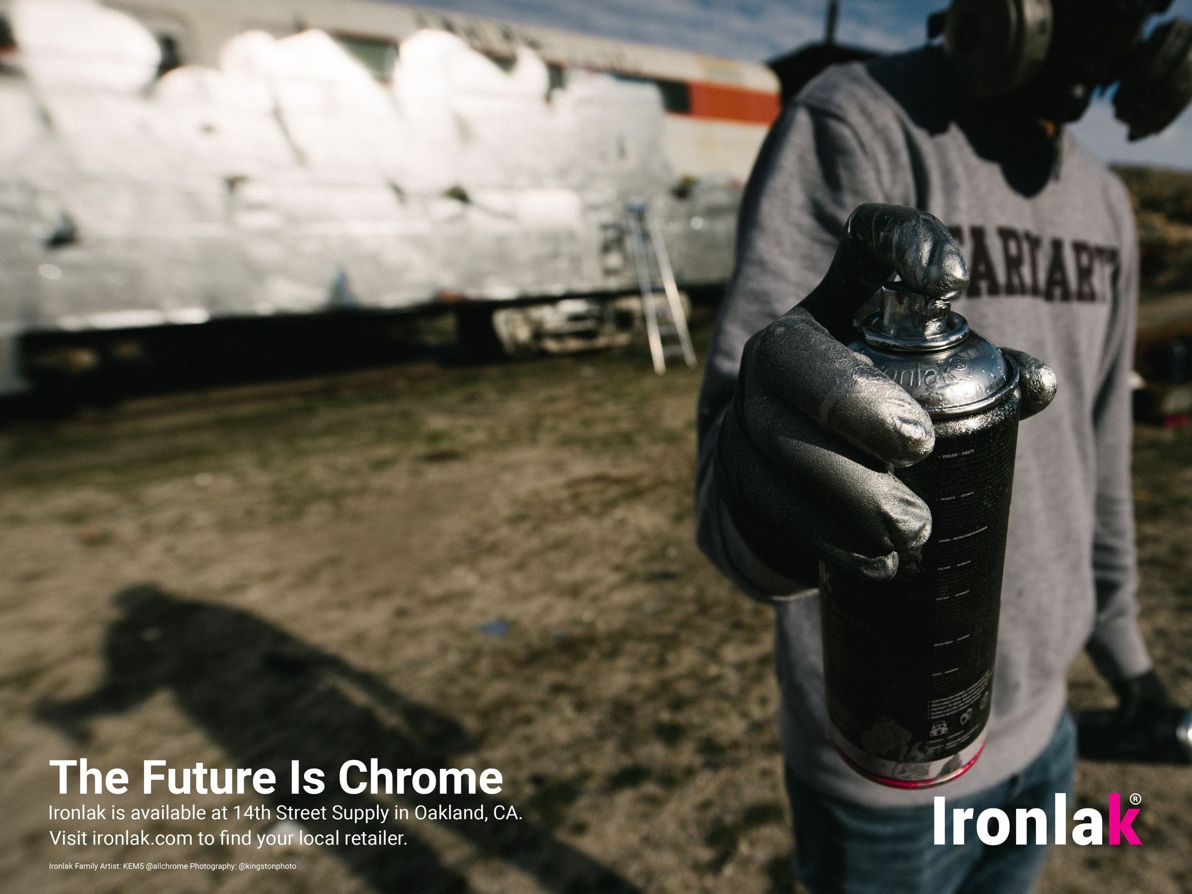
My relationship with graffiti goes back to 2006, and it is a passion I have never put down. So when I was a senior in school looking for a real-world brand challenge, Ironlak felt like a natural fit. An Australian spray paint company built by and for graffiti artists, they were a brand I genuinely believed in. I cold-emailed them with a concept, and what started as a school project eventually turned into a three-month internship.
The Problem
Ironlak wanted to grow beyond its existing audience and connect with artists and communities across the globe. The challenge was building a visual identity that could feel authentic to graffiti culture while speaking to people from entirely different backgrounds, languages, and continents.
The Insight
Research led to a simple but powerful idea. Mark-making is one of the oldest universal human impulses. From Aboriginal Australian cave paintings to Sumerian cuneiform to Arabic calligraphy, every culture has its own visual language. Graffiti, at its core, is just the latest chapter in that tradition. If the identity could tap into that universality, the brand could feel at home anywhere in the world.
The Concept
The solution was a modular wordmark system built around language itself. I translated the word "Iron" into over fifteen languages including Japanese, Hebrew, Arabic, Greek, Russian, Korean, Dutch, French, Albanian, Italian, Bosnian, Irish, Swedish, Latvian, Catalan, and Finnish, while keeping "LAK" constant across every version.
Each mark felt culturally specific on top but unified at its base. A bold red LAK block anchored every version, with the translated word above it rendered in a style native to each script. The brand could speak to someone in Tokyo the same way it spoke to someone in Dublin.
System Applications
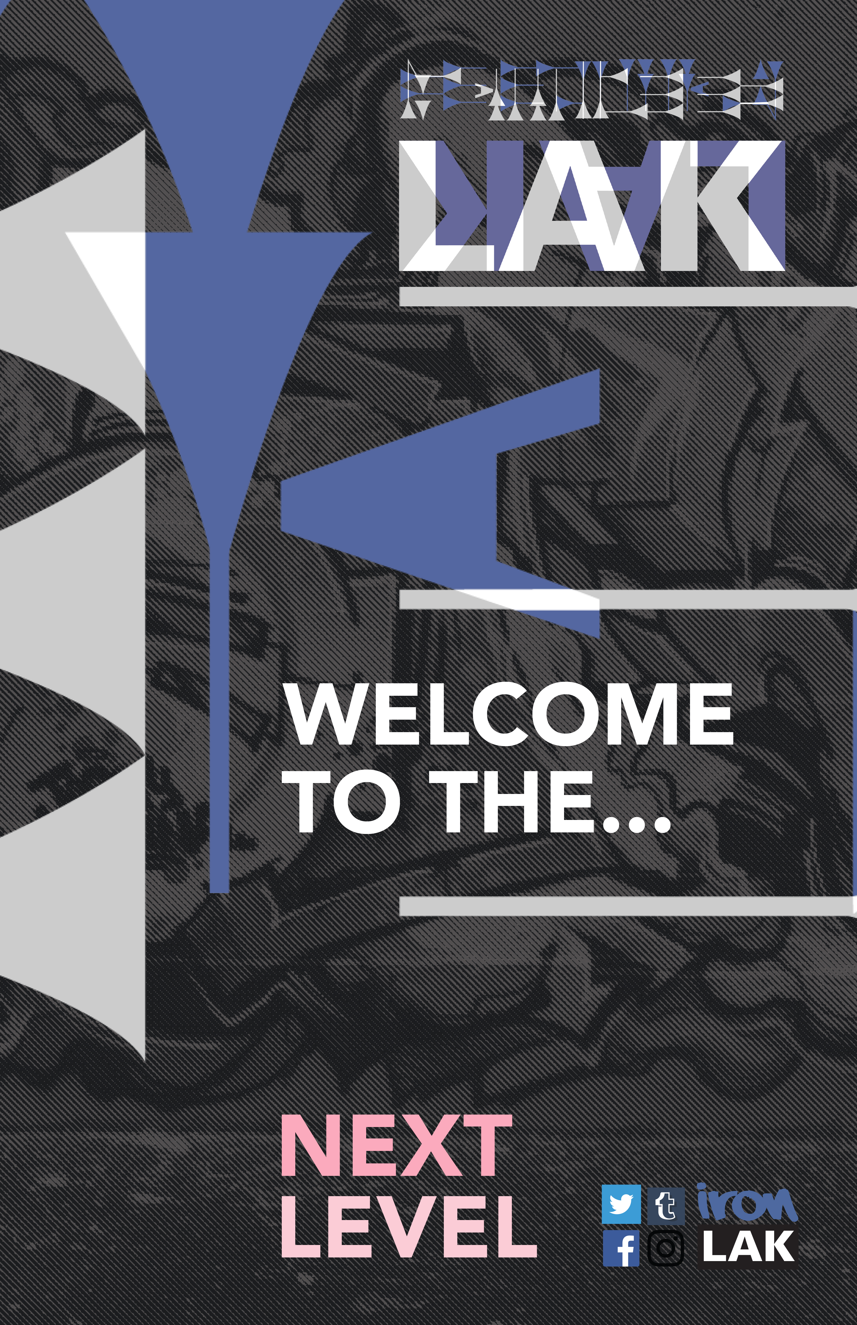
Once the core mark was finalized, the identity was extended across a full brand world — stationery, promotional posters, product packaging, web and mobile interface mockups, branded merchandise, large-format outdoor advertising, and animation storyboarding. Each application showed how the multilingual system could flex across contexts without losing its visual cohesion.
Process
The work began with verbal brainstorming, building out what graffiti means as a cultural force — energy, legacy, universality, dedication, craft. From there I gathered visual inspiration from street art, ancient scripts, and mark-making traditions across history.
Early mark development happened by hand, using Sharpie sketches to explore letterforms and tagging styles before moving into digital execution. In Illustrator I explored 3D rendering, hand-lettered graffiti aesthetics, and clean typographic treatments across all the language variants, testing how each script could carry the system while still feeling true to its own visual culture.

The Internship
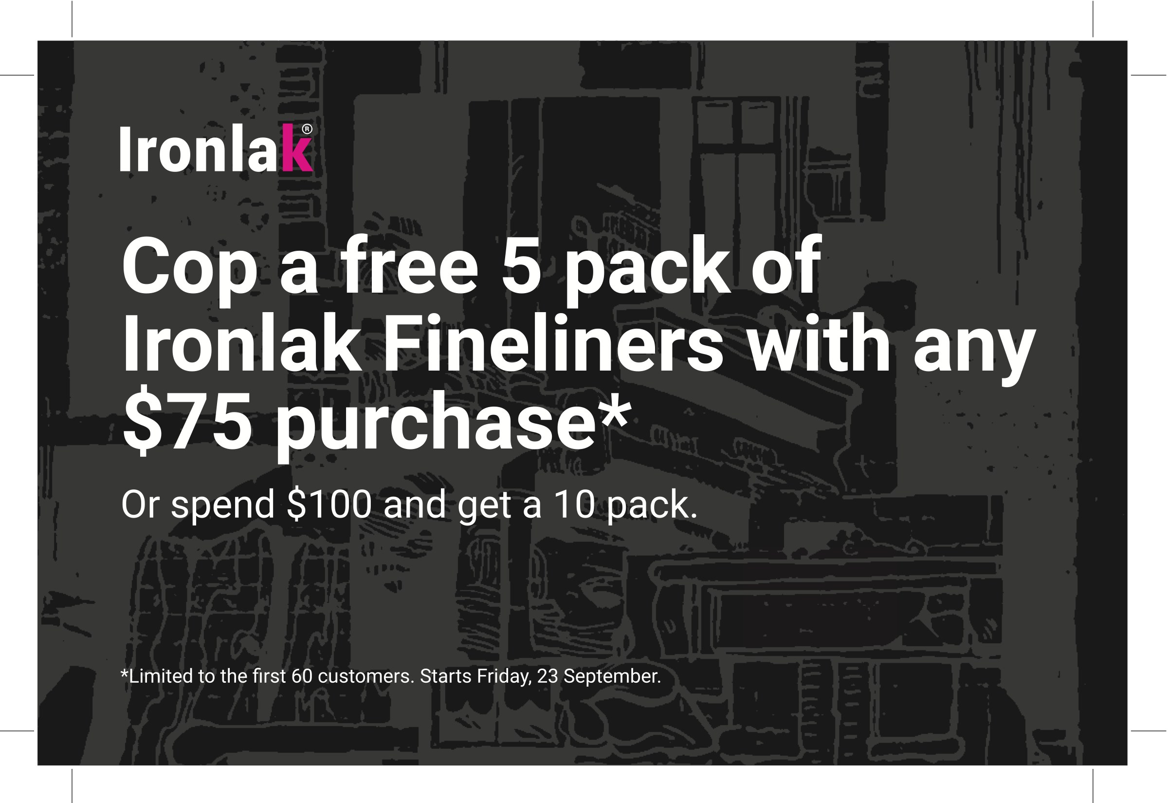
Presenting the full system to Ironlak led directly to a three-month internship with the company. The day-to-day work was grounded in real production across print, digital, and social formats. I designed ads, social media posts, and small promotional cards for Ironlak and several of the spray paint shops they partnered with.
BBQ Burners
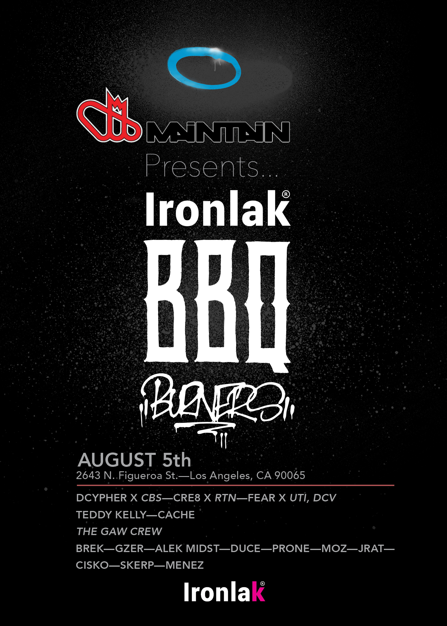
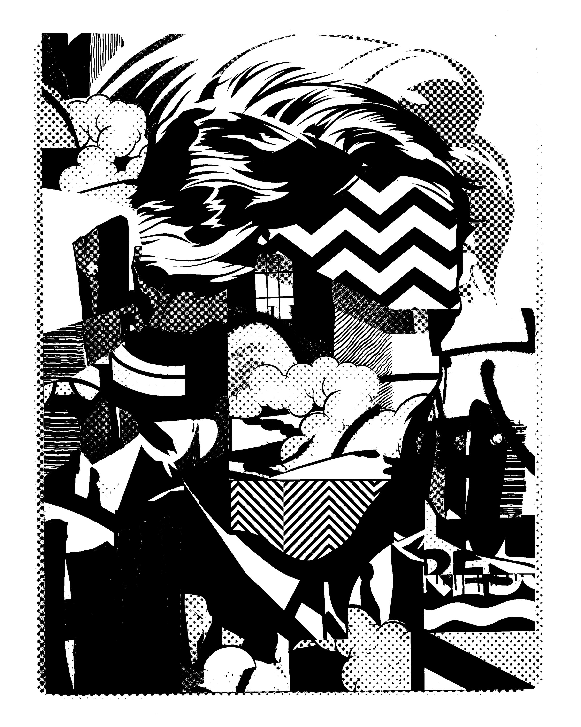
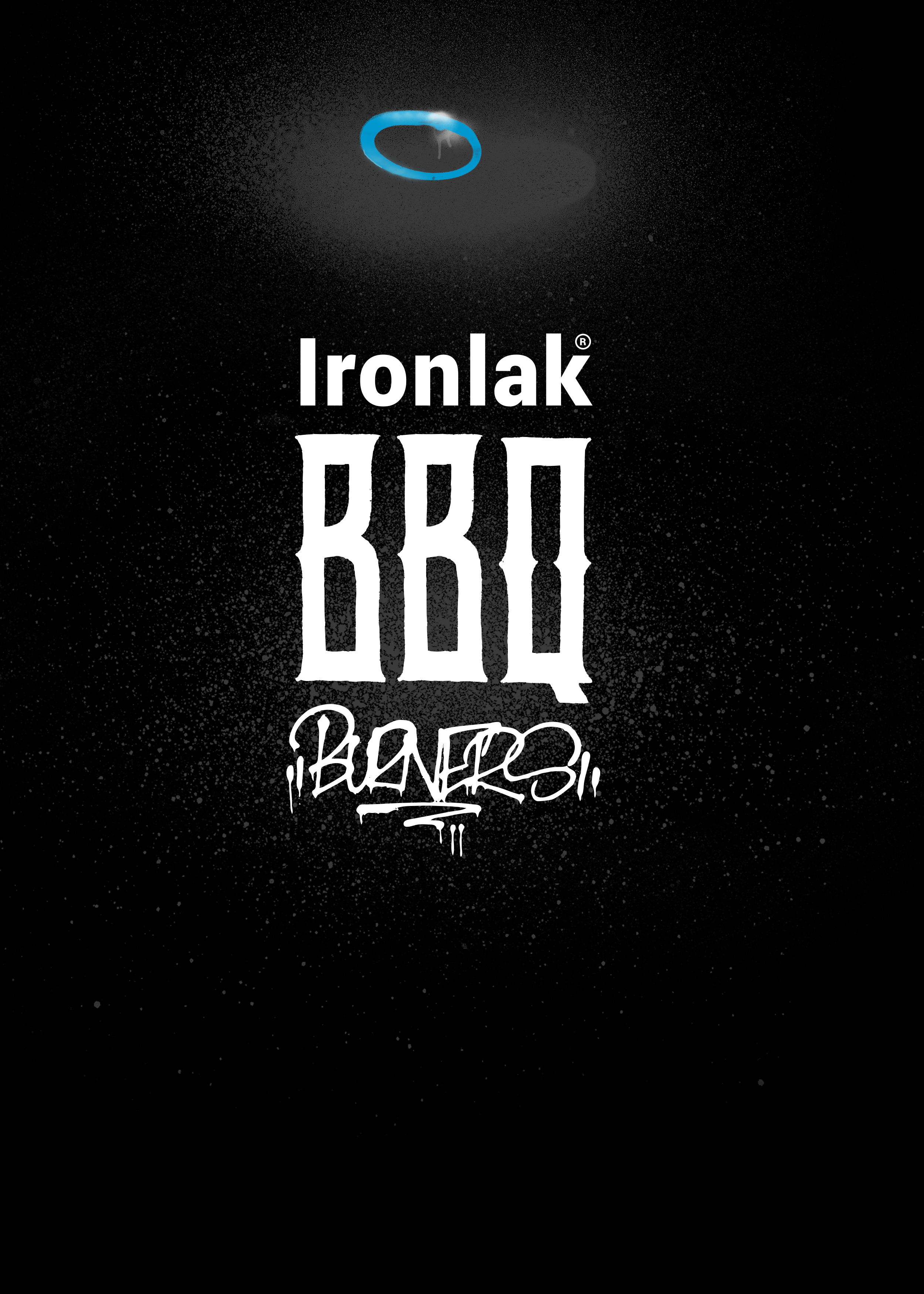
A significant part of the internship was creating flyers for BBQ Burner events — community gatherings where spray paint shops host artists for a day or two of painting, food, and drinks.
To build assets for those flyers I developed a physical-to-digital pipeline: physically spraying paint, scanning the marks, and then tracing and vectorizing them in Illustrator for use as reusable design elements. The team also taught me how to take photographs of their sponsored artists' work and convert them into high-contrast black-and-white bitmap textures for atmospheric backgrounds in ads and flyers.
Physical to Digital
Spray paint marks were scanned and vectorized into reusable assets. Photographs of sponsored artists' work were processed into high-contrast bitmap textures, giving each flyer its atmospheric, in-the-room quality.
BBQ Burner Flyers
Published Work
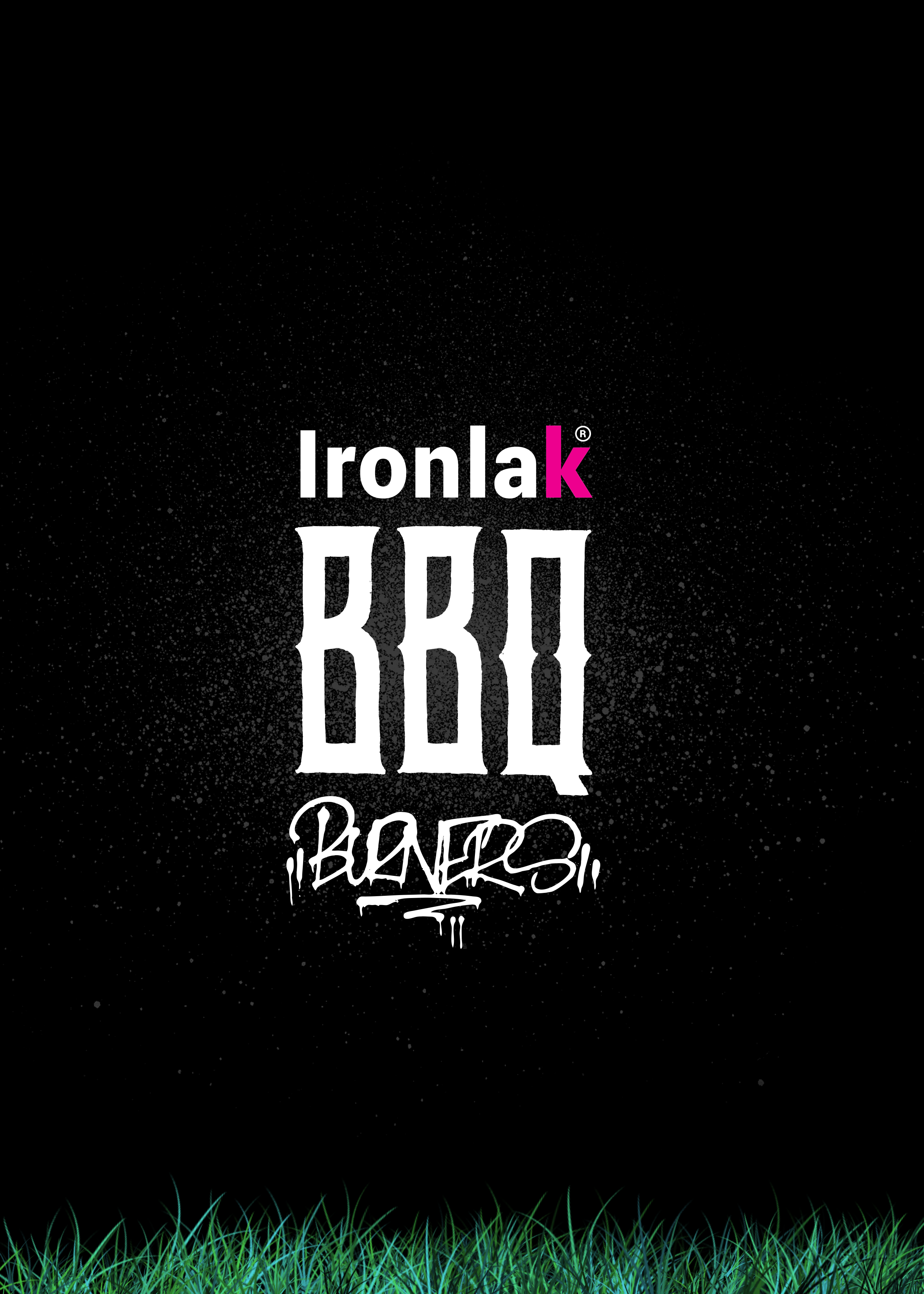
The work reached real audiences. BBQ Burner flyers went live for three shops — Momentum Art Tech, Odds and Evens, and Maintain. An advertisement designed for 14th Street Supply was published in RELISH magazine in San Francisco. Mural festival proposals were also developed for 42 University in collaboration with The Mural Co.
Tools
The primary toolkit across the internship was Adobe Illustrator for asset creation and flyer work, Photoshop for texture and bitmap manipulation, and InDesign for print layout.
My projects
Microsoft
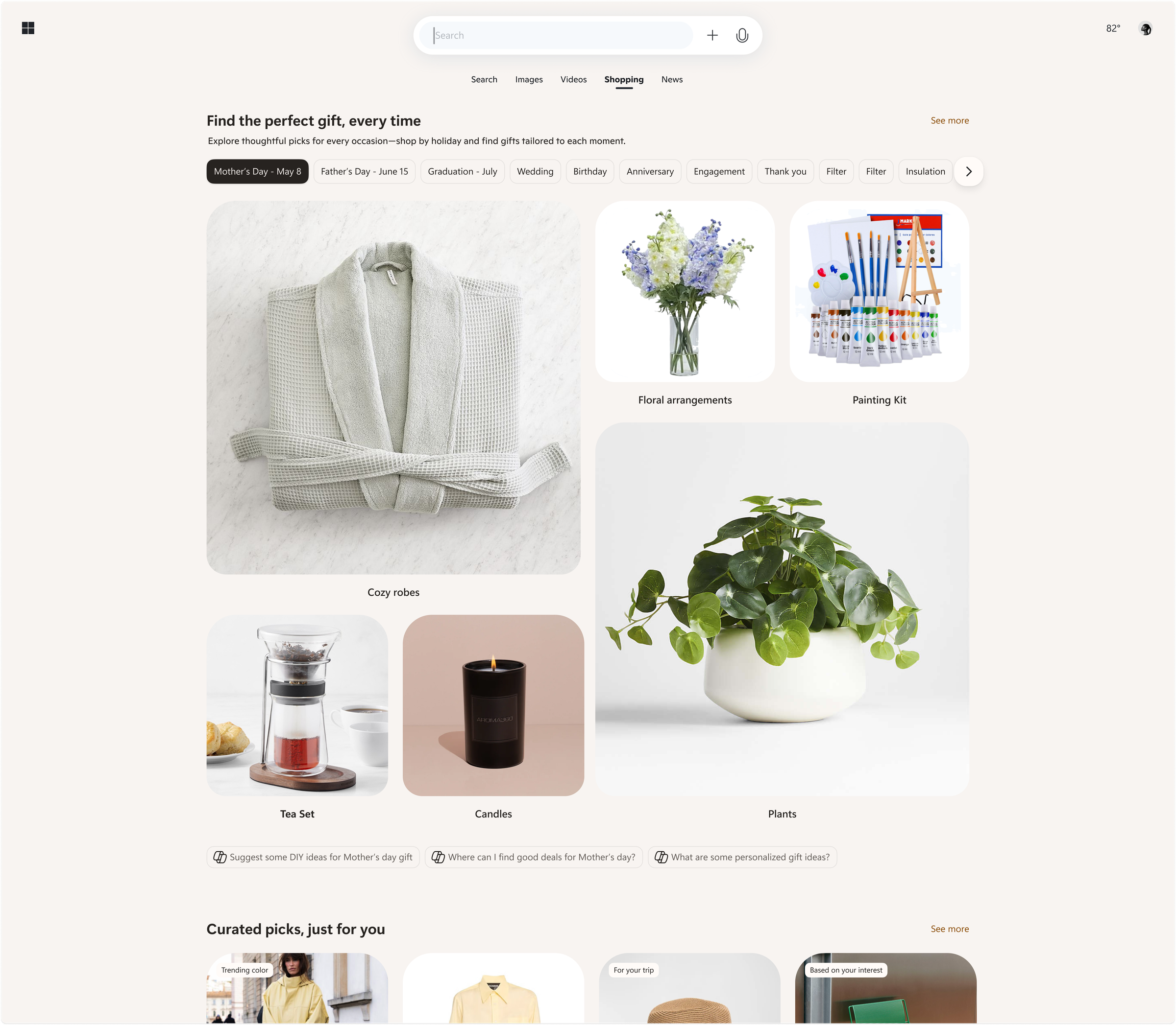
Shopping ecosystem across Bing, Copilot, Windows, Outlook
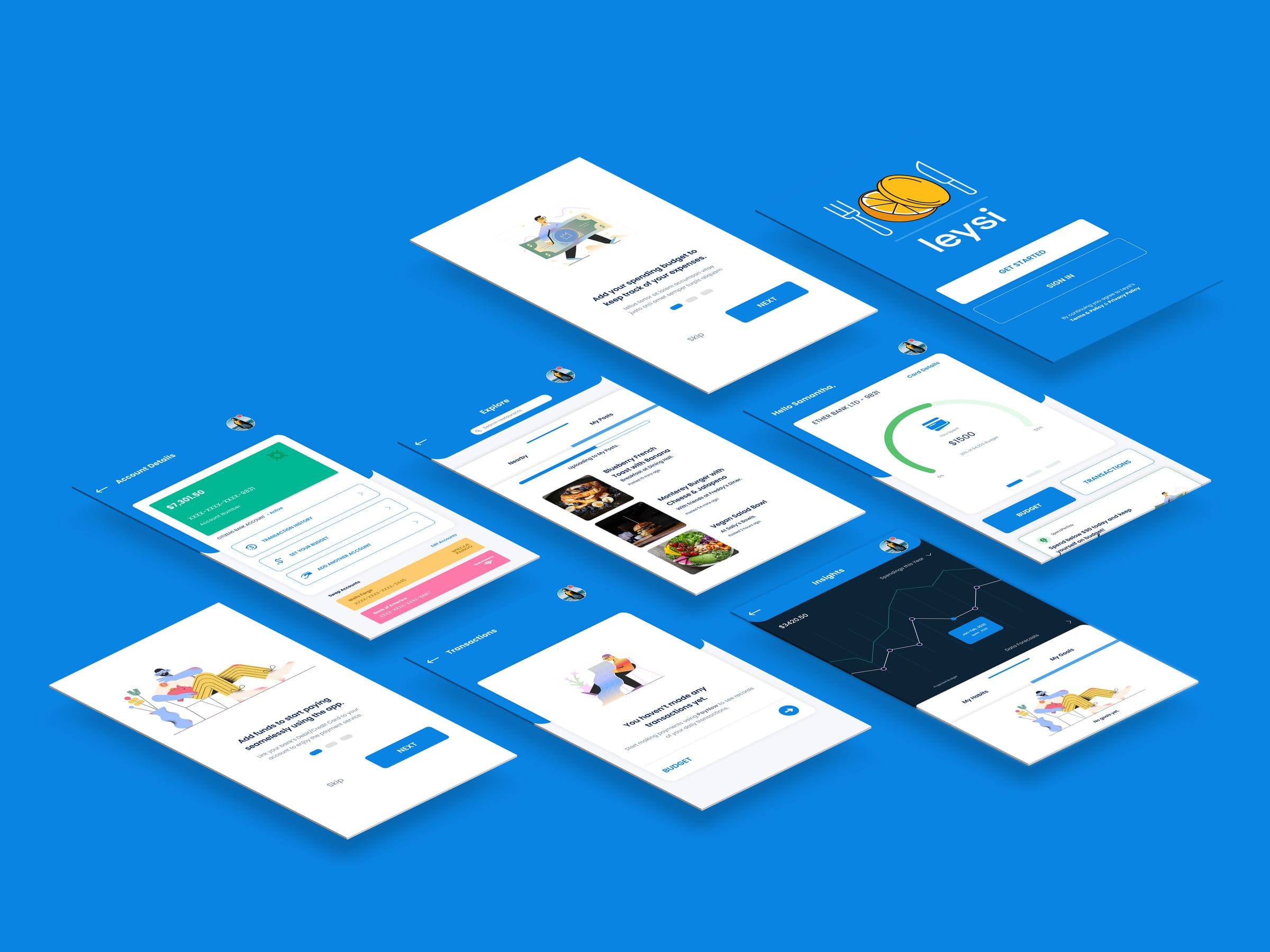
Leysi
Brand identity and iOS app for campus deals
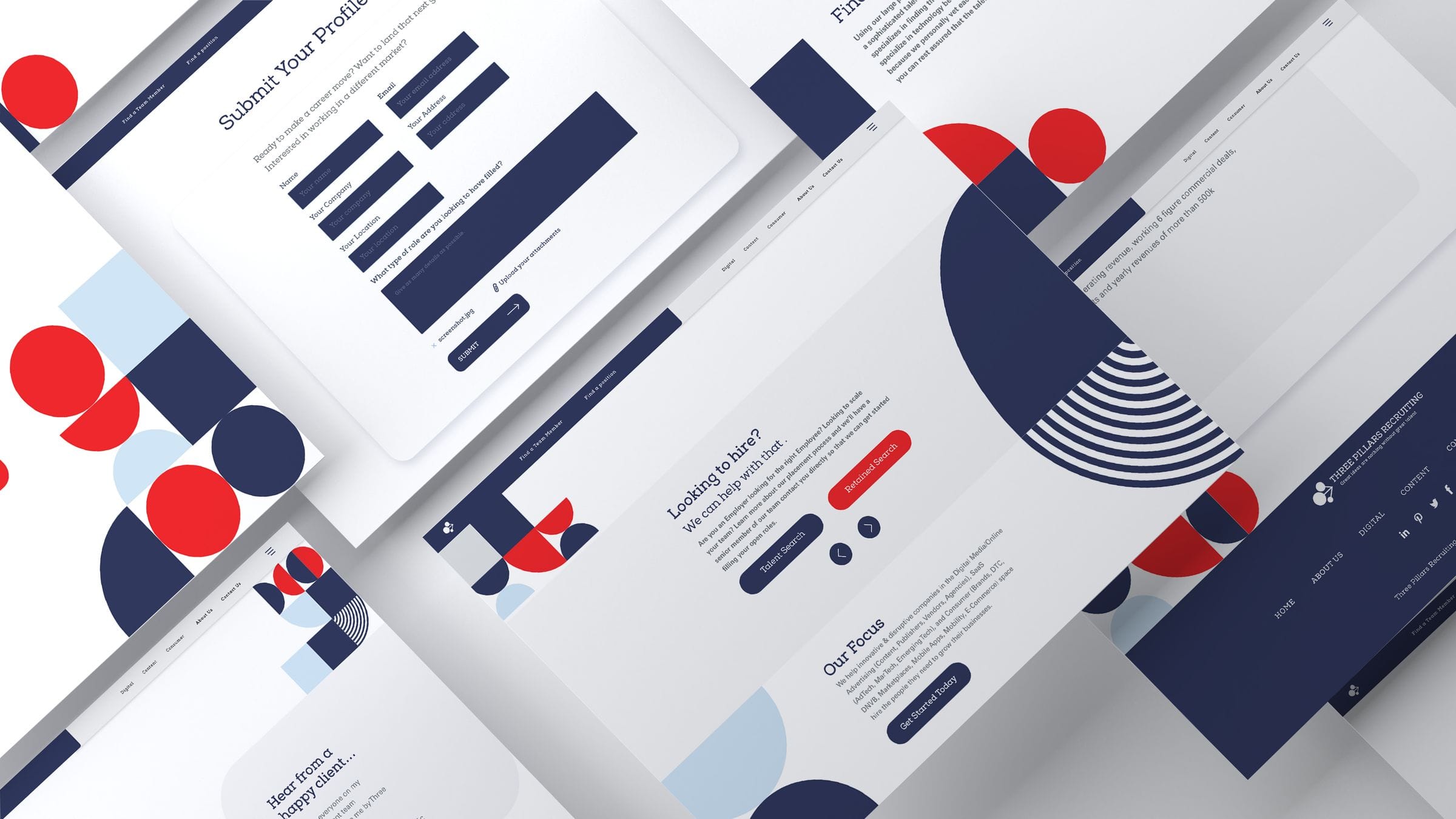
ThreePillars
Recruiting site redesign and brand refresh
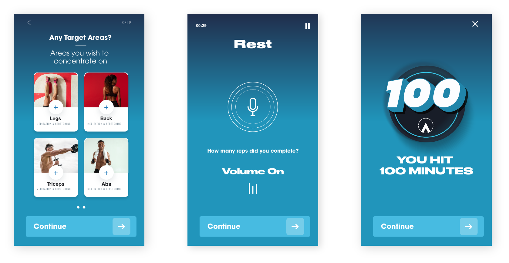
Piton
Product design and mobile interface work
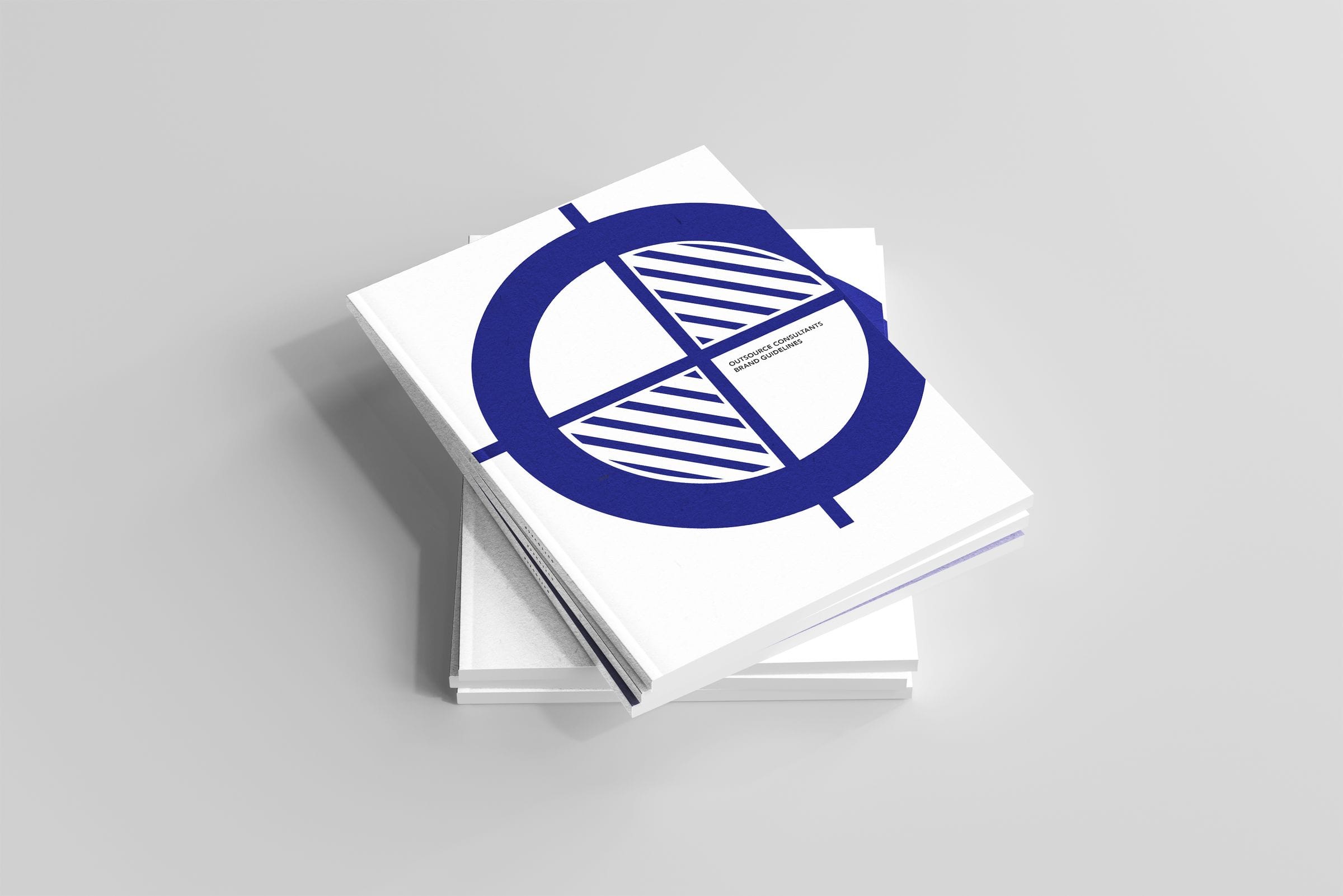
Outsource
Commerce and editorial design across surfaces
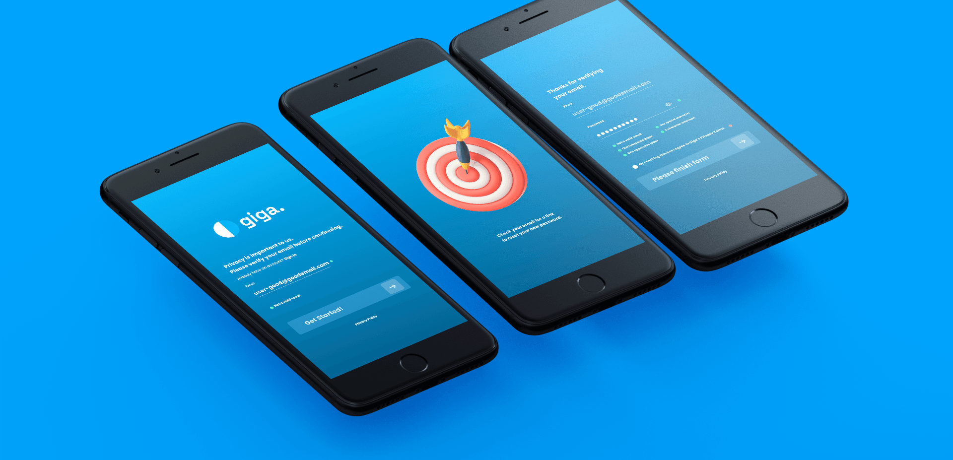
Giga
Cross-platform product design and experiments
%20--%3e%3csvg%20version='1.1'%20id='Layer_1'%20xmlns='http://www.w3.org/2000/svg'%20xmlns:xlink='http://www.w3.org/1999/xlink'%20x='0px'%20y='0px'%20viewBox='0%200%2084.5%2084.5'%20style='enable-background:new%200%200%2084.5%2084.5;'%20xml:space='preserve'%3e%3cstyle%20type='text/css'%3e%20.st0{fill:%23A6D1CA;}%20%3c/style%3e%3cpath%20class='st0'%20d='M42.3,0C19,0,0,19,0,42.3s19,42.3,42.3,42.3s42.3-19,42.3-42.3S65.6,0,42.3,0z%20M42.3,7c8.9,0,17,3.4,23.2,8.8%20c-0.7,0.9-1.6,2-3,3.4c-3,2.9-7.8,6.4-15.2,9.1c-5-9.2-9.9-16.1-13.1-20.5C36.8,7.3,39.5,7,42.3,7z%20M27.3,10.3%20c2.9,3.8,8,10.8,13.2,20.1C26.2,34.3,13,34.8,7.8,34.8C10.2,23.9,17.5,14.9,27.3,10.3z%20M70.3,21c4.3,5.7,7,12.7,7.2,20.4%20c-3.1-0.7-7.8-1.4-13.8-1.4c-3.1,0-6.7,0.2-10.5,0.7c-0.9-2-1.8-3.9-2.8-5.8c7.9-3,13.3-7,16.8-10.5C68.6,23.1,69.5,22.1,70.3,21z%20M43.7,36.9c0.8,1.6,1.6,3.3,2.4,5.1c-15.1,4.2-25.9,16.9-30.5,23.3C10.3,59.1,7,51.1,7,42.3c0-0.2,0-0.3,0-0.4%20C11.8,41.9,26.9,41.5,43.7,36.9z%20M63.7,46.9c6.3,0,10.6,0.9,13.2,1.5c-1.6,9.4-6.9,17.4-14.4,22.7c-1.4-8.4-3.7-16.4-6.5-23.8%20C58.8,47.1,61.4,46.9,63.7,46.9z%20M48.9,48.5c3.2,8,5.8,16.9,7.2,26.2c-4.2,1.8-8.9,2.8-13.8,2.8c-8.1,0-15.5-2.7-21.5-7.3%20C24.4,65.3,35.1,52.1,48.9,48.5z'/%3e%3c/svg%3e)
%20--%3e%3csvg%20version='1.1'%20id='Layer_1'%20xmlns='http://www.w3.org/2000/svg'%20xmlns:xlink='http://www.w3.org/1999/xlink'%20x='0px'%20y='0px'%20viewBox='0%200%2081.2%2081.2'%20style='enable-background:new%200%200%2081.2%2081.2;'%20xml:space='preserve'%3e%3cstyle%20type='text/css'%3e%20.st0{fill:%23A6D1CA;}%20%3c/style%3e%3cpath%20class='st0'%20d='M22.6,0C10.1,0,0,10.1,0,22.6v36.1c0,12.4,10.1,22.6,22.6,22.6h36.1c12.4,0,22.6-10.1,22.6-22.6V22.6%20C81.2,10.1,71.1,0,58.6,0H22.6z%20M22.6,9h36.1c7.5,0,13.5,6.1,13.5,13.5v36.1c0,7.5-6.1,13.5-13.5,13.5H22.6C15.1,72.2,9,66.1,9,58.6%20V22.6C9,15.1,15.1,9,22.6,9z%20M63.1,13.5c-2.5,0-4.5,2-4.5,4.5s2,4.5,4.5,4.5c2.5,0,4.5-2,4.5-4.5S65.6,13.5,63.1,13.5z%20M40.6,18%20C28.2,18,18,28.2,18,40.6s10.1,22.6,22.6,22.6S63.1,53,63.1,40.6S53,18,40.6,18z%20M40.6,27.1c7.5,0,13.5,6.1,13.5,13.5%20s-6.1,13.5-13.5,13.5s-13.5-6.1-13.5-13.5S33.1,27.1,40.6,27.1z'/%3e%3c/svg%3e)
%20--%3e%3csvg%20version='1.1'%20id='Layer_1'%20xmlns='http://www.w3.org/2000/svg'%20xmlns:xlink='http://www.w3.org/1999/xlink'%20x='0px'%20y='0px'%20viewBox='0%200%2079.1%2079.1'%20style='enable-background:new%200%200%2079.1%2079.1;'%20xml:space='preserve'%3e%3cstyle%20type='text/css'%3e%20.st0{fill:%23A6D1CA;}%20%3c/style%3e%3cpath%20class='st0'%20d='M12.1,0C5.5,0,0,5.5,0,12.1V67c0,6.6,5.5,12.1,12.1,12.1H67c6.6,0,12.1-5.5,12.1-12.1V12.1%20C79.1,5.5,73.7,0,67,0H12.1z%20M12.1,6.6H67c3.1,0,5.5,2.4,5.5,5.5V67c0,3.1-2.4,5.5-5.5,5.5H12.1c-3.1,0-5.5-2.4-5.5-5.5V12.1%20C6.6,9,9,6.6,12.1,6.6z%20M20.9,15.4c-3,0-5.5,2.5-5.5,5.5s2.5,5.5,5.5,5.5s5.5-2.5,5.5-5.5S23.9,15.4,20.9,15.4z%20M17.6,30.8%20c-1.2,0-2.2,1-2.2,2.2v28.6c0,1.2,1,2.2,2.2,2.2h6.6c1.2,0,2.2-1,2.2-2.2V33c0-1.2-1-2.2-2.2-2.2H17.6z%20M33,30.8%20c-1.2,0-2.2,1-2.2,2.2v28.6c0,1.2,1,2.2,2.2,2.2h6.6c1.2,0,2.2-1,2.2-2.2V45.1c0-3,2.5-5.5,5.5-5.5c3,0,5.5,2.5,5.5,5.5v16.5%20c0,1.2,1,2.2,2.2,2.2h6.6c1.2,0,2.2-1,2.2-2.2V44c0-7.3-5.9-13.2-13.2-13.2c-3.4,0-6.5,1.3-8.8,3.4V33c0-1.2-1-2.2-2.2-2.2H33z'/%3e%3c/svg%3e)
%20--%3e%3csvg%20version='1.1'%20id='Layer_1'%20xmlns='http://www.w3.org/2000/svg'%20xmlns:xlink='http://www.w3.org/1999/xlink'%20x='0px'%20y='0px'%20viewBox='0%200%2083.7%2083.7'%20style='enable-background:new%200%200%2083.7%2083.7;'%20xml:space='preserve'%3e%3cstyle%20type='text/css'%3e%20.st0{fill:%23A6D1CA;}%20%3c/style%3e%3cpath%20class='st0'%20d='M41.9,0C18.8,0,0,18.8,0,41.9s18.8,41.9,41.9,41.9s41.9-18.8,41.9-41.9S64.9,0,41.9,0z%20M41.9,6.3%20c19.7,0,35.6,15.9,35.6,35.6c0,16-10.6,29.6-25.1,34V65.2c0-4-2.3-7.4-5.6-9.1c11.2-2.2,18.2-11.2,15.5-20.2c-0.5-1.8-1.4-3.5-2.7-5%20c0.9-2.9,2-7.9-0.5-11.8c-4.8,0-7.8,3.3-9.3,5.3c-2.5-0.8-5.2-1.2-7.9-1.3c-2.7,0-5.4,0.4-7.9,1.2c-1.5-2-4.5-5.3-9.3-5.3%20c-2.8,4.5-1.1,9.4-0.1,11.4c-6.5,7.7-4,18.1,5.6,23.3c2.1,1.1,4.4,1.9,6.9,2.4c-2.7,1.4-4.8,4-5.4,7.1h-2.8c-2.7,0-3.8-1.1-5.2-3%20c-1.4-1.9-3-3.1-4.9-3.6c-1-0.1-1.7,0.7-0.8,1.3c3,2,3.2,5.3,4.4,7.5c1.1,2,3.3,3.7,5.8,3.7h3.3v6.8c-14.6-4.5-25.1-18-25.1-34%20C6.3,22.2,22.2,6.3,41.9,6.3z'/%3e%3c/svg%3e)
%20--%3e%3csvg%20version='1.1'%20id='Layer_1'%20xmlns='http://www.w3.org/2000/svg'%20xmlns:xlink='http://www.w3.org/1999/xlink'%20x='0px'%20y='0px'%20viewBox='0%200%2084.5%2048'%20style='enable-background:new%200%200%2084.5%2048;'%20xml:space='preserve'%3e%3cstyle%20type='text/css'%3e%20.st0{fill:%23A6D1CA;}%20%3c/style%3e%3cg%3e%3cpath%20class='st0'%20d='M23.8,0C37,0,47.7,10.7,47.7,24S37,48,23.8,48S0,37.2,0,24S10.7,0,23.8,0z%20M61.9,1.4%20c6.6,0,11.9,10.1,11.9,22.6h0c0,12.5-5.3,22.6-11.9,22.6S50,36.5,50,24S55.3,1.4,61.9,1.4z%20M80.3,3.8c2.3,0,4.2,9.1,4.2,20.2%20c0,11.2-1.9,20.2-4.2,20.2s-4.2-9.1-4.2-20.2S78,3.8,80.3,3.8z'/%3e%3c/g%3e%3c/svg%3e)